


 Arguments


Monckton misuses IPCC equation
What the science says...
| Select a level... |
 Intermediate
|
 Advanced
| |||
|
The IPCC surface temperature projections have been exceptionally accurate thus far. |
|||||
Climate Myth...
IPCC overestimate temperature rise
"The IPCC’s predicted equilibrium warming path bears no relation to the far lesser rate of “global warming” that has been observed in the 21st century to date." (Christopher Monckton)
1990 IPCC FAR
The Intergovernmental Panel on Climate Change (IPCC) First Assessment Report (FAR)was published in 1990. The FAR used simple global climate models to estimate changes in the global-mean surface air temperature under various CO2 emissions scenarios. Details about the climate models used by the IPCC are provided in Chapter 6.6 of the report.
The IPCC FAR ran simulations using various emissions scenarios and climate models. The emissions scenarios included business as usual (BAU) and three other scenarios (B, C, D) in which global human greenhouse gas emissions began slowing in the year 2000. The FAR's projected BAU greenhouse gas (GHG) radiative forcing (global heat imbalance) in 2010 was approximately 3.5 Watts per square meter (W/m2). In the B, C, D scenarios, the projected 2011 forcing was nearly 3 W/m2. The actual GHG radiative forcing in 2011 was approximately 2.8 W/m2, so to this point, we're actually closer to the IPCC FAR's lower emissions scenarios.
The IPCC FAR ran simulations using models with climate sensitivities (the total amount of global surface warming in response to a doubling of atmospheric CO2, including amplifying and dampening feedbacks) of 1.5°C (low), 2.5°C (best), and 4.5°C (high) for doubled CO2 (Figure 1). However, because climate scientists at the time believed a doubling of atmospheric CO2 would cause a larger global heat imbalance than is currently believed, the actual climate sensitivities were approximatly 18% lower (for example, the 'Best' model sensitivity was actually closer to 2.1°C for doubled CO2).
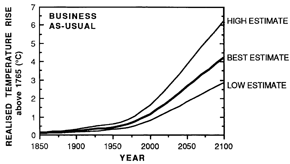
Figure 1: IPCC FAR projected global warming in the BAU emissions scenario using climate models with equilibrium climate sensitivities of 1.3°C (low), 2.1°C (best), and 3.8°C (high) for doubled atmospheric CO2
Figure 2 accounts for the lower observed GHG emissions than in the IPCC BAU projection, and compares its 'Best' adjusted projection with the observed global surface warming since 1990.
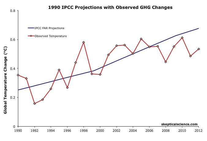
Figure 2: IPCC FAR BAU global surface temperature projection adjusted to reflect observed GHG radiative forcings 1990-2011 (blue) vs. observed surface temperature changes (average of NASA GISS, NOAA NCDC, and HadCRUT4; red) for 1990 through 2012.
The IPCC FAR 'Best' BAU projected rate of warming fro 1990 to 2012 was 0.25°C per decade. However, that was based on a scenario with higher emissions than actually occurred. When accounting for actual GHG emissions, the IPCC average 'Best' model projection of 0.2°C per decade is within the uncertainty range of the observed rate of warming (0.15 ± 0.08°C) per decade since 1990.
1995 IPCC SAR
The IPCC Second Assessment Report (SAR)was published in 1995, and improved on the FAR by estimating the cooling effects of aerosols — particulates which block sunlight. The SAR included various human GHG emissions scenarios, so far its scenarios IS92a and b have been closest to actual emissions.
The SAR also maintained the "best estimate" equilibrium climate sensitivity used in the FAR of 2.5°C for a doubling of atmospheric CO2. However, as in the FAR, because climate scientists at the time believed a doubling of atmospheric CO2 would cause a larger global heat imbalance than is currently believed, the actual "best estimate" model sensitivity was closer to 2.1°C for doubled CO2.
Using that sensitivity, and the various IS92 emissions scenarios, the SAR projected the future average global surface temperature change to 2100 (Figure 3).
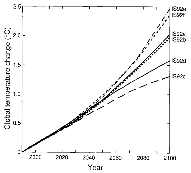
Figure 3: Projected global mean surface temperature changes from 1990 to 2100 for the full set of IS92 emission scenarios. A climate sensitivity of 2.12°C is assumed.
Figure 4 compares the IPCC SAR global surface warming projection for the most accurate emissions scenario (IS92a) to the observed surface warming from 1990 to 2012.
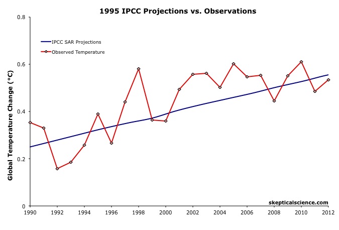
Figure 4: IPCC SAR Scenario IS92a global surface temperature projection (blue) vs. observed surface temperature changes (average of NASA GISS, NOAA NCDC, and HadCRUT4; red) for 1990 through 2012.
Scorecard
The IPCC SAR IS92a projected rate of warming from 1990 to 2012 was 0.14°C per decade. This is within the uncertainty range of the observed rate of warming (0.15 ± 0.08°C) per decade since 1990, and very close to the central estimate.
2001 IPCC TAR
The IPCC Third Assessment Report (TAR) was published in 2001, and included more complex global climate models and more overall model simulations. The IS92 emissions scenarios used in the SAR were replaced by the IPCC Special Report on Emission Scenarios (SRES), which considered various possible future human development storylines.
The IPCC model projections of future warming based on the varios SRES and human emissions only (both GHG warming and aerosol cooling, but no natural influences) are show in Figure 5.
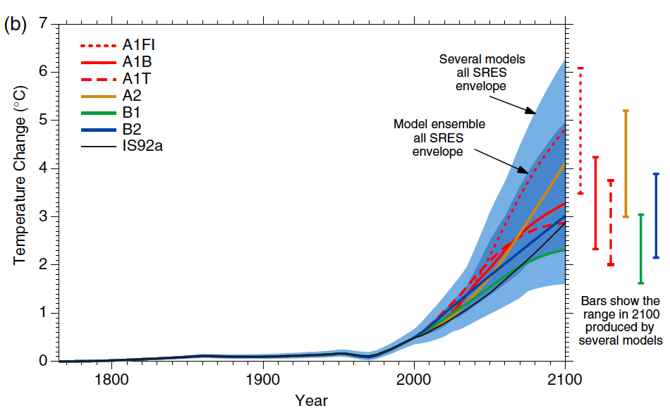
Figure 5: Historical human-caused global mean temperature change and future changes for the six illustrative SRES scenarios using a simple climate model. Also for comparison, following the same method, results are shown for IS92a. The dark blue shading represents the envelope of the full set of 35 SRES scenarios using the simple model ensemble mean results. The bars show the range of simple model results in 2100.
Thus far we are on track with the SRES A2 emissions path. Figure 6 compares the IPCC TAR projections under Scenario A2 with the observed global surface temperature change from 1990 through 2012.
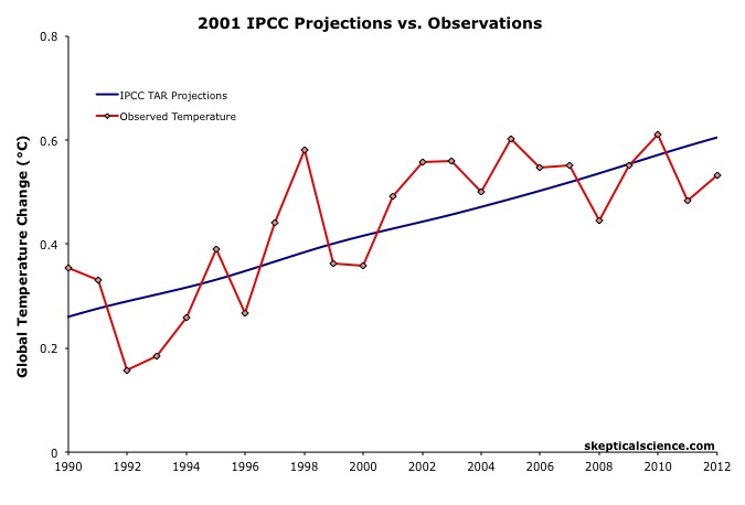
Figure 6: IPCC TAR model projection for emissions Scenario A2 (blue) vs. observed surface temperature changes (average of NASA GISS, NOAA NCDC, and HadCRUT4; red) for 1990 through 2012.
Scorecard
The IPCC TAR Scenario A2 projected rate of warming from 1990 to 2012 was 0.16°C per decade. This is within the uncertainty range of the observed rate of warming (0.15 ± 0.08°C) per decade since 1990, and very close to the central estimate.
2007 IPCC AR4
In 2007, the IPCC published its Fourth Assessment Report (AR4). In the Working Group I (the physical basis) report, Chapter 8 was devoted to climate models and their evaluation. Section 8.2 discusses the advances in modeling between the TAR and AR4. Essentially, the models became more complex and incoporated more climate influences.
As in the TAR, AR4 used the SRES to project future warming under various possible GHG emissions scenarios. Figure 7 shows the projected change in global average surface temperature for the various SRES.

Figure 7: Solid lines are multi-model global averages of surface warming (relative to 1980–1999) for the SRES scenarios A2, A1B, and B1, shown as continuations of the 20th century simulations. Shading denotes the ±1 standard deviation range of individual model annual averages. The orange line is for the experiment where concentrations were held constant at year 2000 values. The grey bars at right indicate the best estimate (solid line within each bar) and the likely range assessed for the six SRES marker scenarios.
We can therefore again compare the Scenario A2 multi-model global surface warming projections to the observed warming, in this case since 2000, when the AR4 model simulations began (Figure 8).
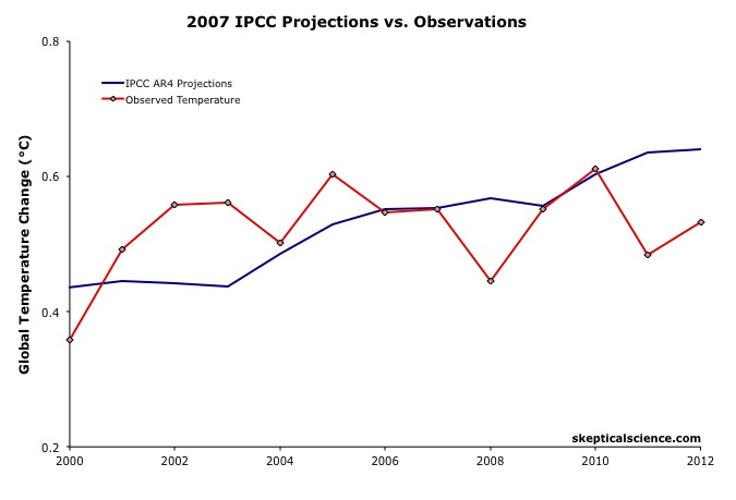 Figure 8: IPCC AR4 multi-model projection for emissions Scenario A2 (blue) vs. observed surface temperature changes (average of NASA GISS, NOAA NCDC, and HadCRUT4; red) for 2000 through 2012.
The IPCC AR4 Scenario A2 projected rate of warming from 2000 to 2012 was 0.18°C per decade. This is within the uncertainty range of the observed rate of warming (0.06 ± 0.16°C) per decade since 2000, though the observed warming has likely been lower than the AR4 projection. As we will show below, this is due to the preponderance of natural temperature influences being in the cooling direction since 2000, while the AR4 projection is consistent with the underlying human-caused warming trend.
IPCC Projections vs. Observed Warming Rates
Tamino at the Open Mind blog has also compared the rates of warming projected by the FAR, SAR, and TAR (estimated by linear regression) to the observed rate of warming in each global surface temperature dataset. The results are shown in Figure 9.
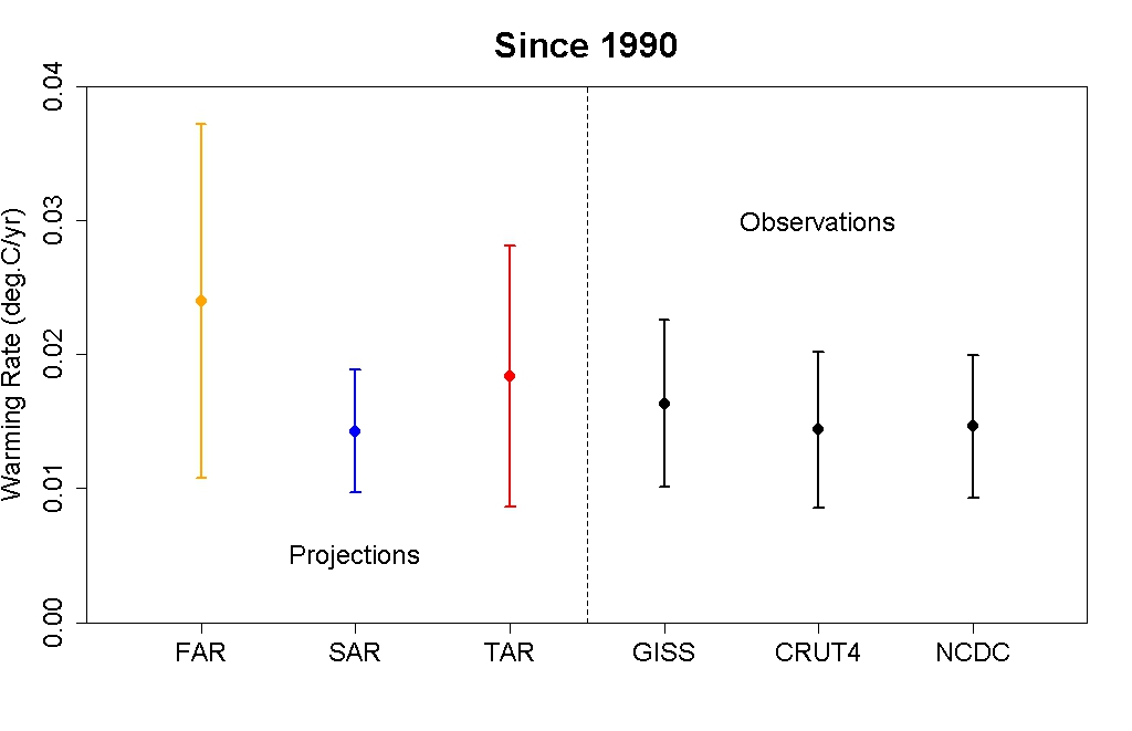
Figure 9: IPCC FAR (yellow) SAR (blue), and TAR (red) projected rates of warming vs. observations (black) from 1990 through 2012.
As this figure shows, even without accounting for the actual GHG emissions since 1990, the warming projections are consistent with the observations, within the margin of uncertainty.
Rahmstorf et al. (2012) Verify TAR and AR4 Accuracy
A paper published in Environmental Research Letters by Rahmstorf, Foster, and Cazenave (2012) applied the methodology of Foster and Rahmstorf (2011), using the statistical technique of multiple regression to filter out the influences of the El Niño Southern Oscillation (ENSO) and solar and volcanic activity from the global surface temperature data to evaluate the underlying long-term human-caused trend. Figure 10 compares their results with (pink) and without (red) the short-tern noise from natural temperature influences to the IPCC TAR (blue) and AR4 (green) projections.
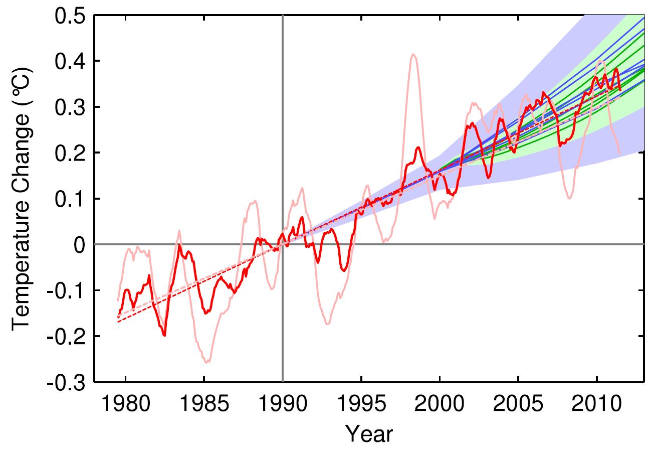
Figure 10: Observed annual global temperature, unadjusted (pink) and adjusted for short-term variations due to solar variability, volcanoes, and ENSO (red) as in Foster and Rahmstorf (2011). 12-month running averages are shown as well as linear trend lines, and compared to the scenarios of the IPCC (blue range and lines from the 2001 report, green from the 2007 report). Projections are aligned in the graph so that they start (in 1990 and 2000, respectively) on the linear trend line of the (adjusted) observational data.
TAR Scorecard
From 1990 through 2011, the Rahmstorf et al. unadjusted and adjusted trends in the observational data are 0.16 and 0.18°C per decade, respectively. Both are consistent with the IPCC TAR Scenario A2 projected rate of warming of approximately 0.16°C per decade.
AR4 Scorecard
From 2000 through 2011, the Rahmstorf et al. unadjusted and adjusted trends in the observational data are 0.06 and 0.16°C per decade, respectively. While the unadjusted trend is rather low as noted above, the adjusted, underlying human-caused global warming trend is consistent with the IPCC AR4 Scenario A2 projected rate of warming of approximately 0.18°C per decade.
Frame and Stone (2012) Verify FAR Accuracy
A paper published in Nature Climate Change, Frame and Stone (2012), sought to evaluate the FAR temperature projection accuracy by using a simple climate model to simulate the warming from 1990 through 2010 based on observed GHG and other global heat imbalance changes. Figure 11 shows their results. Since the FAR only projected temperature changes as a result of GHG changes, the light blue line (model-simuated warming in response to GHGs only) is the most applicable result.

Figure 11: Observed changes in global mean surface temperature over the 1990–2010 period from HadCRUT3 and GISTEMP (red) vs. FAR BAU best estimate (dark blue), vs. projections using a one-dimensional energy balance model (EBM) with the measured GHG radiative forcing since 1990 (light blue) and with the overall radiative forcing since 1990 (green). Natural variability from the ensemble of 587 21-year-long segments of control simulations (with constant external forcings) from 24 Coupled Model Intercomparison Project phase 3 (CMIP3) climate models is shown in black and gray. From Frame and Stone (2012).
Not surprisingly, the Frame and Stone result is very similar to our evaluation of the FAR projections, finding that they accurately simulated the global surface temperature response to the increased greenhouse effect since 1990. The study also shows that the warming since 1990 cannot be explained by the Earth's natural temperature variability alone, because the warming (red) is outside of the range of natural variability (black and gray).
IPCC Trounces Contrarian Predictions
As shown above, the IPCC has thus far done remarkably well at predicting future global surface warming. The same cannot be said for the climate contrarians who criticize the IPCC and mainstream climate science predictions.
One year before the FAR was published, Richard Lindzen gave a talk at MIT in 1989 which we can use to reconstruct what his global temperature prediction might have looked like. In that speech, Lindzen remarked
"I would say, and I don't think I'm going out on a very big limb, that the data as we have it does not support a warming...I personally feel that the likelihood over the next century of greenhouse warming reaching magnitudes comparable to natural variability seems small"
The first statement in this quote referred to past temperatures — Lindzen did not believe the surface temperature record was accurate, and did not believe that the planet had warmed from 1880 to 1989 (in reality, global surface temperatures warmed approximately 0.5°C over that timeframe). The latter statement suggests that the planet's surface would not warm more than 0.2°C over the following century, which is approximately the range of natural variability. In reality, as Frame and Stone showed, the surface warming already exceeded natural variability two decades after Lindzen's MIT comments.
Climate contrarian geologist Don Easterbook has been predicting impending global cooling since 2000, based on expected changes in various oceanic cycles (including ENSO) and solar activity. Easterbrook made two specific temperature projections based on two possible scenarios. As will be shown below, neither has fared well.
In 2009, Syun-Ichi Akasofu (geophysicist and director of the International Arctic Research Center at the University of Alaska-Fairbanks) released a paper which argued that the recent global warming is due to two factors: natural recovery from the Little Ice Age (LIA), and "the multi-decadal oscillation" (oceanic cycles). Based on this hypothesis, Akasofu predicted that global surface temperatures would cool between 2000 and 2035.
John McLean is a data analyst and member of the climate contrarian group Australian Climate Science Coalition. He was lead author on McLean et al. (2009), which grossly overstates the influence of the El Niño Southern Oscillation (ENSO) on global temperatures. Based on the results of that paper, McLean predicted:
"it is likely that 2011 will be the coolest year since 1956 or even earlier"
In 1956, the average global surface temperature anomaly in the three datasets (NASA GISS, NOAA NCDC, and HadCRUT4) was -0.21°C. In 2010, the anomaly was 0.61°C. Therefore, McLean was predicting a greater than 0.8°C global surface cooling between 2010 and 2011. The largest year-to-year average global temperature change on record is less than 0.3°C, so this was a rather remarkable prediction.
IPCC vs. Contrarians Scorecard
Figure 12 compares the four IPCC projections and the four contrarian predictions to the observed global surface temperature changes. We have given Lindzen the benefit of the doubt and not penalized him for denying the accuracy of the global surface temperature record in 1989. Our reconstruction of his prediction takes the natural variability of ENSO, the sun, and volcanic eruptions from Foster and Rahmstorf (2011) (with a 12-month running average) and adds a 0.02°C per decade linear warming trend. All other projections are as discussed above.
Figure 12: IPCC temperature projections (red, pink, orange, green) and contrarian projections (blue and purple) vs. observed surface temperature changes (average of NASA GISS, NOAA NCDC, and HadCRUT4; red) for 1990 through 2012.
Not only has the IPCC done remarkably well in projecting future global surface temperature changes thus far, but it has also performed far better than the few climate contrarians who have put their money where their mouth is with their own predictions.
Intermediate rebuttal written by dana1981
Update July 2015:
Here is a related lecture-video from Denial101x - Making Sense of Climate Science Denial
Last updated on 13 July 2015 by pattimer. View Archives


Just out of curiosity, how do you "adjust" the IPCC's predictions to reflect observed GHG forcings? Because it seems as though there's a big difference between doing that (which results in the images shown above) and not doing it (which results in images like the one below).
In other words, what's wrong with this picture?
Also, I hate to sound like a broken record (as I said this about the "Southern sea ice is increasing" page too), but I don't see why we need both this page and the one called "IPCC global warming projections were wrong," as they both seem to cover the same topic.
[Dikran Marsupial] Please can you limit your images to no more than 500 pixels wide. I have made the adjustment this time.
jsmith, the image you have shown there is not actually "unadjusted". The model projections used in the 1990 IPCC report do not all agree exactly on the temperature in 1990, and they definitely didn't predict the observations exactly either. The thing that is wrong with the picture is that they have used a baseline of year (whci happened to be a peak in the observations), rather than the proper procedure of a 30 year baseline. The problem with a single year baseline is that you can make it give any result you want, you can make it look like the models over-predict temperatures by baselining to a warm year, or you can make them look as if they are running cooler by baselining to a cold year. Sadly this sort of thing is done all the time, but that doesn't mean that it is correct - far from it.
Here is an example of what I mean (vai woodfortrees.org):
Here I've shown the HADCRUT4 datase, along with two lines representing completely accurate representations of the rate of warming, but only differing in the vertical offset introduced by the choice of baseline year.
The green line represents a "skeptics" presentation, where the observations and projection were baselined to a peak in the observations so that the observations are then generally below the projection. "IPCC models over predict warming" is the headline.
The blue line represents an "alarmist" presentation, where the observations and projections were baselined to a trough in the observations, so that the observations are generally higher than the projection. "IPCC models underpredict warming" is the headline.
The magenta line represents the scientific presentation (in this case it is just the OLS trend line), where the offset hasn't been cherry picked to support the desired argument.
Just to further clarify DM...
You can't do this (red circle):
That is a single year, cherry picked, baseline. It's something you see Chris Monckton constantly doing in his presentations.
BTW a later article by Monckton (2012) does another odd thing with IPCC projections, based purely on arithmetic. The final comment there is mine and intended to be read side-by-side with the article. It took some time to work out what Monckton was doing, which was back-projecting the same figures from the projections to obtain estimates for warming in 1960-2008, first assuming the CO₂-temp relationship was logarithmic, secondly that it was linear. Unsurprisingly he finds a discrepancy between those two results, but he assumes that is a flaw in the models (!).
I didn't start from an ad hominem premise, but can't help trying to understand what was driving Monckton in that article. In the Meet the Sceptics (2011) documentary, he claims to have cured himself of Graves' disease. As I understand it, mental confusion is an occasional symptom of hyperthyroidism. I don't mean that gives additional reason to dismiss his varied claims, but it might invite a more sympathetic response.
I don't know why this is not in the top ten. I hear this all the time.
If JSmith's methods were wrong can you not at least address his core concern? Your article doesn't show the actual IPCC first assessment predictions for temperature, but adjusts them prior to comparison to observed temperature. The IPCC first assessment summary states in Chapter 6 that for 2030 they see "a predicted rise trom 1990 of 0.7-1.5°C with a best estimate of 1.1C". If I'm not mistaken, we currently are very much on track to be under 1.1C warmer than 1990 in the next 15 years?
If JSmith made mistakes or inaccuracies in matching the observed temperatures to the 1990 IPCC predictions as they were published below, don't just settle for saying he did it wrong. Graph the actual observed temperatures against the actual published predictions of the IPCC from 1990 as shown below. I'm afraid all my efforts to match recorded observations to them only seem close to matching the very coldest 1990 predictions and I'd love to see a graph that can more clearly show me where I'm going wrong.
bcglrofindel - In short, short term variability. GCMs are intended to project (not predict) average climate over the long term, and there has never been a claim that they could accurately predict short term variations that cancel out over several decades.
See this post examining how recent short term variations have affected longer term projections. Or this thread comparing various projections (including 'skeptic' ones) against actual temperatures, although that only goes to 2011.
Quite frankly, even the earliest IPCC projections are quite good. Certainly when compared to those from people in denial of climate science...
KR,
You still aren't giving a simple apples to apples comparison. The claim I see people making is that the published IPCC trends from 1990 are too high compared to actual measured temperature. Isn't it trivial to plot actual temperature against the 3 projections the IPCC gave in Fig 6.11? That would easily do away with all the hedging and confusion and end the matter, no? Why can't I find such a simple plot anywhere? All the places I find such a plot, like JSmith's in thread, it's called out as inaccurate. Can't 3 simple plots done on excel in about a half hour clear this up and silence skeptics?
bcglrofindel:
I can't sort through just exactly what your issue is with the IPCC projections. To begin with, exactly which projection are you selecting, why are you selecting that one, and what data are you using to compare?
Each IPCC projection has some assumptions in it, with respect to the growth of atmospheric CO2 (emissions scenario) and the temperature response to that change in CO2 (climate sensitivity).
With four emissions scenarios and three climate sensitivty values, that gives 12 projections "on display". Note that these projections are not "predictions", because the IPCC is not claiming that one (or any) of these is "the one". When comparing to observations (i.e., testing the projections as if they were predictions), you have to do the following:
Note that the choice of an approriate scenario is based on the closeness of the assumptions, not the closeness of the temperature trend.
Let's take a trivial model as an example. Let's assume that we have a linear model that states:
where T is temperature at time t, as a function of the concentration of CO2 at time t (CO2(t)), and A and B are parameters. If I want to make a projection (not a prediction) of temperature into the future, I need three things:
I will have uncertainties in my CO2(t) values, and in my sensitivity B. As a good scientist, I will try several values of each, based on my understanding of what is reasonable or possible, and I will publish results of those several projections. This is what the IPCC did (with models a little more complex than the linear example here!).
Now, after several years, I want to compare the actual observed T to my model results. I need to determine:
...and, most importantly...
Once I have all that, I can start to compare the model to observations. I may need a new CO2(t) time series, and I may need to use different values of A and B from my earlier projections. Note that this does not mean that I'm changing my model: I'm just changing input parameters.
jsmith's graph has the mistake of choosing an inappropriate value for A. The observations contain a lot of "noise", which causes annual variation that is not a function of CO2 concentration. If jsmith's graph were repeated using 1992 as a starting point, the results would be very different. This lack of a robust result ("robust" means that the analysis is not highly dependent on a particular assumption) is an indication that the result is unreliable. This is what Dikran points out in comment #10.
By contrast, if you averaged observations over several years and matched that to the average of the model over the same years, and used that to determine the value of A, you would likely discover that the value of A did not change much if you chose different periods (near the start of the comparison). This would be a robust result, because you could say "I chose this period, but the results are pretty much the same if I choose another period".
I wa referring to the temperature projections from the IPCC first assessment report, Chapter 6. In Figure 6.11 they have 3 graphs for three different temperature sensitivities. It's also notably the ONLY temperature predictions posted in the first assessment report, isn't it? I'll post the image a second time below. What I am told is that actual instrumental temperatures are colder than all of the predictions in Fig 6.11 from the IPCC F(irst)AR. Can someone not simply graph instrumental temperatures against the IPCC projections below and demonstrate the truth? Shouldn't it be a simple enough task? Unfortunately the only examples I can find are like JSmith's that are declared inaccurate.
Maybe more simply, I want to add the red line below where the red line is actual instrumental temperature record:
bcglrofindel - You certainly can find such a plot. I would suggest looking at the AR5 Technical Summary, in particular Fig. TFE.3:
[Source]
JSmith's graph suffers from selecting a single timepoint offset, rather than a multi-year average that cancels out short-term variations, and hence is a misleading presentation.
Thanks KR, my trouble is still actually seeing what the FAR range actually is on that graph. I've hunted around for the actual underlying data for the graph but can't find it anywhere. Regrettably, the shading of all 4 AR onto the same graph leaves the FAR virtually completely hidden for the entire time the instrumental record is plotted :(.
bcglrofindel - I would have to agree that the chart is quite difficult to parse. But that's not uncommon when overlaying so much data, and frankly the TAR/SAR/FAR models and projections, while interesting as historical documents, are far from state of the art in resolution, in incorporated components of the climate, and perhaps most importantly in the more recent forcing histories.
Hence, while I personally would have preferred to have just the overlaid ranges and not individual model runs plotted there, I'm not surprised that AR5 spent very little time and graph space on the previous reports.
" Isn't it trivial to plot actual temperature against the 3 projections the IPCC gave in Fig 6.11?"
But doing that comparison would be falling for a straw man fallacy. The IPCC does NOT predict that actual measured temperatures will follow those lines. However, it would expect 30-year trends to follow those lines. It is interesting that skeptic make dance that actual temperature is below ensemble mean (its natural variation), but werent worried when in earlier decades suface temps were running hotter (also natural variation). Trends in surface temp shorter than 30 year are weather not climate.
bcglrofindel:
1) In the estimates made using the energy balance diffusive model, the IPCC assumed a radiative forcing for doubled CO2 of 4 W/m^2 rather than the actual 3.7 W/m^2. The more accurate value was determined by Myhre et al (1998), and included in IPCC reports since the Third Assessment Report (2001).
2) The radiative forcing for the BAU scenario in 2015 for the energy balance diffusive model of IPCC FAR was 4 W/m^2 (Figure 6, Policy Makers Summary, IPCC FAR). For comparison, the current radiative forcing is 3 W/m^2 (IPCC AR4 Technical Summary, Table TS.7), 25% less. To properly test the actual model used in making the predictions, you would need to run the model with accurate forcings. An approximation of the prediction can be made by simply scaling the values, so that the IPCC 2030 predictions would be 0.83 C (0.53-1.13 C).
3) The reasons for the high value of the projected BAU forcings are:
a) The high estimate of radiative forcing for a doubled CO2 concentration already mentioned;
b) The fact that the model did not project future temperature changes; but the effect on future temperature changes based on changes in GHGs alone; and
c) A failure to predict the break up of the former Soviet Union, and the consequent massive reduction in emissions growth.
Factors (a) and (c) explain the discrepancy between the projected BAU forcing for GHG alone (4 W/m^2 for 2015) and the current observed forcing for GHG alone (3.03 W/m^2). From that, it is easy to calculate that there is a 16.75% reduction in expected (BAU) forcing due to reduced industry in the former Soviet Block (plus unexpectedly rapid reduction in HFC's due to the Montreal Protocol).
Thus insisting on a comparison of the actual temperature trend to the actual BAU projections in order to determine the accuracy of the model used by IPCC FAR amounts to the assumption that:
A) The IPCC intended the projections as projections of actual temperature changes rather than projections of the expected influence of greenhouse gases, contrary to the explicity statement of the IPCC FAR;
B) The IPCC should be criticized based on their use of the best current science rather than the scientific knowledge gained 8 years after publication, and 16 years prior to the current criticism (Myhre et al, 98); and
C) The failure of the IPCC to project the break up of the Soviet Union invalidates its global climate models.
The last leaves me laughing. I look forward to your produceing quotes from the critics of the IPCC dated 1990 or earlier predicting both the break up of the Soviet Union and a huge reduction in CO2 emissions as a result to show that they were wise before the event. Better yet would be their statements to that effect in peer reviewed literature so that the IPCC can be shown to be negligent in not noting their opinion. I expect confidently zero evidence of either (due to their not existing).
I am also looking forward to your defence of those three assumptions, as you seem to consider the direct comparison (rather than a comparison with the forcings of the model adjusted to observed values) to be significant. Failing that defence, or your acknowledgement that the assumptions are not only invalid but unreasonable, I will consider you to be deliberately raising a strawman.
4) Despite those issues, the 30 year trend to 2013 of the GISS temperature series is 0.171 C per decade, just shy of the 0.175 C per decade for the lower value. That it is just shy is entirely due to short term variation due to ENSO. The 30 year trend to 2007, for example is 0.184 C per decade, just above the lower limit. Further, that is a misleading comparison in that it treats the trend as linear, wheras it the projection in fact accelerates (ie, we expect a lower than 0.175 C trend in the first half of the period). Ergo, not withstanding all the points raised above, the IPCC FAR projections have not in fact been falsified - even without adjustments to use historical forcing data, and even ignoring the fact that it was not intended as a projection of future temperatures (but only of the GHG impact on future temperatures).
Tom Curtis - Note that bcglrofindel didn't insist that modeling was invalidated by differences between past projections of climate versus emission expectations, but presented a query as to why a simple comparison might look off. While there are a lot of climate trollers who pass by, I would prefer to treat everyone as sincerely interested in a discussion unless/until proven otherwise.