Global Surface Temperature: Going Down the Up Escalator, Part 1
Posted on 5 November 2011 by dana1981
One of the most common misunderstandings amongst climate "skeptics" is the difference between short-term noise and long-term signal. In fact, "it hasn't warmed since 1998" is ninth on the list of most-used climate myths, and "it's cooling" is fifth.
This myth stems from a lack of understanding of exactly what global warming is. The term refers to the long-term warming of the global climate, usually measured over a timescale of about 30 years, as defined by the World Meteorological Organization. This is because global warming is caused by a global energy imbalance - something causing the Earth to retain more heat, such as an increase in solar radiation reaching the surface, or an increased greenhouse effect.
There are also a number of effects which can have a large impact on short-term temperatures, such as oceanic cycles like the El Niño Southern Oscillation or the 11-year solar cycle. Sometimes these dampen global warming, and sometimes they amplify it. However, they're called "oscillations" and "cycles" for a reason - they alternate between positive and negative states and don't have long-term effects on the Earth's temperature.
Right now we're in the midst of a period where most short-term effects are acting in the cooling direction, dampening global warming. Many climate "skeptics" are trying to capitalize on this dampening, trying to argue that this time global warming has stopped, even though it didn't stop after the global warming "pauses" in 1973 to 1980, 1980 to 1988, 1988 to 1995, 1995 to 2001, or 1998 to 2005 (Figure 1).
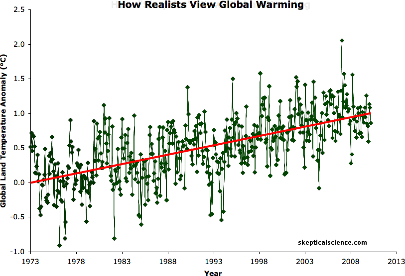
Figure 1: BEST land-only surface temperature data (green) with linear trends applied to the timeframes 1973 to 1980, 1980 to 1988, 1988 to 1995, 1995 to 2001, 1998 to 2005, 2002 to 2010 (blue), and 1973 to 2010 (red). Hat-tip to Skeptical Science contributor Sphaerica for identifying all of these "cooling trends."
As Figure 1 shows, over the last 37 years one can identify overlapping short windows of time when climate "skeptics" could have argued (and often did, i.e. here and here and here) that global warming had stopped. And yet over the entire period question containing these six cooling trends, the underlying trend is one of rapid global warming (0.27°C per decade, according to the new Berkeley Earth Surface Temperature [BEST] dataset). And while the global warming trend spans many decades, the longest cooling trend over this period is 10 years, which proves that each was caused by short-term noise dampening the long-term trend.
In short, those arguing that global warming has stopped are missing the forest for the trees, focusing on short-term noise while ignoring the long-term global warming signal. Since the release of the BEST data which confirmed the global warming observed by all other global temperature measurements, climate "skeptics" have been scrambling for a way to continue denying that global warming is a problem, and focusing on the short-term noise has become their preferred go-to excuse.
The Noisy Group
Unfortunately, those making a lot of noise about the noise (and sweeping generalizations that global warming has magically stopped) include several "skeptic" and/or "lukewarmer" climate scientists, who really should know better. One of these, Judith Curry, is actually a member of the BEST team whose data has been used by climate "skeptics" as "proof" that global warming has stopped. Unfortunately, Dr. Curry herself fed these myths in a rather dismaying interview:
"There is no scientific basis for saying that warming hasn’t stopped...To say that there is detracts from the credibility of the data, which is very unfortunate...This is “hide the decline” stuff. Our data show the pause, just as the other sets of data do. Muller is hiding the decline"
Predictably, Dr. Curry's comments have been disseminated far and wide by climate "skeptics" who desperately want this myth to be true.
Dr. Roger Pielke Sr. has made similar claims in the comments on Skeptical Science:
"Since 2002, as shown in the lower tropospheric plot and in the upper ocean data, little of that heat has accumulated there. There is not enough melt of sea ice or glaciers to account for it there. "Global warming" has nearly stopped using these two metrics"
Dr. Roy Spencer has taken this argument to the extreme, claiming that based on one cool month in his University of Alabama at Huntsville (UAH) tropospheric temperature dataset, "the troposphere is ignoring your SUV" and that (perhaps sarcastically):
"While any single month’s drop in global temperatures cannot be blamed on climate change, it is still the kind of behavior we expect to see more often in a cooling world"
These climate scientists really should know the difference between short-term noise and long-term signal, and it's a travesty that they're misinforming the public, the media, and policymakers by conflating the two concepts.
The Signal Comes Through Loud and Clear
On the other hand, other scientists who understand statistics are doing an excellent job explaining the difference between signal and noise. For example, when asked if BEST showed that global warming had stalled over the last decade in response to the interview with Dr. Curry, Dr. Richard Muller (the BEST team lead) said:
“That’s incorrect...I mean, what they have done is an old trick. It’s how to lie with statistics, right? And scientists can’t do that because 10 years from now, they’ll look back on my publications and say, ‘Was he right?’ But a journalist can lie with statistics. They can choose a little piece of the data and prove what they want, carefully cutting out the end. If I wanted to do this, I could demonstrate, for example, with the same data set that from 1980 to 1995 that it’s equally flat. You can find little realms where it’s equally flat. What that tells me is that 15 years is not enough to be able to tell whether it’s warming or not. And so when they take 13 years, and they say based on that they can reach a conclusion based on our data set, I think they’re playing that same game and the fact that we can find that back in 1980, the same effect, when we know it [was] warming simply shows that that method doesn’t work. But no scientist could do that because he’d be discredited for lying with statistics. Newspapers can do that because 10 years from now, nobody will remember that they showed that.”
What the Science Says
The peer-reviewed scientific literature confirms Muller's comments. For example, Santer et al. (2011):
"Because of the pronounced effect of interannual noise on decadal trends, a multi-model ensemble of anthropogenically-forced simulations displays many 10-year periods with little warming. A single decade of observational TLT data is therefore inadequate for identifying a slowly evolving anthropogenic warming signal. Our results show that temperature records of at least 17 years in length are required for identifying human effects on global-mean tropospheric temperature."
and Easterling and Wehner (2009):
"Numerous websites, blogs and articles in the media have claimed that the climate is no longer warming, and is now cooling....We show that the climate over the 21st century can and likely will produce periods of a decade or two where the globally averaged surface air temperature shows no trend or even slight cooling in the presence of longer‐term warming."
Not only are these short-term "pauses" just noise in the data, but observations show that they are entirley expected, and predicted by climate models (i.e. see Meehl el al. 2011).
Other Physical Evidence of Continued Warming
It's also important to point out that global temperature measurements aren't our only evidence of the long-term global warming trend. We've observed many physical indicators of global warming (Figure 2).
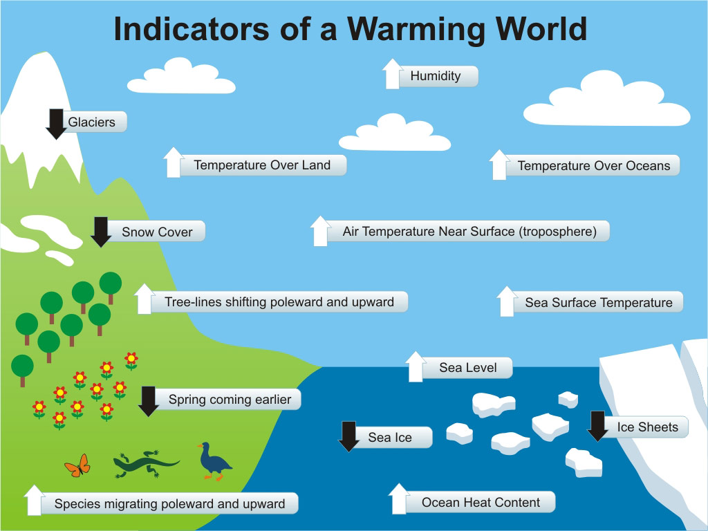
Figure 2: Physical Indicators of a Warming World
When is Warming Cooling?
When constantly confronted with this myth that global warming stopped in 1998, or 2000, or 2002, or 2005, or [insert year], we wonder why distinguishing between short-term noise and long-term signal is such a difficult concept for climate "skeptics." They remind us of the Penrose stairs made famous by M.C. Escher - a staircase which people can descend forever and not get any lower. This paradoxical perception of an impossible construction seems to be how climate "skeptics" view the world, which is undoubtedly why they're willing to risk our future on the hopes that 97% of climate scientists are wrong about climate science.

Part 2 of this post examines the "skeptic" explanation of how these cooling periods can add up to a net warming, and why that explanation is physically incorrect.
Note: this post has been incorporated into the rebuttals to "global warming stopped in [insert year]", and Figure 1 has been added to the SkS Climate Graphics Page
Arguments


(i) generate lots of synthetic time-series with the expected trend (say 0.2 deg per decade) and ARMA(1,1) noise similar to the observed data.
(ii) for each sesies calculate the statistical signiicance of trends over various timescales
(iii) for each time-scale, calculate the proportion of trends that reach statistical significance
(iv) plot these proportions as a function of the length of trend and label the y axis "statistical power".
Statistical power is the probability of rejecting the null hypothesis when it actually is false, so in this case it is the probability that the noise can dominate the AGW signal.
So that the test is symmetrical, I would suggest that the power should be 95%, so you just need to use a window lengh long enough to have a statistical power of 95% or greater. I expect this is around the 17 year mark. I hope to have a go at this mysel at some point.
With this data, Curries question reduces to, will at least 5% of 10 year trends have a trend at least twice the long term trend, or of opposite sign to the long term trend. If the answer is yes, then short term factors can still swamp the long term trend. If no, then they cannot.
Now, probably in about 50 years, the answer will be unequivocally "no". At the moment, the answer is very close to "no", but perhaps not. Certainly, however, you will not answer this question by looking at a single cherry picked trend, and especially if you allow yourself the use of dodgy data (April and May of 2010 in the BEST data) to fudge the answer.
Have I got that right, or have I sawed my way through the branch.
With that, she plays a very delicate game of semantics. The words 'pause' and 'stop' confuse the question. Anyone who hears the superficial 'warming stopped' does not hear the following 'because of a relatively large short term variation' and takes away only the carefully crafted message.
If she agrees that "identifying an AGW signal on this short timescale isn’t useful," then she must agree that saying 'warming stopped' due to a short-term variation is a misrepresentation. All she can claim is that the short term variation is indeed large enough to mask the ongoing rise and make it appear to cool for a few years - something we see clearly demonstrated in the animation in Figure 1 in this post.
But to imply this short variation is a 'pause' or 'stop' in the long term trend is an overreach. It is akin to Pielke's 'the trend has changed' based on a few years. What of all the past 'pauses' or 'stops'? Did warming stop each time?
Suppose that your route up a mountain includes a detour down a small valley where you camp for the night. The next morning you continue climbing. Curry and Pielke would describe the overnight as 'climbing has stopped'. That would give the casual observer the incorrect message that you might be on your way down. Such an ambiguous (and false) report could delay a rescue team from reaching your correct position.
But perhaps that's the reason for these semantic debates; look how much effort has to be spent attempting to set it right. Bravo to tamino for calling her out in front of her own denizens.
When she’s asked point-blank for the scientific basis of her claims she changes the subject. When she’s shown the error of her ways she refuses to admit it.
Science by pronouncement: As tamino says "It’s not a crime. It’s a sin."
30 Year trend: 0.275 degrees C per decade
Number of 10 year trends less than zero: 2
Number of 10 year trends greater than twice the thirty year trend: 17
Total percentage of 10 year trends < 0 or > twice the thirty year trend: 7.9%
So if my test has any value, the long term trend does not completely dominate short term variations yet, but it's very close.
Out of interest, the two negative ten year trends where June 1987 to May 1997, and Dec 1987 to Nov 1997. The most recent ten year trend at double the long term trend was from March 1993 February 2003.
-- source
The red is BEST with a 12 month mean; green is the linear trend. Then use the detrend operator to remove that, yielding the blue curve. Sure looks like the blue oscillates around 0; but if you wanted to play the 'eyecrometer pick-a-trend' game, are the peaks at the tail end of the blue curve trending up?
Or does 'warming stop' every 4 years or so?
Regardless, however, even for what she is now saying, she is not justified in cherry picking start dates. At a minimum she should have been doing what I just did in 55. Even that, Dikran now advises me, is not a proper test. But it would certainly be better than cherry picking a single year, and as can be seen the results do not encourage her pretense.
This whole storm started because Curry insisted that a single cherry picked data set of less than 10 years using dodgy end data showed us something significant. Well, to find a 10 year interval in the BEST data with a negative 10 year trend, you need to go back 14 years and pick one of two out of 240 possible ten year trends. That's quite some cherry pick she indulged in.
I think that is an excellent and very compelling point.
If this (2 out of 240!) was the strength of the warming argument, the skeptics and pseudo-skeptics would be jumping up and down crying 'Foul!' for good reason. But this is the strength of the pseudo-skeptic argument, so it must be ok.
a) the warming due to human-induced increases in CO2?
b) the warming due to a) plus all other factors that affect global temperatures?
The temperature records shows b). Attribution studies attempt to tease out a) from b). Theory tells us that b) will not rise continuously at a steady rate: it will have fluctuations imposed on the long-term trend that is caused by a).
Now here's the rub: the "skeptics" look at variations in b) and make statements like "the warming has stopped", but what they are trying to imply (whether they believe it or not, or whether they are just employing FUD), is that noting a change in b) means that a) has stopped. The word "warming" does not mean the same thing in a) and b) - that's the undistributed middle in the logical fallacy.
To make an analogy, let's say we have a bathtub full of water. At one end, we have a small heater. At the other end, we measure temperature. Periodically, someone stirs up the tub. Over time, we see the temperature rise slowly, but it doesn't rise evenly because the mixing isn't uniform. Let's say someone periodically adds some ice at the thermometer end - that causes periodic drops in observed temperature.
We know that the heater at the far end is still adding energy slowly warming the bath, but the "skeptics" want us to believe that the occasional drop in temperature (or decrease in the heating rate) at one end means that the heater at the other end has stopped - or even never existed at all.
There is also (yet another) inconsistency in the skeptic position here: they often argue the strawman that climatologists ignore other factors when attributing the global temperature rise to CO2. Yet that is exactly what the "skeptics" are doing when they pretend that short-term fluctuations are evidence against the current scientific understanding of global temperature and the effects of CO2.
I would love to be able to link to that when I am whopping the deniers on Politico.
Classic skeptic behavior: misinform and vanish. Damage done!
Brilliant...finally a distillation of what it's really all about.... natural variation/noise swamping the AGW signal vs the AGW signal disappearing. Making that explicit is really important...because I think Curry et al are blurring that distinction, perhaps on purpose to "feed the uncertainty monster".
I can see a cartoon based on "little shop of horrors"...with Audrey II being labled "The Uncertainty Monster"...and Prof. Curry scurring around in response to its demands "Feeeeeeeeeed me!"
Since 2005 he has been describing calculations primarily based on measured ocean heat content in his public statements as a “smoking gun”. Now the term, i.e. “smoking gun”, is in his latest paper in press.
He is becoming increasingly confident in analyses of data coming from the recently deployed Argo floats:
“The strong positive energy imbalance during the solar minimum, and the consistency of the planet’s energy imbalance with expectations based on estimated human-made climate forcing, together constitute a smoking gun, a fundamental verification that human-made climate forcing is the dominant forcing driving global climate change.”
This is the data he is using:
(From von Shuckmann and Le Traon 2011, “How well can we derive Global Ocean Indicators from Argo data?”)
To illustrate how “noisy” the previously available ocean heat storage data is compared to this new Argo data, Hansen provided this chart. The solid red line is his calculation based on the data from the von Schuckmann chart above, and the dotted red line is calculation based on data from a previous von Shuckmann et. al. effort. Both are Argo analyses:
The ocean is where the heat is. Mere sloshing around of a tiny bit of the heat in the ocean, i.e. ENSO, can show up as a cooling trend in the global average surface temperature chart. Debate about whether the planetary system could possibly be cooling should be done using terms that make it clear that the global average surface temperature chart isn't a measure of whether the planet is cooling or not, or whether global warming is occurring or not.
Thus I left those data points in there because as the graphic title notes, that is how 'skeptics' viewed the data. However, realists knew that the final two points were incomplete and removed them, hence I removed them from the realist frame.
Levitus etal show a dramatic chart of escalating oceanic heat content.
But water has a huge heat holding capacity. If converted to the units measured (heat increment, in degrees centigrade) we find the top 2000 meters of the entire world’s oceans has risen 0.09 degrees C over a period of 55 years.
0.09 degrees C over 55 years?
Can they really measure the temperature of the whole world's ocean to that degree of accuracy even now, with the Argo floats?
And could they measure to that level of accuracy 55 years ago, with buckets and ropes?
A longer answer-- typical and one of many describing specific methods-- can be found here:
Improved Analyses of Changes and Uncertainties in Sea Surface Temperature Measured In Situ since the Mid-Nineteenth Century: The HadSST2 Dataset
As always, follow references to drill into the whole story.
These people have really powerful senses of curiosity and are extremely stubborn in their pursuit. Same deal as with many other amazing human endeavors.
The flaw in your argument is rather easy to spot, but I'd be genuinely interested in your justification for making this claim.
And on the buckets & ropes comment, maybe you're thinking of something else. How do you measure ocean temperature down hundreds of metres with a bucket?
For detailed discussion about how accurately can you measure anything from Argo, see Von Schuckmann and Le Traen 2011 .
"...measure ocean temperature down hundreds of meters..."
Yes, with a mercury thermometer, but marked in 1/10th degrees.
Until about 2004, there were not so many Argo measures being taken below 700 meters. The Argo project only really starting in earnest in 2000.
It seems to be quite test of the power of the statistical analyses to take this back to 1955.
Granted, not evenly distributed: Levitus etal 2010 showed a 0.18 degree C rise in the Zero to 700 meter depth range world wide over 55 years, as well as the aforementioned 0.09 degrees C rise over the whole 2000 meter depth over 55 years.
It seems the Argo floats are not always precision instruments.
From NASA – (Titled “Correcting Ocean Cooling”. by Rebecca Lindsey November 5, 2008
http://earthobservatory.nasa.gov/Features/OceanCooling/page1.php
“…But when he factored the too-warm XBT measurements into his ocean warming time series, the last of the ocean cooling went away. Later, Willis teamed up with Susan Wijffels of Australia’s Commonwealth Scientific and Industrial Organization (CSIRO) and other ocean scientists to diagnose the XBT problems in detail and come up with a way to correct them. “So the new Argo data were too cold, and the older XBT data were too warm, and together, they made it seem like the ocean had cooled,” says Willis. …”
But here's the rub if you've got other issues with the matter of ocean warming: if you question the measured amount of warming of the ocean then you also have to come up with an alternate explanation for thermosteric SLR. Tough cookie to crack: if the average km3 of the ocean is expanding in volume, how does it accomplish that without becoming warmer?
As you begin to replace thermosteric SLR with a novel hypothesis you'll be entering the region of "here be dragons." Tread carefully.
Reversing thermometers, but it's good to see you've moved on from the ropes and buckets claim. I note you never attempted any explanation as to why you thought ropes and buckets were used to measure subsurface ocean heat. Is that a myth circulating on contrarian blogs?
"It seems to be quite test of the power of the statistical analyses to take this back to 1955"
The uncertainty of the analysis is shown in vertical red bars (0-2000mtrs) & grey shaded areas (700-2000m) in this figure from Levitus (2012):
"I worry at the statistically calculated precision over a 55 year period from data which itself has required corrections"
Virtually all datasets require corrections. Until such time as humans invent a perfect measuring instrument, it's something we have to live with.
The issues with some of the ARGO floats is unlikely to side with the wishful thinking of contrarians I'm afraid. The faulty floats have a pressure sensor issue which underestimates the actual depth that they are at. This means they are taking a temperature reading colder than is actually the case, introducing a cool bias into the dataset.
This issue is still being addressed, and no doubt other problems will crop up, but this is no different to any other climate-related dataset.
I do note, however, that many contrarians, such as Roger Pielke Snr, thought ARGO was the greatest thing since sliced bread when it indicated the oceans were cooling. But now that ARGO confirms the long-term ocean warming trend, contrarians are falling over themselves trying to find excuses not to accept the evidence.
I suspect, given additional papers discussed in this Skeptical Science post, that improving the coverage would not favour the claim that the oceans are cooling.
Looking a the loss of Arctic Sea ice, loss of permafrost, extreme weather events, rising sea levels, extreme storm surges, I am of the opinion that there are other things to "worry" about.
"....Virtually all datasets require corrections. Until such time as humans invent a perfect measuring instrument, it's something we have to live with..."
Agreed. It was interesting to note that the errors in the Argo data were detected due to mismatching with Ceres TOA data. Of course, Ceres data is also adjusted, to match modeled TOA expectations.
I respect and admire the detail these scientists go to to monitor, analyze and correct such data. But I cannot help but wonder about corrections piled on adjustments, and I appreciate the chance to discuss this.
Loeb etal 2009 ‘Toward Optimal Closure of the Earth’s Top-of-Atmosphere Radiation Budget’ J. Climate, 22, 748–766
"...the claim passes the "sniff test" - the OHC increase is consistent with thermosteric sea level rise...."
In addition to above posts, satellite TSL rise itself is not matching OHC as calculated from known measurements.
But is there a really tight agreement between calculated and TSL, measured OHC and TOA?
It seems to me all require adjustments, partially based on each-other.
GEOPHYSICAL RESEARCH LETTERS, VOL. 32, L12602, 4 PP., 2005
doi:10.1029/2005GL023112 Thermosteric sea level rise, 1955–2003 Antonov Levitus Boyer
I'd be interested in seeing a reference for that. Pointer?
Perhaps before questioning yet more adjustments you should describe in detail the basis of your doubts, keeping in mind that "I doubt it" is not an argument?
http://ilrs.gsfc.nasa.gov/docs/GRASP_COSPAR_paper.pdf
This is all heading in the right directions, but it seems to me at this stage it still leaves us with a cycle of interdependent adjusted data: OHC/TSL/TOA.
Observed changes in top-of-the-atmosphere radiation and upper-ocean heating consistent within uncertainty
Are you remembering that incorrectly, or is that a rumor you've heard? Or is it real? How about a reference?
"...I'd be interested in seeing a reference for that. Pointer? .."
Hi Doug; for the article mentioned in a previous post.
From NASA – (Titled “Correcting Ocean Cooling”. by Rebecca Lindsey November 5, 2008 http://earthobservatory.nasa.gov/Features/OceanCooling/page1.php
I'm not on any mission at all. Just asking sensible questions.
We have a very small temperature increment of great precision, all 'proven' or at least 'confirmed' by interdependent adjusted measurements.
I have no doubt re the skill and integrity of the scientists involved, but have some doubts re the risks of using pyramided data adjustments and calibrations in proving a 'fact'.
I trust you can assure me it is all as clear and precise as you report it to be.
".... CERES data is also adjusted, to match modeled TOA expectations....How about a reference? ..."
Hi Doug, provided in #81, but here it is again (added detail):
Loeb etal 2009 ‘Toward Optimal Closure of the Earth’s Top-of-Atmosphere Radiation Budget’ J. Climate, 22, 748–766
And:
And no, the objective of the paper is not to have CERES data chase model output. Don't be insulting.
".... the objective of the paper is not to have CERES data chase model output...."
Hi Doug.
Forgive me if I misinterpret you here:
Where did the knowledge of the TOA flux come from? Are you saying that knowledge of the TOA flux was innate, and this was only about ironing out the kinks in the satellite measurements?
And now we have finally got the satellite measures of TOA spot on? They match "the actual"?
Utilizing calculated net heat storage of the earth, and estimated or known (from where?) TOA fluxes, it seems we can adjust our satellite measurements. And using our (new-found?) knowledge of the TOA flux we can confirm that it (now) matches the OHC data. (Itself measured to a precision of 3 decimal places over 55 years).
The objective of the authors had nothing to do with improving CERES data. They necessarily explain the evolution of improvements in CERES data by the experiment operators but that's not the point of the paper.
Looking beyond your problem with understanding the paper you brought up, what I find surprising is your metaphorical condemnation of calibration via your suspicions over the refinement of CERES data (and apparently any other data you find inconvenient). Apparently you're more comfortable with the idea that instrumentation should be manufactured and deployed in a state of nature, reading just as it did when first assembled regardless of whether the dial pointing to "accurate" was put on its axle pointing reciprocal to its proper direction.
Readers might want to take a look at table 2 of Loeb and decide what the dominant source of error is going to be. Personally I'll put my money on OHC measurements being the least of the problems, way less than other issues w/CERES at this level of precision.
I suppose I've already developed an observational bias based on Markx's Argo error. Too twitchy. :-)
The Levitus methodology, upon which Levitus (2012) & Nuccitelli (2012) are based, actually shows the smallest warming rate over 2004-2008, for the upper 700 metres of global ocean. This is largely down to differences in how to handle sparse sampling in the datasets.
Contrary to Markx's insinuations, uncertainty is like a dagger - it cuts both ways.
So measurement of sea level is dependent on heat measurements?? Sea level has the interlinked tide gauge and satellite measurements.
There are many problems in determining heat imbalance from satellite measurements. Argo is quite definitely the best instrument for that but it's short term data. On the other hand, the problems is closing the heat balance would point to MORE heat being stored in the ocean to close with the sea level curve not less.
"...So measurement of sea level is dependent on heat measurements?? Sea level has the interlinked tide gauge and satellite measurements..."
No, but all are interlinked. Each is used to justify the value obtained for the other. As is pointed out, that does not mean any of them are incorrect. And, on the other hand it does not mean that all, or any of them are entirely correct.
We are really still in the very early stages of data collection here, with ocean temperature data being collected in detail and depth only since 2000, and satellite data for both TOA radiation flux and sea level rise needing better technology and better data.
This is a perfectly legitimate topic for discussion, and I am surprised you find it heretical;
Topic: Just how precisely measured are all these parameters?
Uncertainty is discussed in the literature, and observationally-based studies do quantify this. It is no great secret. Now if you want to start quantifying this yourself, and/or actually engage in meaningful discussion, then do so. Needless repetition of memes or myths constitutes sloganeering, and may result in future comments being snipped accordingly.
Do note, however, that Earth's observed energy imbalance is a logical consequence of the increased Greenhouse Effect. Reduce the rate of loss of heat to space, and the Earth must warm to eventually return to equilibrium. So there is a very obvious physics-based foundation which underpins the observations.
doug_bostrom at 19:29 PM on 5 November, 2012
"..Markx's Argo error. ..." I didn't think I was in error there, I simply asked a question.
The 0 to 700 meter level of the world's oceans have risen 0.18 degrees C in 55 years (early measurements were taken from ships decks using a reversing mercury thermometer calibrated in 10ths of degrees C, by a line ... thanks Rob)
And the total 0 to 2000 metre range of the world's oceans has been measured to have risen 0.09 degrees C over 55 years...
So therefore the 701 to 2000 meter ocean depth must have risen a measured 0.00415 degrees C in 55 years.
Is my maths correct?