Climate Science Glossary

Term Lookup

Enter a term in the search box to find its definition.

Settings

Use the controls in the far right panel to increase or decrease the number of terms automatically displayed (or to completely turn that feature off).

Term Lookup

Settings


All IPCC definitions taken from Climate Change 2007: The Physical Science Basis. Working Group I Contribution to the Fourth Assessment Report of the Intergovernmental Panel on Climate Change, Annex I, Glossary, pp. 941-954. Cambridge University Press.

Home Arguments Software Resources Comments The Consensus Project Translations About Support

Bluesky Facebook LinkedIn Mastodon MeWe

Twitter YouTube RSS Posts RSS Comments Email Subscribe


Climate's changed before
It's the sun
It's not bad
There is no consensus
It's cooling
Models are unreliable
Temp record is unreliable
Animals and plants can adapt
It hasn't warmed since 1998
Antarctica is gaining ice
View All Arguments...


Username
Password
New? Register here
Forgot your password?

Latest Posts

Archives

Where is global warming going?

Posted on 20 April 2010 by John Cook

The recent discussion on heat content got me thinking about an alternative way to communicate where all the heat content from global warming is going. Inspired by the elegant methods of Information is Beautiful, here is a visual depiction of how much global warming is going into the various components of our climate system:

Components of global warming heat content
Figure 1: components of  global warming for the period 1993 to 2003 calculated from IPCC AR4 5.2.2.3.

The percentages were calculated from Figure 5.4 from Section 5.2.2.3 of the IPCC 4th Assessment Report (h/t to Humanity Rules for the heads up). The IPCC graph shows changes in energy content for two different periods: 1961 to 2003 and 1993 to 2003.


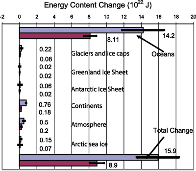
Figure 2: Energy content changes in different components of the Earth system for two periods (1961–2003 and 1993–2003). Blue bars are for 1961 to 2003, burgundy bars for 1993 to 2003 (IPCC AR4 5.2.2.3).

I opted for the latter period 1993 to 2003 as the last decade should be more indicative of recent trends. Of course, what would be even more interesting is data up to 2008 but hopefully I'll get an opportunity to update the graphic at a later date. The ocean heat figure of 93.4% is almost certainly an underestimate as it only includes ocean heat down to 700 metres (Levitus 2005).

Lastly, let me head the nitpickers off at the pass. The percentage figures actually add up to 99.9%. I could've gone to several more unsightly decimal places to get it closer to exactly 100% but I figured the maths nerds will just have to deal

UPDATE 22 April 2010: AndyS correctly points out that my graphic incorrectly scales the circles by the diameter rather than the area. Apologies for the error, this is my first attempt at fancy shmancy Information is Beautiful style graphics and didn't quite think it through. Have updated the graph so the contribution to each component is represented by the area, not the diameter. Thanks to AndyS for spotting the error (I quite enjoyed this exercise and plan to do similar style graphics down the track).

0 0

Printable Version  |  Link to this page

Comments

1  2  Next

Comments 1 to 50 out of 97:

  1. Is not averaging effect created by the colossal thermal mass of the oceans the reason why the evidence of rising ocean temperatures -- as opposed to the much more erratic atmospheric temperature readings -- is so much more useful when attempting to convince sceptics that there is a clearly visible overall warming trend?
    0 0
  2. There is another heat reservoir around for Global Warming to go. It is actually the coldest of all (-270 °C). The huge March temperature anomaly around the North Pole for example, while temperatures are higher than average, is still pretty cold (way below freezing). This excess heat can not go to the oceans, because open sea surface is defined to be above freezing temperature and according to the Second Law heat is never transferred to a warmer reservoir from a colder one. It has simply nowhere else to go but space.
    0 0
  3. "The ocean heat figure of 93.4% is almost certainly an underestimate as it only includes ocean heat down to 700 metres (Levitus 2005)." I think I'm with John Russell on this one. As I understand it, a lot of the "natural variation" in the climate, that part usually described by the shorthand "El Niño", is the result of changes in the rate of transfer of heat from the top levels of the oceans to deeper levels so when the globe is supposedly cooling what's really happening is the heating is happening deep in the ocean rather than on the surface. Therefore, what's of interest is the rate of change of total heat content of the ocean all the way down, not just the surface or even the top 700 metres. Are there now enough measuring buoys, etc, to plot that reliably?
    0 0
  4. Seems to me this might provoke a 'so why are we concerned about a tiny 2.3%' comments. And isn't it not about the amount of energy but, given the atmosphere is so much less mass than the oceans, the relative effect of that 2.3% on a much smaller mass. So, I'd like to see a mass v change graphic for each component I think
    0 0
  5. I wonder about how to communicate this further than just the concept of "heat" - because in countries where it tends to be cold, "heat" has a positive connotation - and vice versa in warm countries. Could we explain what the warming affect actually means within each of the environments? The phrase Global Warming is more widely associated with temperature and perceived by how we feel it, but does not explain what "work" is done as a result of global warming, and what impact that has on systems. To make it straightforward what does heating the oceans actually mean? What does heating the atmosphere really mean, and are we talking about in terms of ice-sheets - is that "work" related to the amount of heat given to the ice-sheet but with no temperature change? Sorry for the stream of consciousness!
    0 0
  6. Nice graphic, although I'd like to see the others in orbit around the large 'sun-like' ocean :) So why are we concerned about a tiny 2.3%? A simple answer might be because that is were we've being doing most of our measurements for along time. Science has to be pragmatic.
    0 0
    Response: "So why are we concerned about a tiny 2.3%?"

    I thought the answer to that was obvious... we live in that 2.3%
  7. And with that 2.3% sitting next to that great big 93.4%, the 2.3% can easily get pretty volatile. And Juliet Davenport. You are so right. Looking at AGW as energy change should be a no-brainer. But that assumes that people have a technical education so that looking at the world in terms of energy and quantification is second nature. My humble BEng(Mech) leads me to do that as a matter of course. But how many of our friends, family, neighbours, fellow countrymen look at the world that way. How many naturally seek to quantify a problem as their first step to understanding it? This is the terrible insidious danger of AGW. The appropriate way of looking at it, the best mode of thought on the subject, is simply a foreign language and mental framework for the majority of people. So people distrust their lack of understanding of it more than they fear the actual problem. A foreign idea gets doubted precisely for its foreignness, not for its correctness.
    0 0
  8. Berenyi Peter (#2), Isn't the "huge temperature anomaly" you mention taking place where there are only a few thermometers left in the GHCN gridded data?
    0 0
  9. Berényi Péter at 18:17 PM on 20 April, 2010 Two problems: 1. Since the question of "where's the heat?" relates to a TOA radiative imbalance, the loss of heat to space is implicitly accounted for. 2. The Second Law is often misused in the manner you illustrate. Excess heat builds up in the oceans (warmer) as a result of a positive radiative imbalance originating in the cooler atmosphere. Remember that warming of the oceans requires that the balance of energy input minus energy output is shifted such that energy output is less than energy input. So oceans warm as a result of a decrease in ocean heat loss. If the atmosphere warms due to radiative imbalance (enhanced greenhouse warming), this will suppress loss of thermal energy from the oceans even if the atmosphere is always cooler than the oceans. No heat flow from the cold atmosphere to the warmer oceans is required. Obviously we know this has to be true both from simple thermodynamics and from observations that the oceans are warming significantly under the influence of enhanced greenhouse-induced radiative forcing.
    0 0
  10. Following on #4, I think it would be neat to see the figure scaled by mass (but how heavy is the continent component that they're measuring?). Question: Antarctic ice sheet has an ozone hole and air current stuff that keeps warming at bay. Arctic sea ice is in contact with warming water, so it's easy to see why more global warming 'goes' there. How do we explain the relatively high proportion of heat going into other glaciers given their small total mass and often more tropical distribution? Is this perhaps just a result of ~edge effects (there is so much contact with other warming features [continents] that a lot of the heat is transferred)?
    0 0
  11. Response to #6 Oh yeah! 7.Glenn Tamblyn Seems to me doctors and surgeons speak their own foreign language but it generally doesn't stop the ordinary folk from taking pills or going under the knife. The problem is bigger than just communication.
    0 0
  12. Take a look at the Argo float distribution. Floats You will note there is a dearth of them around the Antarctic and in the Arctic. We have none under ice shelves. The scale of the missing energy is too large to have most of it occur anywhere besides the ocean. The poorest data is in the high latitudes, thus, that is likely where the heat is. The arctic in particular has had high air temperatures.
    0 0
  13. Re #11 -- do you think the analogy works very well? I don't think it works, but the differences could be instructive. First, a person's decision to go under the knife is very personal and the outcome is direct. Compare this to the discussion of how to fund health care! I think the latter is more similar to the discussion about global warming. Second, the 'medical industrial complex' spends a lot of money, effort, expertise on communication. Third, and closely related, anti-medical industry communication is rather limited. Who are the powerful players who lose money by people making decisions to get medical treatment? Maybe chiropractors would like you to try them before getting back surgery, but you don't see commercials by them telling you not to get back surgery. (That's probably illegal.) Fourth, and sort of looping around to the first thing, I bet the people who refuse to go under the knife ARE victims of communication problems. The demographics of those that believe something else will heal them are probably biased toward those without a good education, with too much access to strongly messaged but bad advice, etc. To sum up, I think your comparison to medical care shows that communication is key -- the medical industry spends heaps of money on it even though they aren't fighting much counter-communication, and those who fall through the cracks are probably the ones getting the worst ratio of communication/counter-communication. The communication of climate science should be even better than medical industry communication because it has more obstacles. Sorry for not having a single study to back any of this up, but I don't think I'm saying anything controversial.
    0 0
  14. Re 12 MsPelto, While the distribution of buoys may not be very uniform, I don't think that can be eyeballed from that map. The map, like most flat maps, suffers the distortion of projecting a globe onto a flat surface. Nice article. I was trying to imagine the relative sizes of the various possible heat sinks, and it was very fuzzy to me, then click, there it is.
    0 0
  15. #12 mspelto at 00:46 AM on 21 April, 2010 The arctic in particular has had high air temperatures Come on. The "Arctic" has only one active GHCN station in Canada. It is Eureka, Nunavut (79.98 N, 85.93 W). This year the average March temperature there was -32.2 °C. It is higher indeed than the multi-year average of -37 °C, but still damn cold. And all the excess heat comes from a brief hot spell at the end of the month when temperatures reached an unbelievable high of -9 °C (between 7 AM and 4 PM, 29th March).
    0 0
  16. Re #15, Yes, the polar regions are still cold relative to everywhere else. I don't find that surprising. But, I'm wondering if you are totally disregarding GISS data. http://data.giss.nasa.gov/gistemp/graphs/
    0 0
  17. Anyone with a Physics background will wince at phrases like "heat storage" and "missing heat". A lecturer may have just finished taking a first year university Physics through an introductory thermodynamics class. Where it would be explained that for instance it would be wrong to say that the higher temperature reservoir contained "a lot of heat". The correct description would instead use "internal energy". Heat it would be explained is reserved for the process by which energy is transferred from a body at a higher temperature to a body at a lower temperature. Its disappointing that leading NCAR scientist Kevin Trenbertht uses phrases like “missing” heat." and “The heat will come back to haunt us sooner or later,” Perhaps he doesn't know any better!
    0 0
  18. > suibhne Look it up; you're wrong about language physicists use: http://scholar.google.com/scholar?q=climate+heat+storage+missing First year physics? where are you reading this stuff?
    0 0
  19. Oops, sorry about that premature submission. I find the graphic to be a little misleading. The circles seem to be scaled so that their diameters are proportional to the percentages, whereas the implication from a graphic of this type is that it's the areas that are proportional. The area of the "ocean" circle (from my rough measurements) is about 750 times the area of the "atmosphere" circle. The point that the oceans are massive sinks of heat compared to the air, land or ice is still entirely valid, it's just exaggerated in that figure.
    0 0
    Response: You're completely correct - it should be areas, not diameters. Should've thought of that (smacks forehead). Am updating the graphic accordingly.
  20. suibhne at 02:16 AM on 21 April, 2010 I don't think so. Your point might be worth considering if everyone has a Physics background or has taken a first year university introductory thermodynamics class! Trenberth's concept is pretty straightforward and easily understandable by the layman. If there is a radiative imbalance we expect an accumulation of thermal energy in the system. Why not call it "heat", since everyone can understand that? Once we've grasped the simple idea, then we can develop it towards more rigorous directions (the expected accumulation of Joules in the ocean under a radiative imbalance of so many W/m^2, and so on). I suspect Trenberth knows full well what he's doing - he's trying to communicate simple concepts in an easily understandable manner.
    0 0
  21. suibhne, it's not very constructive to think that Trenberth doesn't know physics, besides being absurd. You are probably missing what Joule demonstrated more than a century centurie ago and the first law of thermodynamics. It's taught at the high school level, no need for a higher degree. Think twice before beliving that you know more than reputable scientists.
    0 0
  22. Let me know if this makes sense. Consider the following: 1) Excess heat is radiated predominately into the oceans. 2) Algae growth increases due to increased heat. 3) Algae growth is an endothermic process therefore the increased growth absorbs a portion of the excess heat[ref Barinov et al, "Respiration energetics of marine algae for total heat production and some features of photosynthesis", Thermochimica Acta, Vol. 309, Is. 1-2, 1998] 4) Increased algae growth "consumes" both energy and C02, sequestering both on the sea floor eventually (either directly or indirectly) Could this account, at least in part, for the missing energy?
    0 0
  23. mspelto @12, You beat me to it. I was pondering the same thought after reading John's articles. The period of divergence does seem to coincide with the time when the Arctic has experienced a significant loss of sea ice (2005, 2007, 2008 and 2009 were all very low). So perhaps some of the "missing" energy has been sequestered into those portions of the Arctic Ocean which have been largely ice free during the "warm" season since 2005? As mspelto pointed out, there are no Argo floats or other instrument platforms up there to measure the OHC. Not sure about the Antarctic though, sea ice cover has not changed much, although if the Southern Oceans did have a role in this puzzle it would not surprise me. Anyhow, I don't want to presume to know more than Drs. Trenberth and Fasullo; they have probably already considered mspelto's idea in addition to many other possibilities....
    0 0
  24. A car without shocks gives a bad ride and on a subjective level can seem horrendous, but the amount of energy related to these extra vibrations is very small. Similarly, the big blue circle representes a percentage, whereas its the absolute value that matters.
    0 0
  25. dscheidt, phytoplankton productivity is not increasing. (See also here).
    0 0
  26. Albatross you are certainly correct that Trenberth has considered the polar areas. What to do to close that data gap is actually the focus of some new projects in the Arctic Ocean , and what Trenberth is trying to motivate us to do, better capture the energy balance of our globe. In the Antarctic the hidden area is under the ice shelves. or was in the case of Wordie Ice Shelf.
    0 0
  27. As mspelto pointed out there's the big unknown of the Arctic and the Antarctic oceans, we don't know much about what's happening down there. But I would say we do not know much about global ocean circulation either. For example, we know that convective mixing in the Labrador Sea stopped for a while and then resumed. Does anybody know why? Also, scientists are still debating on the behaviour of the North Atlantic thermohaline circulation or the fate of Anarctic Deep Water. These are huge amount of heat (energy, to make suibhne happy ;)). Although the overall picture is clear, the details are missing. Trenberth has shown he does not belive the ocean heat content measurements much (see the email exchange with Pielke Sr.). With him, I'd not be surprised if that heat is in part "hidden" somewhere there.
    0 0
  28. Riccardo @ 26, Thank you for the links. You are correct that phytoplankton productivity has not been increasing during the period for which there is data [1998-2008]. Over that period the observed sea surface temperature hasn't increased. Indeed, in the Behrenfeld paper that you cited shows that there is a strong corollation between sea surface tempurature and ocean productivity. In short, if I understand Behrenfeld correctly, globally phytoplankton is behaving as expected with respect to temperature. Since we know that phytoplankton growth is endothermic the elevated levels of phytoplankton shown by Behrenfeld (with respect to pre-1998 levels) must be absorbing more energy than pre-1998 levels. The question is whether the amount of the negative feedback is significant. Of course, if the feedback was linear then one would expect to see a consistant divergence between temperature and missing energy, which we are not seeing. I suspect that it is, as it always seems to be with AGW, a more complex process. I'm not at all sure that the phytoplankton feedback effect is significant. I suspect that it's not. But I wanted to pose the question.
    0 0
  29. dscheidt, the NASA image shows that there's an inverse correlation between phytoplankton productivity and temperature.
    0 0
  30. RSVP @25 The most recent figure I have seen are Murphy et al which go from 1950 to 3002 and give the total heat rise as around 1 *10^23 Joules. Thats around 3 Billion Hiroshima bombs. So thats what we are taking a percentage of.
    0 0
  31. Here is my pass at the graph where area is proportional to magnitude. http://docs.google.com/present/view?id=d5sm6vp_50k3vzx2g3
    0 0
  32. Taking dscheidt's idea and running with it. Let's suppose we're trying to imagine a biological sequestration of 0.5 W/m2 over the whole planet via phytoplankton. Let's ballpark that as 1W/m2 over the most productive 70% of the ocean (therefore ~50% of the planet). Skipping a bit of math ... and charitably assuming that dead phytoplankton is nearly as nutritious (i.e. energy-laden) as pure sugar ... that's around 40g of excess material every 24 hours, in every square meter. So a patch of ocean 1000km by 1000km would create 40 mega-tonnes excess every day, which would be about 1.5 giga-tonnes per year. Scaling up to 50% of the planet's surface, that would be 300 Gt/y. Bearing in mind that this is excess, on top of "normal" it doesn't fit with estimates of the *total* biological rain over the entire ocean. which is on the order of 1 Gt/y
    0 0
  33. Don't we have to give serious consideration to the idea that either 1) the heat is not there to be missing or 2) the heat is leaving the atmosphere? I would be satisfied to know that this "missing heat" comes from the 2000s "lack of warming" - this is tongue in cheek as everyone knows the world warmed - even during an el nino and the very low sunspot activity. So are we missing heat that IS there and it is just finding it? Or are we worried the models are wrong because they predict heat we can't find (so it could have never existed or left the envelope)? thanks.
    0 0
  34. 33 - this "missing heat" comes about because of the discrepancy between OHC (heat stored) and TOA measurements (difference between incoming energy and outgoing energy). Heat leaving is measured so unless there is error in measurement, you can discount that. What do you trust most? The satellite measurements of heat imbalance or the buoy network of ocean temperature measurements? There is clearly an issue to be sorted out here. Its not about models - its about the heat balance.
    0 0
  35. 34.scaddenp The ocean doesn't just heat it also expands so there is a way of double checking the bouy data by using satellite data to measure sea level rise. For the present period (2003-2008) almost all the sea level rise is accounted for by melting land ice. That means very little thermal expansion, which means the energy is unlikely to be in the ocean. The bouy results are in agreement with the GRACE satellite data you don't just need to believe the bouy data. Secondly OHC was in line with expectations upto the mid 2000's before they began to diverge. So you have to believe that the data was fine and then became corrupted in some way. The reality is that the quality and coverage of the bouy ( and other ocean data) have only continued to improve a a time when we are meant to believe they have got worse. It's not just a matter of believing one or the other.
    0 0
  36. 12.mspelto There's a couple of practical problems with the idea that the extra energy is hidden. While it could be anywhere in the ocean that we don't measure there remains the important question of how did it get there. Everything was accounted for pre 2003 so in that time period it wasn't heading for these unknown energy stores. After 2003 it must have started being sequestered but it wasn't detected transitting any of the regions we do measure to make it to these mysterious energy stores. We should take readings in those difficult regions not yet covered by the bouys but is there really any reason to believe we'll find the lost energy?
    0 0
  37. I find the “missing heat” problem very interesting. I’m only a layperson, but I’m leaning towards the Arctic Ocean explanation. Since 2005, Arctic summer sea ice has declined dramatically. Less sea ice means that the ocean is able to absorb more heat. I’m guessing the Arctic Ocean on average is probably cooler than 4°C, so that might explain why the ocean hasn’t expanded more. If this explanation is correct, it would mean that ocean heat content measurements are biased for the same reason as HADCRUT global temperatures – inadequate coverage in the Arctic.
    0 0
  38. HumanityRules> How would you expect to detect the energy in transit?
    0 0
  39. re: Berényi Péter at 01:38 AM on 21 April, 2010 mspelto at 00:46 AM on 21 April, 2010 says: The arctic in particular has had high air temperatures Berenyi Peter replies: "Come on. The "Arctic" has only one active GHCN station in Canada" so what Peter? There are lots of active Arctic temperature stations
    0 0
  40. @35 HR. Do you have a cite for lack of thermal expansion in the current period. My recollection without going back to check is that sea level rise is currently at least 50% thermal, with most of the rest from "reglar" glaciers and ice caps, and the small remaining bit from the two big ice sheets. However, very recent results show non-trivial acceleration from the two big ice sheets.
    0 0
  41. 40.GFW This is a review paper on sea level rise. I'd draw your attention to table 1 on page 7. Most of the relevant references to the original data are in here.
    0 0
  42. Thanks HR. Looks like a good review.
    0 0
  43. #39 chris at 00:18 AM on 22 April, 2010 so what Peter? Have a look and compare coverage.
    0 0
  44. suibhne has been peddling the same ad hominem nonsense about people misusing the word "heat" (and therefore they are supposedly wrong about global warming) at http://scienceblogs.com/deltoid/2009/03/gerlich_and_tscheuschner_oh_my.php where he has repeatedly been refuted but has refused to address any of the substantive criticisms.
    0 0
  45. Chris (#39), The NASA link you provided cuts off at the year 2000 so you should look at more recent information: http://diggingintheclay.blogspot.com/2010/01/station-drop-out-problem.htm Ned has challenged me to find the reasons behind the station drop offs. With this in mind I am planning a trip to North Carolina during May. My correspondence with staff members at NOAA, Asheville and Environment Canada is going well but I still don't understand why so many stations have "dropped off". With regard to the Canadian Arctic, by 2004 only Eureka was left in the GHCN v2. Resolute appears to be back but I overlooked it as the station number changed. One of the problems with having so few stations is that METAR data errors can cause huge changes in NASA's anomaly maps of the polar regions. Berenyi Peter has already pointed to the "huge anomaly" of about 4 degrees Celsius for polar regions in March 2010. This anomaly may result from some strange readings at Eureka on March 29. This issue popped up on WUWT today. They found something similar on July 13, 2009: http://wattsupwiththat.com/
    0 0
  46. It just struck me July 13 is the eve of Bastille Day. Given that we are talking about Canada, could there have been some celebrating going on?
    0 0
  47. gallopingcamel at 13:53 PM on 23 April, 2010 No the NASA link is current right through to the present. Click on the Arctic region of the map on the NASA page I linked to. You will get lists of all the stations within 1500 km, and can select those that are Arctic ( >66 o N), and can discover which ones have data through 2010. There are quite a lot of these. The NASA Giss temperature for the Arctic is based on the full set (not just Eureka and Resolute). Berényi Péter at 15:41 PM on 22 April, 2010 Peter, I was addressing your non sequitur. If we want to address Arctic temperature station coverage, we should addres Arctic station coverage, not just Canadian Arctic station coverage..
    0 0
  48. #47 chris at 17:33 PM on 23 April, 2010 Peter, I was addressing your non sequitur I have mentioned Canada because GHCN artic station dropoff is most serious in that country. But we can get more specific if you wish. I have pulled off most recent GHCN v2 data at 2010-04-23 08:00 UTC from the GISSTEMP site. There are 108 stations in the database north of the Arctic Circle (66.5619° N). The distribution according to 1° latitude bands is as follows: 66 8 67 13 68 25 69 15 70 13 71 5 72 6 73 4 74 2 75 1 76 6 77 2 78 3 79 2 80 1 81 1 82 1 According to country: CANADA - 43 RUSSIAN FEDERATION (ASIAN SECTOR) - 25 NORWAY - 15 GREENLAND (DENMARK) - 10 UNITED STATES OF AMERICA - 7 RUSSIAN FEDERATION (EUROPEAN SECTOR) - 3 FINLAND - 3 SWEDEN - 2 Of these 108 stations 38 (35.2%) can be considered "active", ie. having data for January-March 2010. Latitudal bands: 66 2 (25% / 8) 67 5 (38.5% / 13) 68 8 (32% / 25) 69 4 (26.7% / 15) 70 5 (38.5% / 13) 71 2 (40% / 5) 72 1 (16.7% / 6) 73 1 (25% / 4) 74 2 (100% / 2) 75 0 (0% / 1) 76 2 (33.3% / 6) 77 1 (50% / 2) 78 1 (33.3% / 3) 79 2 (100% / 2) 80 1 (100% / 1) 81 1 (100% / 1) 82 0 (0% / 1) Country: CANADA - 6 (14% / 43) RUSSIAN FEDERATION (ASIAN SECTOR) - 17 (68% / 25) NORWAY - 7 (46.7% / 15) GREENLAND (DENMARK) - 3 (30% / 10) UNITED STATES OF AMERICA - 2 (28.6% / 7) RUSSIAN FEDERATION (EUROPEAN SECTOR) - 2 (66.7% / 3) FINLAND - 0 (0% / 3) SWEDEN - 1 (50% / 2) As you can see, station dropout rate in Canada Arctic is 86%, pretty high. I would rather not go into arcane details, just consider a single case, Alert, Nunavut. It is the northernmost permanently inhabited place in the world with not just an operational weather station, but also part of Global Atmosphere Watch. Still, it was dropped from GHCN in September 1991. It is not that data are not available. One can even download them in tabular format from Weather Underground for free. The closest active GHCN station is Eureka, 480 km away. Can you think of any valid reason it was dropped?
    0 0
  49. Yes, fine Peter, but it still doesn't address the point. If we want to assess Arctic surface temperatures as mspelto's point related to, then your response that "The "Arctic" has only one active GHCN station in Canada" is a non-sequitur. If we want to assess Arctic temperatures then the full set of Arctic temperature station data and satellite sea suface temperature data for the Arctic should be used (in fact the method by which NASA Giss assesses Arctic temperatures means that the Arctic data has some distance-scaled contributions from non-Arctic sites. I don't know the reason why Eureka was dropped. if you find out I'm sure we'd all be interested to know...
    0 0
  50. James Wight 37 Your figures for Arctic Sea Ice may need an update. Now highest for last 8 years. http://wattsupwiththat.com/
    0 0

1  2  Next

You need to be logged in to post a comment. Login via the left margin or if you're new, register here.


The Consensus Project Website

THE ESCALATOR

(free to republish)


© Copyright 2024 John Cook
Home | Translations | About Us | Privacy | Contact Us