


 Arguments


Real Skepticism About the New Marcott 'Hockey Stick'
Posted on 10 April 2013 by dana1981
A new global temperature reconstruction over the past 11,300 years by Marcott et al. (2013) has been described as 'the new hockey stick,' and adopted into 'the wheelchair' by Jos Hagelaars by including temperatures further in the past and projected for the future (Figure 1).
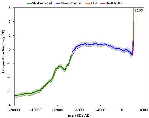
Figure 1: The temperature reconstruction of Shakun et al (green – shifted manually by 0.25 degrees), of Marcott et al (blue), combined with the instrumental period data from HadCRUT4 (red) and the model average of IPCC projections for the A1B scenario up to 2100 (orange).
The Marcott paper has been subjected to an immense amount of scrutiny, particularly in the climate contrarian blogosphere, with criticisms about everything from the wording of its press release to the timing of its Frequently Asked Questions (FAQ) publication. Unfortunately climate contrarians have been so noisy in their generally invalid criticisms that the media has begun to echo them, for example in this Washington Post blog.
With all the hubub, it's easy to lose sight of the important conclusions of this paper. The bottom line is that the rate of warming over the past century is very rapid and probably unprecedented for the past 11,000 years. That's actually both good and bad news.
Why Climate Contrarians Should Love the Hockey Sticks
The last, best hope for climate contrarians is for climate sensitivity (the total global surface warming in response to the increased greenhouse effect from doubled atmospheric CO2) to be low. We know the planet is warming due to humans increasing the greenhouse effect, and the only remaining plausible argument against taking action to do something about it is the hope that future climate change will be relatively minimal.
This is where climate contrarians lose the plot. It's understandable to look at 'hockey stick' graphs and be alarmed at the unnaturally fast rate of current global warming. But in reality, the more unnatural it is, the better. If wild temperature swings were the norm, it would mean the climate is very sensitive to changes in factors like the increased greenhouse effect, whereas the 'hockey stick' graphs suggest the Earth's climate is normally quite stable.
On the one hand, these graphs do suggest that current climate change is unnatural – but we already knew that. We know that humans are causing global warming by rapidly burning large quantities of fossil fuels. On the other hand, the past climate stability suggests that climate sensitivity is probably not terribly high, which would mean we're not yet doomed to catastrophic climate change. See, good news!
In their efforts to deny that the current warming is unprecedented and human-caused, climate contrarians are actually scoring a hockey stick own-goal because they're also arguing that the climate is more sensitive than the IPCC believes. For those who oppose taking major steps to reduce greenhouse gas emissions, that's the worst possible argument to make.
The good news for climate contrarians is that the current rate of global warming appears to be unprecedented over the past 11,000 years. During that timeframe, the difference between the hottest and coldest average global surface temperature is around 0.7°C, with the cooling between those temperatures happening slowly, over about 5,000 years.
Over the past 100 years, we've seen about 0.8°C global surface warming (Figure 2). While the time resolution in the Marcott reconstruction is relatively low, there is simply no evidence of a similarly rapid or large natural climate change in the past 11,000 years. As Tamino at the Open Mind blog shows, any similar rapid and large warming event to the current one would likely have shown up in the Marcott analysis, despite its low resolution. Tamino concludes,
"the Marcott et al. reconstruction is powerful evidence that the warming we’ve witnessed in the last 100 years is unlike anything that happened in the previous 11,300 years."
While it may seem counter-intuitive, that's a good thing, because it means the climate is not highly unstable.
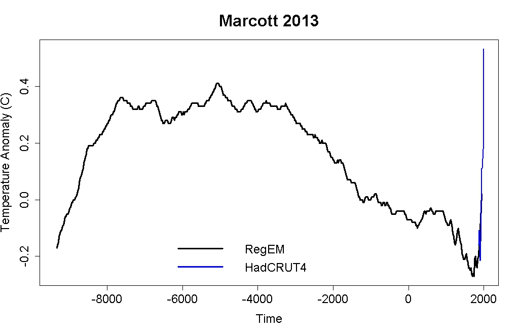
Figure 2: Regularized expectation maximization (RegEM) Marcott reconstructions (black), plus the HadCRUT4 series in 20-year averages centered on the times of the Marcott reconstruction (blue). Created by Tamino.
The Hockey Stick 'Blade' is Real
Much of the manufactured controversy about the Marcott paper is in regards to the 'blade' or 'uptick' – the rapid warming at the end of the graph over the past century. While their reconstruction does identify an approximately 0.6°C warming between 1890 and 1950, the authors note in the paper that this result is probably not "robust." Tamino notes that this uptick appears to largely be a result of proxies dropping out (although a smaller uptick seems to be a real feature), as many individual proxies do not extend all the way to the year 1950. If proxies with colder temperatures drop out, the remaining reconstruction can show an artificial warming toward the end.
In the paper, where they talk about temperatures over the past decade, the authors reference the instrumental temperature record rather than the proxies. As Tamino notes in another excellent analysis of the paper,
"for the Marcott et al. reconstruction data coverage shrinks as one gets closer to the present. But that’s not such a problem because we already know how temperature changed in the 20th century."
Certain parties have complained that the press release and subsequent media coverage of the paper have not made it sufficiently clear that the 'blade' of this hockey stick comes from the instrumental temperature data. This is the focus of the Washington Post article, for example. However, the authors were clear on this point in the paper, and in several interviews and subsequent discussions, like the FAQ.
In reality, the 'blade' of the 'hockey stick' – the instrumental temperature record – is our most accurate temperature data set. As noted in the FAQ on RealClimate, the instrumental temperature record is also consistent with proxies from other studies. For example Anderson et al. (2012) compares their study's natural proxy temperature reconstruction (Paleo; solid line in Figure 3) to the instrumental surface temperature record (MLOST; dashed line in Figure 3) and finds a strong correlation (of 0.76) between the two. Reanalysis data, as in Compo et al. (2013), has also independently confirmed the instrumental global surface temperature record accuracy (correlations between 0.84 and 0.92), as of course did the Koch-funded Berkeley Earth study.
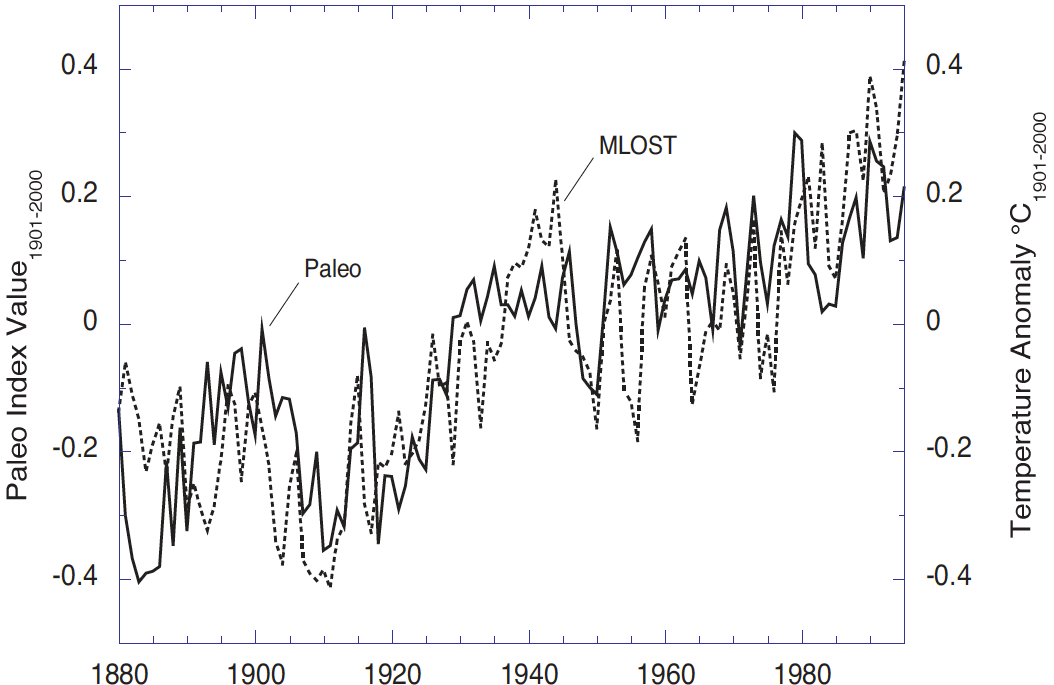
Figure 3: Paleo Index (solid) and the merged land-ocean surface temperature anomalies (MLOST, dashed) relative to 1901-2000. The range of the paleo trends index values is coincidentally nearly the same as the instrumental temperature record although the quantities are different (index values versus temperature anomalies °C). From Anderson et al. (2012).
There may be some valid criticism that the press release and some media discussions were not clear that the comments about recent unprecedented warming are based on comparing the instrumental temperature record to the Marcott reconstruction, but that is a very minor criticism that has no bearing on the scientific validity of the discussion or the Marcott paper. Unfortunately the media has begun amplifying this minor and scientifically irrelevant point.
Real Skepticism
It's worth taking a moment here to reflect on real skepticism. Spending literally dozens of blog posts attacking a study because its results seem inconvenient is not real skepticism. Comparing climate scientists to the mafia is not real skepticism. Nitpicking minor details in press releases and media articles while ignoring the discussion in the paper itself is certainly not real skepticism.
If you want an example of real skepticism, look no further than Tamino's Open Mind blog. Tamino read the Marcott paper, noted they had expressed doubt about the robustness of the final uptick in their proxies, looked at the data, identified the proxy dropout issue, tried some new analyses, and found that the proxy uptick is probably real but probably smaller than it appears in the paper. Also see similar efforts by Nick Stokes. These are the approaches of real skeptics. At least the manufactured controversy over the Marcott paper has served to show who the real skeptics and "honest brokers" are.
The irony is that the climate contrarians are being their own worst enemies here. A 'hockey stick' shape means less past natural variability in the climate system, which suggests that climate is relatively stable. It's revealing that in their zealotry to deny that the current global warming could possibly be unnatural and unprecedented, the contrarians are actively trying to undermine their only potentially valid remaining argument against serious climate mitigation.
Nevertheless, all signs indicate that the current rate of warming is very rapid, probably unprecedented in the past 11,000 years; that if we're not at the highest temperatures during that timeframe, we will be soon; and that despite the contrarians' best efforts to argue otherwise, we're not yet doomed to catastrophic climate change.
Also see this good post on the subject by John Timmer at Ars Technica, and this one by Climate Science Watch.


Tom (@44), one can’t invent data where it doesn’t exist. The Kilimanjaro paper you link simply doesn’t show evidence for a local cold spike. The delta 18O data (e.g. their Fig 4) shows high (warm) values for the period from about 10.8 kYr through about 6.8 kYr (when there is a very significant and abrupt “cooling” transition). All the apparent temperature spikes in the period are “warming” spikes.
The Morrill et al paper you mention (thanks for that) gives a pretty good summary of existing knowledge on proxies covering the 8.2 kYr event. These indicate large cooling in Greenland (delta 18O of -0.08 - -1.2 %o), cooling in the N. Atlantic and Europe of around 1 oC (del 18O – 0.4 - -0.8%o), with positive del 18O (+ 0.4 - +0.8 %o) in the N. hemisphere tropics. The more limited S. hemisphere proxies support negligible cooling (or at least a mix of either no change or some regional warming or cooling).
That’s simply what the data shows at this point. It seems reasonable to conclude that there was a very significant cooling in the high N. latitudes with an overall cooling in the N. Atlantic and Europe of around 1 oC, and negligible cooling (or warming) at lower latitudes and in the S. hemisphere. The pattern of temperature variation and the speed of the event is consistent with the meltwater hypothesis and its effect on the AMOC.
So there simply isn’t any evidence for a widespread global cooling that matches the magnitude of contemporary global scale warming. The proxy data would certainly support a rapid high N hemisphere cooling that was “diluted” globally so that the 1oC identified in the proxies in these regions is reduced when considered on a N. hemisphere basis and then halved by the lack of S. hemisphere cooling. The proxies are consistent with a global scale cooling perhaps somewhere between 0-0.5 oC. And this cooling (and warming) occurred faster than contemporary global scale warming. As far as the evidence goes, the 8.2 kYr event isn’t a particularly good test of the Tamino analysis.
One of the very useful things science-wise about the Marcott paper is that it provides a focus for addressing these issues (Holocene proxies and their spatial distribution). But it’s when the analyses enter the scientific literature that some incremental progress is made. Tamino’s analysis is simply the result of a couple of day’s consideration. It would be good if individuals with interest and expertise in this particular issue put their heads together and wrote a paper addressing the possibilities that particular scenarios could or could not be tested with existing proxies. Useful tests would involve inspecting the proxies themselves or addressing a global scale temperature reconstruction around the 8.2 kYr event using the proxies that cover this (e.g. in Morrill et al 2013). I expect that some of this is underway…
Glen (@43) re:
And as an aside, how does a spike that intense and that short occur in the NA? If there was a significant collapse of the MOC, would it recover that quickly?
The evidence is pretty strong that it arises from a dramatic increase in fresh water from ice melt (or meltwater release from lake Agassiz in the case of the 8.2 kYr event) that dilutes the cold salt rich waters in the N Atlantic and disrupts the thermohaline circulation. This can seemingly occur and recover very quickly indeed. Related events in glacial periods (Dansgaard–Oeschger events) typically show very rapid warming in Greenland (over a few decades) followed by a slower decline (the Wikipedia page seems pretty decent on this!). D-O events are marked by a N-hemisphere S-hemisphere “see-saw” where N-hemisphere (Greenland) warming matches S-hemisphere (Antarctic) cooling and vice versa. It’s not clear whether the 8.2 kYr event matches the D-O events in terms of the bipolar “seesaw”. However the proxy evidence is consistent with more localised cooling in the high N-latitudes and little cooling (and perhaps some warming overall though this remains to be determined) in the S hemisphere [see my posts above and Morrill et al (2013) that Tom referred to which can be found here]:
www.clim-past.net/9/423/2013/cp-9-423-2013.html
Interestingly, the AMOC provides one of the few possibilities for fast “switch-like” processes in the climate system. On the question whether other large temperature excursions might have occurred in the past (e.g. the Holocene!) it's worth noticing that the other natural event expected to lead to rapid temperature responses is an intense and prolonged (e.g a decade or two) series of strong volcanic eruptions. Strong fast global scale temperature increases are less likely (requiring catastrophic release of CO2 or methane or a dramatic change in solar output). All of these potential catastrophic events would leave their own particular signatures in the paleorecord, especially in ice cores….
John Cook recently "tweeted" this:
Sharing a link to this piece which shows a graph of projected temperatures grafted to Marcott et al's reconstruction. The visual impact of this graph depends largely upon the uptick of Marcott et al's reconstruction flowing into the projected temperatures. However, this post says:
Without the uptick in Marcott et al., there would be little (if anything) to create a visual connection between the "reconstructed Temperature" and "Projected Temperature" of the graph John Cook says is "powerful." You guys say that uptick is "probably not 'robust.'"
How can a "powerful" graph rely upon a result that is "probably not 'robust'"?
Brandon@53
Tamino answers your question comprehensively here.
Essentialy, the "uptick" in Mercott 2013 reconstruction is not reliable because fewer of their data covers the last centuary.
What is reliable, is the almost perfect alignment of last 2000y with other proven reconstructions of that period, e.g. Mann 2008, and consequently, with temperature record such as HadCRUT4. That's why the "blade" on figure 1 is marked with red (reliable HadCRUT4 data). So, Marcott 2013 uptick is not robust, but the rest of it is robust and the alignment with the other reconstructions is also robust and that's all we need to know to have confidence in this graph.
Tom Curtis,
You turned a lot of attention to 8.2ky event as the proof that Marcott 2013 reconstruction could not catch signifficant departures from Holocene optimum, contradicting Tamino's conclusions.
But have you considered the oposite: can 8.2ky be taken as a proof that Marcott 2013 is "incensitive" to the dT signals such as AGW? I tend to agree with chris who says that it cannot. He's shown @51 that there is no evidence 8.2ky was a global event, and the NH cooling due to AMOC overturning, was globaly diluted.
So, we may turn the topic around and ask: since Marcott 2013 did not detect 8.2ky event, can we conclude the event wasn't global? I.e. it resulted in circulation overturning only, therefore influenced some proxies only but overall, it did not create any forcing that would influence the global energy budget, like CO2 does? I'm postulating that it was only local cooling, because I don't know any mechanism by which the global energy imbalance could have been created to last over a century. To my liking it was more like a gigantic ENSO disturbance. To claim otherwise (that 8.2ky created signifficant negative global forcing comparable in scale with AGW, as you seem yto imply) you have to provide the physical mechanism for that.
chriskoz, I'm afraid the link you provided doesn't answer my question at all. The graph I'm referring to showed "Reconstructed Temperature" from Marcott et al cleanly flowing into "Projected Temperature." The part where the two join is at the end of the uptick you say is "not reliable."
I'm not asking about Marcott et al's work. I'm saying, given the uptick isn't reliable, why is John Cook praising a graph that relies upon the uptick? Erase the uptick from that graph, and there would be a large gap between the two lines. It wouldn't be a "powerful" graph anymore.
Brandon... "Robust" in reference to the Marcott paper is not the same thing as "reliable." You're conflating the two terms. In fact, the modern warming data is extremely robust and reliable. So, the modern uptick, irrespective of Marcott, is something that should shock you out of your shorts!
As has been continually pointed, you're making arguments that support high climate sensitivity. So, you can't do that, then turn around again and claim that CS is low in another conversation.
Brandon Shollenberger - If Marcott et al had aligned their reconstruction with modern instrumental temperatures on just the last 150 years of their reconstruction, which they state "...is probably not robust", you might have a point.
They did not, this is a strawman argument. As clearly stated in the paper:
They used 1000 years of overlapping data to align and reference to a paleotemperature reconstruction, which itself is aligned and referenced to overlapping data in the instrumental record. The last 150 years of the Marcott et al reconstruction during the instrumental period (the 'uptick') are interesting to consider, but have no impact on alignment. Your objection therefore has no grounds - I would strongly suggest reading the paper.
I would also strongly suggest that Brandon read the blog post that he's commenting on.
@chriskoz Thanks again for the format tips, much better quality and more downloadable now.
@Tom Curtis Graphic adapted as per your corrections (I think).
This is the poster version revise since @20 (base graphic as above, derived from Marcott via Hagelaars, and then annotated). Does need to be downloaded to see it well. Any suggestions/corrections from SkS readers welcome.
Well I think the Paul's graph is excellent. The impact comes from
a/ temperature range in the holocene. (question on uptick irrelevent to that).
b/ the instrumental temperature range.
c/ and, more importantly, the size of projected range.
The only way I can see bleating about the robustness of the uptick in the proxies is relevant given the instrumental record, would be if you believed the proxies were biased low. This in turn means finding some problem with the calibration that somehow as escaped notice.
Brandon Shollenberger @53:
1) Jonathon Koomey's graph should have included the instrumental record to link the robust section of Marcott's reconstruction to the temperature projections with a robust record of temperatures over the last 130 years; but
2) Had he done so, as Jos Hagelaars did above, it would have made no difference in visual impact, as can be easilly seen above. This is true even if the "blade" is omitted and the instrumental record is shown. It follows that you are quibbling.
3) Tamino has shown that using the difference rather than simple averages, the uptick is still there (and is robust), but that it is not as large. Further, he has shown the uptick using the method of difference to be well represented by Marcott et al's RegEm reconstruction. So, here is Tamino's replication of the RegEm reconstruction from Marcott plus the HadCRUT4 temperature record:
When you can point out a visually significant difference from including that graph instead of Marcott et al's 5x5 reconstrution in Koomey's graph, then you will show you have a point.
Paul R Price @60, excellent!
Dana, would it be possible to include Paul's graphic as an update to this post, to the Axis of Evil post, and to include it in the climate graphics.
Chriskoz @55, I would not be so confident of what Chris has shown.
Consider Tamino's comparison of Marcott's Regem reconstruction (with temporal and temperature perturbation; black) with his unperturbed reconstruction by the difference method (red):
You will notice, very prominently in Tamino's reconstruction, a down spike of about 0.15 C at 8.2 Kya. You will also notice its entire absence from Marcott et al's RegEm reconstruction (as also, of course, from their Standard5x5 reconstruction). So, clearly the full Marcott method will smooth away an 8.2 K event, even if the record of it exists inthe proxies.
Based on the 73 Marcott proxies (or at least those which extend to 8,2 Kya), the 8.2 K event was an event that significantly altered the global mean surface temperature if not an event experienced as a negative temperature excursion everywhere globaly. In fact, again based on those proxies, it probably altered NH extra-tropical temperatures:
It also probably altered NH tropical temperatures, although by how much it is hard to say given the two large, flanking warming spikes:
You will note that Marcott et al do not even show the 8.2 Kya spike in regional reconstructions, and oddly, shows a slight positive spike in the tropical reconstruction at the location of the downward spike in the unperturbed difference reconstruction. Also of interest, the tropical 8.2 K event shows as about 50% larger at maximum than the NH extra-tropical event, as near as I can estimate it.
Finally, the 8.2 K event is not identifiable in the SH extra-tropics:
I will respond to Chris's specific criticism in a later post. For now it is sufficient to point out that the 8.2 K event was sufficiently large and wide spread to appear clearly in a global network of proxies, and that Marcot et al's reconstruction does not show it, even though based on that reconstruction. More importantly to this specific discussion, even though Marcott et al's reconstruction does not show it, Tamino's reconstruction does even taken as the mean of 1000 temporally perturbed reconstructions:
And this comes to the point. I am not arguing that the 8.2 K event was as large as a Tamino spike, or that it was a globally extensive negative temperature excursion. I am arguing that if the Marcott et al reconstruction were sensitive enough to show a Tamino spike, then it is surprising that it does not show the 8.2 K event. Citing Tamino's analysis does not undercut this point, as his reconstruction clearly shows the 8.2 K event. Ergo Marcott et al did something different that resulted in a lower temporal resolution than Tamino shows, and until his emulation shows sufficiently low a resolution as to not show the 8.2 K event, but still shows Tamino spikes, he has not established his point.
As a secondary point, I am also arguing that the 8.2 K event could, with low but significant probability have been the equivalent of a negative Tamino spike. Arguments to the contrary persist in ignoring temporal error in proxies.
Tom @63... That's a very busy graphic. It's information overload, IMHO. It would be great to find a way to simplify it because there's a lot of really good information.
Rob, sometimes the information overload is worth it, IMO. That is particularly the case when you have the simple version of the same graphic, ie, the original "wheel chair", already available when simplicity is desirable.
Having said that, Paul has already asked for suggestions, so if you can think of an appropriate way to simplify the graphic, suggest away.
My suggestion would be to try to let the image speak and use less words. Way less words. Try to get rid of the right side altogether. Enhance the left to where it says, visually, everything written on the right.
Also, sit down to list the 3 or 4 most important points (better if only 2 or 3) for the graphic and make sure you're delivering that effectively in your visuals.
I think there's a ton of potential in the graphic. Right now it's too much and you lose more people than you inform. The viewer really has to be able to grasp the key points in 1 or 2 seconds, almost without thinking. This can do that. It just needs to be edited down.
Rob@67,
Depending what you want to do with it.
As slide aid for science presentation, it's indeed bad: too much text. The text should be converted to graphics. Presenter would not be able to fit that information in one slide anyway.
As a poster about implications of Marcott 2013, it is good. Viewers like yours, who "be able to grasp the key points in 1 or 2 seconds, almost without thinking" does so by looking at the graphic only, inquisitive viewers may want to read the text which enhances the graphic quite well.
The only simplification that I'd do (without loss of information) is to remove the first bullet point in the first frame (±1ºC band of temperatures) because the same can be read from the graphic. The frame title can also be removed, so maybe somehow combining two frames would be good idea (they are talking about emissions rather than T). The small print (credits) can be made even smaller and tenser, esp. long link to the blog. Marcott 2012 is a typo (unless you mean Shaun's dissertation from a y ago - you probably do not).
Enhancement of the graphic caption is possible to match the graphic:
Shakun et al - make it green
Marcott et al - blue
A1B - red
HadCRUT 4 - brown
I like the horizontal arrows tied to dates when emissions must fall. Year 2012 should be stressed with a comment "(we missed it)". Maybe a shortened version (graphics + horizontal lines & dates + just one line of credits) would suit SkS. It would suit my slide show, if you asked me.
Tom, my point is very simple. You can’t use as a test for whether a contemporary style 100 year warming (converted into a spike with an additional 100 year cooling) might have existed in the Holocene but missed in the Marcott reconstruction…. an event for which the evidence indicates was faster and probably much smaller in amplitude when globally averaged.
There are some other points:
1. In my opinion Marcott et al (2013) has been over-interpreted. It’s value lies in the fact that it provides a continuous record of global surface temperature throughout virtually the entire Holocene. It captures the broad temperature excursion forced largely by orbital insolation effects and supports expectations based on the latitudinal response to those. That’s an excellent advance.
2. However the nature of the reconstruction means that moderately high resolution temperature variability is sacrificed. It’s simply not a suitable reconstruction for assessing this.
3. How do we deal with this if we want to address questions about amplitudes and time scales of potential temperature excursions in the Holocene? I would say that we approach this in exactly the way it has been approached. We look at high resolution records (ice cores mostly and maybe tree rings for isotopic signatures of solar variability) in which evidence of virtually any climatic perturbation (and its likely origins) is very likely to be recorded. We then make a focussed effort to address the amplitude and timescale by examining pre-existing proxy series and finding new ones that cover the period of the climatic excursion.
4. That's been done with the 8.2 kYr event. The evidence is pretty strong (it seems to me) that the event (the last great delayed gasp of the glacial to Holocene climatic transition) is the stand-out event in the Holocene ice core record, and that there isn’t evidence for other marked and rapid climatic excursions records (although there is plenty of evidence of smaller scale temperature variability). Focussed attention on proxies encompassing the 8.2 kYr event supports the interpretations about its origins and its local and globally averaged temperature impacts that we discussed above.
5. But pretty much none of that comes out of inspection of Marcott et al which was addressing a different set of questions.
scaddenp @61 Thanks! My messaging aims exactily, especially with regard to emissions choices.
Tom Curtis @64 Thank-you for your corrections and suggestions, and for the commendation. I managed to leave off the key colours at the bottom but will link to new version below.
Rob Honeycutt @65 You are right it is a busy graphic and too busy for a presentation. It is intended as a large information poster so it is trying to present science to serious policy types (who do seem to need a major climate science update as far as I can see from my discussions with them and in reading their reports). For any other purpose, as you say, it needs breaking into simpler and more visual slides. Below is just graphic.
chriskoz @68 I think I will try to use the poster as the basis for a presentation of three or four slides. Perhaps the whole big picture reconstruction alone, then zoom in to the present, then add in the emissions outlook, and then Stocker's trap doors.
I think you right about the first bullet point, I'll think through the text some more. Yes, typo and colours omitted by mistake. I will think some more and update below.
As you say even as an information poster it needs changing depending on the audience. Depending on interest I'm happy to play around with it and do some more work. As with "SkS Beginner/Intermediate/Advanced" one needs different levels and forms of the same information to deliver the science effectively, as well as correctly.
––
Thanks to all for the suggestions. This is a creative commons effort, and all credit is really due to the scientists and their research work. If we here can help to create effective messaging to policy makers and the public then effort is well worthwhile.
Here is updated poster with a bit less text. Still open to suggestions/corrections.
Here is graphic only. Maybe better for many purposes? Not sure how to adjust adjust graphic in Mac Pages to suit a new page size, hence the white space and big page).
I have attempted to check the various "spike" claims in another fashion entirely - the frequency response Marcott et al found for white noise (all frequency) inputs, as described in the Supplement Fig. S17(a). Here they found the frequency gain to be zero for 300 years or less variations, 50% for 1000 years, 100% for 2000 years.
Hence a sinusoidal variation with a period of 300 years would entirely vanish during the Marcott et al processing. However - a 200 year spike contains many frequencies out to the 'infinite' frequency addition to the average. Not all of such a spike would be removed by that frequency gain filtering.
Here is a 200 year spike filtered as per the Marcott et al gain function described in the supplement, 0 gain at 300 years, 100% at 2000 years, linear slope between those frequencies:
Marcott spike and resulting filtered values
This was Fourier filtered out of a 10240 year expanse, with the central 4000 shown here for clarity. Note that the 0.9C spike of 200 years has, after filtering, become a 0.3C spike of 600 years duration. This makes complete sense - the average value added by the spike (which will not be removed by the Marcott et al transfer function) has been broadened and reduced by a factor of 3x, retaining the average value under the spike.
This is to some extent an overestimate, as I did not include the phase term (which I would have had to digitize from their graph) from the Marcott transfer function - I expect that would blur the results and reduce the peak slightly more than shown here. However, I feel that based upon the Marcott et al measured transfer function in the frequency domain, a 0.9 C/200 year spike would certainly show in their results as a 0.2-0.3 C / 600-700 year spike after their Monte Carlo perturbation and averaging.
While I will not be presenting this in peer-reviewed literature (without significant cross-checking), I believe this clearly demonstrates that global spikes of the type raised by 'skeptics' would have been seen in the Marcott et al data.
[RH] Fixed typing error.
[DB] Fixed broken image and link.
KR @71, almost there.
The Marcott et al reconstruction contains at least four levels of smoothing. Three are features of the method itself.
First, the linear interpolation of missing values at 20 year resolution imposes an artificial smoothing that will be present not just in the full reconstruction, but also in individual realizations. This shows up in Tamino's first, unperturbed reconstruction in which the amplitude of the introduced spikes is approximately halved from 0.9 C to about 0.45 C by this feature alone:
Second, the age model perturbation applies a further smoothing. In the supplementary material, Marcott et al identify this as the largest source of smoothing. In their words:
The effect of this smoothing shows up as a further halving of the spikes in Tamino's analysis, although the effect is much smaller between 1 and 2 Kya where the age uncertainty is much smaller:
A third form of smoothing comes from the temperature perturbations, which Tamino did not model. Marcott et al (supplementary material) note in the supplementary material that:
That shows in their figure S18, with the differences gain function between 0.1 C and 1 C perturbations being impercetible, and that between 1 C and 2 C being imperceptible up to 800 years resolution, and negligible thereafter.
This result may understate the smoothing from the temperature perturbations, or more correctly, the temperature perturbations as influenced by the temporal perturbations. Specifically, in their model used to test the effects of different factors on signal retention, Marcott et al varied one factor at a time, and used the same perturbation for all pseudo-proxies. In the actual reconstruction, different proxies had different temperature errors (and hence magnitude of perturbation), and different temporal errors. Because of this, the alignment of cancelling perturbations will not be perfect resulting in some residual smoothing. This effect may account for the greater smoothing of the Marcott et al reconstruction relative to the Tamino reconstruction even when the latter includes 1000 realizations with temporal perturbation.
If I am incorrect in this surmise, there remains some additional smoothing in the Marcott et al reconstruction as yet unaccounted for.
In addition to the three smoothing mechanisms implicit in Marcott et al's methods, there are natural sources of smoothing which are the result of how proxies are formed, and of not having perfect knowledge of the past. Some of these are the consequences of how proxies are formed. For example, silt deposited on a shallow sea floor will have ongoing biological activity, particularly by worms. This activity will rework the silt, resulting in a partial mixing of annual layers, in effect smoothing the data. This sort of smoothing will be specific to different proxy types, and even to different proxy locations.
If a proxy has a natural 200 year resolution (ie, events over the full 200 years effect its value), even if the mean of time interval of a particular sample coincides with the peak of a Tamino style spike, it will only shows elevated values of 0.45 C, rather than the full 0.9 C. Without detailed knowledge of all the proxy types used in Marcott et al, however, it is difficult to say how influential this style of smoothing will be; and for some, possibly all poxies used it may not be a factor. Further, estimates of the effect of this smoothing may be incorporated into error estimates for the proxies, and hence be accounted for already. Therefore I will merely note this factor, and that anybody who wishes to argue that it is a relevant factor needs to do the actual leg work for each proxy they think it effects, and show how it effects that proxy. (This sort of factor has been mentioned in comments at Climate Audit, but without, to my knowledge, any of the leg work. Consequently it amounts to mere hand waving in those comments.)
Finally, there is a form of smoothing resulting from our imperfect knowledge. We do not have absolute dates of formation of samples of various proxies; and nor do those samples give an absolute record of temperature. Each of these measurements comes with an inherent error margin. The error margin shows the range of dates (or temperatures) which, given our knowledge, could have been the date (temperature) of formation of the sample. Given this error, most proxies will not have formed at their dated age. Nor will the the majority have formed at their estimated temperature. Their estimated age and temperatures are the estimates which, averaged across all samples will minimize the dating error.
Because not all proxies dated to a particular time will have formed at that time, the mean "temperature" estimated from those proxies will represent a weighted average of the temperatures within the error range of date. That is it will be a smoothed function of temperature. The magnitude of this effect is shown by Tamino's comparison of his reconstruction plus spikes to his singly perturbed reconstruction:
Using the Marcott et al proxies and dating error, this effect halves the magnitude of a Tamino style spike over most of the range. During the recent past (0-2 Kya) the reduction is much less due to the much reduced dating error, and for proxies that extend into the 20th century the reduction is almost non-existent due to the almost zero dating error. This is a very important fact to not. The high resolution spike in the early 20th century in the Marcott reconstruction should not be compared to the lack of such spikes early in the reconstruction. That spike is real, or at least the 0.2 C spike shown by using Tamino's method of difference is real, but similar spikes in prior centuries, particularly prior to 2 Kya would simply not show against the background variation. This is particularly the case as proxies are not extended past their last data point, so the smoothing from interpolated values is greatly minimized in the twentieth century data, and does not exist at all for the final value. The smoothing may be greater than that due to imperfect temperature measurement, but probably not by very much.
In any event, from the singly perturbed case, it can be estimated that any Tamino style spike would be halved in amplitude in the proxy data set simply because peaks even in high resolution proxies would not coincide. Importantly, Marcott et al's estimte of gain is based on the smoothing their method applies to the proxies, and does not account for this smoothing from imperfect knowledge.
Taking this to KR's interesting experiment, to close the case he needs to show the smoothed peak from a 0.45 C spike is distinguishable from a line with white noise having the same SD as the Marcott reconstruction; or better, he should first perturb 73 realizations of his spike by 120 years (the mean perturbation in Marcott et al), take the mean of the realizations and then apply his filter. If the result shows clearly against the background of white noise, he has established his case.
As a further note, Tamino to establish his case also needs to singly perturb the proxies after introducing his spike before generating his 100 realization reconstruction. If the spikes still show, his case is established.
Tom Curtis - I'm afraid I'm going to have to disagree with you.
Marcott et al ran white noise through their reconstruction technique, including sampling, multple perturbations, etc., and established the frequency gain function noted in their supplemental data. That includes all of the smoothing and blurring implicit in their process, unless I have completely misunderstood their processing. That is a measure of data in/data out frequency response for their full analysis, the entire frequency transfer function, including 20-year resampling. The lower frequencies (with the average contribution to the entire timeline, and the ~1000 yr curves) will carry through the Marcott et al Monte Carlo analysis, their frequency transfer function - and no such spike is seen in their data.
WRT imperfect knowledge - the perturbations of the proxies should account for this, as (given the Central Limit Theorem) the results of perturbed data with random errors should include the correct answer as a maximum likelihood.And radiocarbon dating does not have a large spread over the 11.5 Kya extent of this data - dating errors will not be an overwhelming error. And if there was a consistent bias, it would only stretch or compress the timeline.
If you disagree, I would ask that you show it - with the maths, as I have done. Until or unless you do, I'm going to hold to my analysis of the effects of the sampling and Monte Carlo analysis effects. Without maths, I will have to (with reluctance) consider your objections to be well meant, but mathematically unsupported.
I will note that my results are in agreement with Taminos - he shows a ~0.2 C spike remaining after Marcott processing, consistent with my 0.3 C results plus some phase smearing. Again, if you disagree - show it, show the math, don't just assert it.
A side note on this discussion: Transfer functions and frequency responses.
If you can run white noise (all frequencies with a random but known distribution) or a delta function (a spike containing correlated representatives of all frequencies) through a system and examine the output, you have completely characterized its behavior, its point spread function (PSF). You can then take a known signal, any signal, run its frequencies through the transfer function, and see what happens on the output side of the system. The system can be treated as a "black box" regardless of internal processing, as the transfer function entirely characterizes how it will treat any incoming data.
Marcott et al did just that, characterizing the frequency response of their processing to white noise and examining the transfer function. Which is what I have applied in my previous post, showing that a 0.9 C spike (as discussed in this and other threads) would indeed survive, and be visible, after Marcott et al processing.
If you disagree - show the math.
KR @73, you are missing the point. Marcott et al's analysis of signal retention analyzes the effects of their method on the proxies themselves. It does not analyse the effects of the natural smoothing that occurs beause the original proxies are not temporally aligned. They state:
The input series are not the actual temperatures, but the proxies. Ergo any smoothing inherent in the proxies or inter-proxy comparison are not tested by Marcott et al. Consequently your analysis is a reasonable test for whether a Tamino spike would be eliminated by the first three forms of smoothing I discussed; but it does not test the impacts of the other "natural" forms of smoothing. In particular it does not test the most important of these, the smoothing due to lack of synchronicity in "measured age" in the proxies for events which were in fact synchronous in reality.
Further, your use of the central limit theorem is misleading. It indicates, as you say, "the results of perturbed data with random errors should include the correct answer as a maximum likelihood" but it give no indication of the magnitude of that maximum likilihood response relative to noise in the data. Put simply, given a noise free environment, and the central limit theorem, we know that a Tamino spike will show up at the correct location as a peak in the smoothed data. We do not know, however, that the peak will be large relative to other noise in the data. The assumption that it will be is simply an assumption that temperatures throughout the holocene have been relatively flat on a decadal time scale, so that any variation other than the introduce Tamino spike will be smoothed away. In effect, you are assuming what you purport to test.
You can eliminate that assumption by introducing white noise with the same SD as the variation in the full Marcot reconstruction after you have applied your filter. That noise then provides a natural scale of the significance of the peak. That step is redundant in your current analysis, given the size of the spike after smoothing. However, your current spike is exagerated because while it accounts for all methodological smoothing, it does not allow for natural smoothing.
KR @74, one disadvantage of a background in philosophy rather than science is that I can't do the maths. I can however, analyse the logic of arguments. If you are correct in your interpretation of the transfer functions and frequency responses, apply your filter to the mean of 73 proxies generated by perturbing your spike and it will make no difference.
Of course, we both know it will make a difference. That being the case, the issue between us is not of maths, but whether or not we should take seriously errors in dating.
The radiocarbon dating error (applying to most of the proxies) in Marcott et al is modeled as a random walk, with a 'jitter' value of 150 years applied to each anchor point. For the Antarctic ice cores, a 2% error range is assumed, for Greenland, 1%. The measured Marcott et al transer function includes perturbing the samples by those date uncertainties through Monte Carlo perturbation analysis - if I am reading the paper correctly, the frequency response is indeed a full characterization of the smearing effects of the processing including date errors, 1000 perturbation realizations, temperature variations, time averaging of proxy sampling (linear interpolation between sample times, not higher frequencies), etc. The date errors, I'll point out, are significantly smaller than the 600 year result of filtering a 200 year spike - and they are incorporated in that transfer function.
Once properly measured, the Marcott et al processing can be treated as a black box, and the modification of any input determined by that transfer function, as I did above.
Again, I must respectfully consider your objections sincere, but not supported by the maths. And again, maths, or it didn't happen. I'm willing to be shown in error, but that means demonstrating it, not just arguing it from what might seem reasonable.
I feel I should thank Tom Curtis for his comment @62 as he is the only person who has responded to what I actually said. Hopefully chriskoz, Rob Honeycutt, KR and dana1981 can understand what I actually said after reading his comment.
However, I disagree with this part of his response:
I don't think it makes "no difference in visual impact" to have an entirely new record added to a graph. Even if the resulting curve is (nearly) the same, there is an obvious difference introduced when you have to have three records as opposed to two. The additional complexity alone is important. The fact an over-simplification gives a "right" answer doesn't stop it from being an over-simplification.
The graph in question shows projected temperatures flowing directly from the reconstructed temperatures. That's a very simple image which relies on the two records meeting at an exact point. If you remove the uptick, they no longer meet. That's a significant change. You may be able to make another significant change to combat that, but that doesn't mean the original version is correct or appropriate.
Brandon, the graph very obviously needs 3 parts - past, present, future. I would be quite happy with a gap (though I think other as yet unpublished analyses deal with uptick issues). If you are worried about whether they meet, it seems to imply you have problems with the calibration of the proxies? Instead of me trying to guess, can you explain exactly why do think it is so significant?
Brandon @ 78.... I have to say, that just strikes me as desperately trying to avoid the obvious. You're quibbling over details of joinery in the woodwork whilst the house burns behind you.
scaddenp @79, I think the graph John Cook praised is a bad graph. I think comparing it to the lead graph of this post shows it is a bad graph. I think the lead graph of this post is a reasonable depiction of Marcott et al's results. I haven't examined Shakun et al's results, but I assume the same is true for them.
You say "the graph very obviously needs 3 parts." I don't disagree. And like you, I'd have been fine if the graph had a gap rather than relying on the (at least largely) spurious uptick. If John Cook had praised this post's graph instead of the one from Joe Romm, I wouldn't have said anything. But he praised a bad graph that is incongruous with this post's.
The issue I raised wasn't whether or not Marcott et al's results are right (though multiple users argued against that strawman). The only part of their part that matters for what I said is the uptick which pretty much everyone agrees is faulty.
Rob Honeycutt @80, given everything you responded to in your comment @57 addressed total strawman arguments, I can't say I care much about how my comments strike you.
Okay, Brandon. I see your issue. I was actually confusing Paul's graph with Koomey's graph. I agree that graph at start of the article is better.
Brandon Shollenberger @78 & 81,
First, for everybody's convenience, here is the graph in question:
A brief examination shows that there are two flaws in the graph. The first is that, as noted by Brandon, the reconstruction should not lead directly into the projection. That is because the terminal point of the reconstruction is 1940 (or technically, the 1930-1950 mean), whereas the the initial point of the reconstrution is 1990. That time seperation represents about one pixel on the graph. It is an important pixel, however, and the one pixel seperation should be there. Further, the modern instrumental record should probably have been shown.
Personally I am not going to fault Romm for that because, at the date when the graph was created (March 8th) preceded extensive discussion of the cause of the uptick by a week. That missing pixel represents an error of interpretation rather than the misrepresentation of common knowledge Shollenberger presents it to be. In light of that discussion, however, Romm should have included an update pointing out that issue; and his nearest thing, the follow on post has far more problems in the title than in the graph.
Confining ourselves to the graph, however, the second problem is the projections. Romm identifies the projections as being those of the MIT "No Policy" case. Romm significantly misrepresents that case. Specifically, he shows a projection of 8.5 F increase relative to the 1960-1990 mean temperature. As it happens, the MIT median projection is for a 9.2 F increase relative to 1990. Romm understates the projection by more than 0.7 F. (More, of course, because the "1990" temperature, more accurately the 1981-2000 mean, is higher than the 1960-1990 mean.)
This second error makes a 15 pixel difference to the graph. Now, what I am wondering is what sort of though process was behing Shollenberger's decision that the one pixel difference was worthy of comment and makes a significant difference, whereas the 15 pixel difference is not even worthy of note?
Relative to Tom Curtis's post, the terminology used in the graph is a split between "Reconstructed" and "Predicted" temperatures.
I would have to say that the Marcott et al 2013 Holocene reconstruction, Mann 2008 paleo work (which as stated in Marcott joins that reconstruction to the present via a 1000 year overlap - not the last 150 years over which there has been some controversy), and recent instrumental records all meet the definition of "Reconstructed" temperatures.
As noted before, Brandon's complaints about "...a graph that relies upon the uptick..." could best be addressed by simply reading the Marcott et al paper, since the graph does not rely on that feature of the Marcott data.
scaddenp @82, glad to hear it. It looks like that's the all the agreement there'll be here.
Tom Curtis @83, you just created a strawman whereby you claimed the issue I raised deals with the horizontal aspects of the graph when in reality it deals with the vertical. Grossly distorting a person's views is bad enough, but using it to make implicit insults is just pathetic.
That said, I'm happy to take your word when you say Romm's graph is flawed in more ways than I stated. I don't know why you'd say I think the issue "is not even worthy of a note" though. I didn't check the exact length of the line so I wasn't aware of the issue. I don't think anyone should make much of that.
If you want to argue I didn't criticize the graph for as many reasons as I could have, you're welcome to. It's perfectly possible Romm did a worse job than I thought.
KR @84, you can keep saying I should read the paper, but that won't make your claims correct. It probably won't even convince people I haven't read the paper. Removing the spurious uptick from Romm's graph creates a glaringly visible gap where the two lines no longer meet. That's a huge change.
[JH] You are skating on the thin ice of sloganeering. Please cesase and desist or face the consequences.
Brandon Shollenberger - You have complained repeatedly about the "uptick". but Marcott et al 2013 does not use the last 150 years of their reconstruction for alignment with instrumental temperatures in any way - they align with 1000 years of overlap with Mann 2008, which is then itself aligned with overlapping instrumental data - three steps, not two, those 150 years are not in play.
So your various complaints about alignment over that 150 year period are nothing but a strawman argument, completely ignoring the interim step. Furthermore, your repeated assertions of that argument indicate that you have indeed not read (or perhaps understood?) the Marcott paper.
And as I pointed out above, the Marcott, Mann, and instrumental data can all be correctly referred to as "Reconstructed" - as stated in the graph. You have, quite frankly, no grounds for your complaints.
Furthermore, Brandon, if you feel that the Mann 2008 data is significantly different than the last 150 years of the Marcott data (a difficult argument given the scaling in the opening post graph) - show it.
Thou doth protest too much, methinks...
It appears I owe Brandon Shollenberger an apology. I mistook him as having a legitimate (if overblown) concern that the Romm graph spliced the MIT predictions directly to the Marcott uptick, thereby temporally displacing one or the other by 50 years. That splice misrepresents the data and hence should not have been done. The difference it makes in the graphic is so slight, however, that it is unlikely to decieve anybody.
It turns out that Shollenberger's actual objection to the graph is that when it says it shows Marcott's reconstruction, it actually shows Marcott's reconstruction rather than some truncated version of it. That is not a legitimate criticism. If you say that you show the Marcott reconstrution, then you must show the reconstruction shown by Marcott et al in their paper, ie, the one shown by Romm. Uptick and all. Doing otherwise would be dishonest. You should then note that the uptick in the reconstruction is not robust - but there is no basis for not showing it.
Indeed, the final value in the uptick in the main reconstruction shows a positive anomaly of 0.05 C, compared to the 0.19 C of the 1981-2000 average in the instrumental record. If the vertical component of the uptick is Shollenberger's concern, that fact shows him to be indulging in shere obfustication. The instrumental records shows very robustly that the twentieth century uptick is larger than that shown by Marcott. Marcott's reconstructed uptick is not robust, and is rises too rapidly too soon, but when showing a continuous period through to 2100, it is the displacement on the x-axis, not the y-axis which is the concern.
In any event, I do apologize to Brandon for incorrectly understanding him as making a valid though trivial point rather than, as apparently he now inists, demanding that Romm act unethically in preparing his graph.
I note that Shollenberger says:
Bullshit!
The only way it would have made a "glaringly visible gap" is if all temperatures post 1850 had been excized to create a denier special, ie, by hiding the incline. If the robust uptick (as shown by the RegEM or Tamino's difference method) is shown the gap is visible, and clearly inconsequential. Either that is what Shollenberger tried, or (more likely) he in fact did not check his claim at all prior to making it.
it is always easier to find fault with original research than to build upon it. As soon as this message is understood, most of the contrairians will be ignored. One of the many great aspects of "doing science" is its reproducability. Of course most of Earth Science is not reproducable. We're living the experiment. But some of it is and I notice that contrarians, deniers, and many other non-scientists do not even attempt to reproduce a research project before trying to dispute the results. Shouldn't that tell us something?
Tom Curtis - "...neither Tamino nor your tests allow for the innate smoothing implicit in any reconstruction from the fact that the measured age of each proxy will differ from the actual age of the proxy by some random amount"
I would wholly disagree, as they tested that effect as well. From the Marcott et al supplemental:
As they stated, their 'white-noise' test explicitly includes the random uncertainties in proxy age you are concerned with. As per the prior discussion on this thread, I feel that their frequency response fully characterizes the effects of their analysis, and that correspondingly a 200-year duration 0.9C spike would be reduced and blurred by a factor of roughly three - leaving a signal that would be clearly visible in the Marcott reconstruction. Tamino found results consistent with mine by performing the Monte Carlo analysis himself, which again indicates that a 'spike' of that nature would be visible in the Marcott analysis - evidence that such a spike did not in fact occur.
For such a signal to be missed, for the frequency response to have far less of a high frequency response, would require that Marcott et al significantly underestimated proxy age uncertainties - that they mischaracterized their proxies. I believe the burden of proof for such a claim would rest with the claimant.
As to my characterization of such spikes, I consider them fantastical unicorns because there has been _no_ postulation of _any_ physically plausible mechanism for such a short-lived global temperature excursion. It is my personal opinion that at least some of the emphasis on 'spikes' (such as the many many posts on the subject at WUWT, ClimateAudit, and the like) has been for the purpose of rhetorically downplaying the Marcott et al paper and its evidence of the unusual nature of current climate change, an extended claim of it's not us. I would take the entire matter far more seriously if there was _any_ physical possibility involved.
Tom
It seems to me that your proposal is that there might be a short, 0.9C spike in the indiviudal records but they cancel out because of dating errors. Can you provide two proxies that show such a spike? If none of the individual proxies show such a spike, it follows that the sum of the proxies cannot have an undetected spike in it.
michael sweet - As the Marcott et al authors themselves stated, their Monte Carlo method, including perturbation of proxy dating and temperature value, will blur high frequency (fast) changes. With a cut-off around 300 years, a signal that varied at <300 years won't come through at all.
However, a single unphysical 0.9Cx200yr 'unicorn' spike such as hypothesized by skeptics is a complex signal, from the 0.9x100yr addition to the average, to the very fast changes at the inflection points of the spike - and much of the <300yr signal survives the Marcott processing leaving a diminished but noticeable 600yr peak. Tom Curtis and I disagree on the possibility of Marcott style processing being able to detect such a short spike - but the frequency space math I've run, as well as Tamino's Monte Carlo tests, indicate that it shows clearly. A point that I will insist upon until I see math indicating otherwise.
KR @90, I believe that you have misinterpreted the quoted passage. Following the passage through in detail, we see that:
1) They generate 73 identical pseudo proxies;
2) Each proxy is perturbed 100 times to generate 100 pseudo-proxy stacks;
3) The power spectra of the stacks is examined, and compared to the power spectra of the white noise proxies to determine the resolution of the technique.
Now, by your interpretation, the generation of the 100 pseudo-proxies for each proxy perturbation of the signal by error in the proxies. In that case, however, there is no additional step corresponding to the monte carlo method using 1000 pseudo-proxy stacks generated by perturbing the actual proxies. On that interpretation, it follows that Marcott et al never got around to testing the resolution of their procedure.
Alternatively, the 100 perturbations are the analog of the perturbations of the proxies in the full Marcott proceedure. On that interpretation, however, the test of resolution starts with 73 identical proxies. That differs from the real life situation where regional proxies will vary due to regional differences (the result of which being that limited proxy numbers can enhance variability in the record); and in which proxies records contain noise, both with regard to dating and signal strength, both of which tend to smooth the record.
That is, either my criticism is valid (on my interpretation of the quote), or the test does not even test the effect of Marcott's proceedure on resolution (on yours).
While discussing your method, I will further note that the original issue was whether or not, consistent with Marcott's reconstruction, there could have been periods of 100 years or more with global temperature trends equivalent to those over the twentieth century (0.1 C per decade). There is no basis to assume that such trends would be part of a single spike. They could have been part of a rise to a plateau, or a short sine pulse (ie, a spike followed by a trough of similar magnitude and duration). Therefore your test, although based on Marcott's estimate of resolution, does not properly test the original hypothesis, but only a subset of instances of that hypothesis.
I have more to add in direct response to Michael Sweet, but that response may be delayed untill this afternoon (about 5 hours).
Michael Sweet @91, here are Marcott's reconstruction plus all thousand "realizations" created by perturbing the proxies:
If you look at about 5.8 kyr BP, you will see a purple spike that rises about 0.2 C above the mass of realizations, and about 0.7 C above the mean. It is certainly possible that this is a "unicorn spike" similar to, of slightly smaller in magnitude to those of which KR speaks. It is impossible to tell for sure, as once the realization falls back into the mass, it is impossible to track. All that spike, and similar spikes above and below the mass, show is that very rapid changes in global temperature are possible given the Marcott data. It does not show the potential magnitude of such changes, nor their potential duration, other than that the magnitude cannot be greater than about 1.2 C (the width of the mass of realizations).
One thing the individual spikes do not show is that their is a reasonable probability of such spikes above the mass. Given that there are 1000 realizations, over circa 10,000 years of relatively stable temperatures, those few visible spikes are significantly less than 5% of occurences. Whether or not there are high magnitude spikes, we can be reasonably certain global temperatures over the last 12 thousand years are constrained within the mass of realizations except on the shortest of time scales.
The one thing that is required to close the argument is an analysis of all 100 year trends within all one thousand realizations to determine what percentage have a 100 year trend close to 0.1 C per decade. I in fact requested the data on his realizations from Marcott at the original time of those discussions, but he replied that he was too busy at the time, and I have not renewed the request.
Finally, with regard to KR's response to you @92, clearly we disagree about what is at issue (100 year trends, vs unicorn spikes). I also disagree with his characterization of my position. I am not arguing that such high 100 year trends are possible, given Marcott; but only that it has not yet been shown that they are not possible given Marcott. Finally, I consider his insistence on seeing the math as bluster. My argument is that he has not shown me the relevant math to support his position. The relevance of the maths he has shown can be shown without bringing in more maths.
Tom,
The single realization you point to is smaller than the 0.9C spike you suggest so it does not seem to me to be an appropriate example.
When we look at the MWP it is easy to find single proxy records that show an increase in temperature much greater than the average across the globe. If your hyothesized spike in temperature existed, there should be many individual proxies that are higher i.e. 1-2C higher for 200 years. Can any such proxies be found? How can the hypothesis that a global spike of 0.9C might have happened when no local spikes have been identified be supported? Almost by defination, if there was a global spike, local spikes must have been higher.
I see your claim as that high local spikes exist and have been poorly dated so that they cancel out. Can you provide examples of these local spikes ( I have not seen examples in the past)? If the local spikes do not exist, it is a moot point wether they were properly dated. If they exist we can look at the individual data to see how reliable the dating is for those proxies.
Michael Sweet @95, it is likely that the realization with that single spike I drew attention to lies near the mean either shortly before or after the spike, giving it an amplitude of 0.7 C, large enough to be a candidate "unicorn spike". Potentially it is even larger. Of course, we do not know that that is the case. But nor do we know that the realization in question had values above the mean for several centuries before or after the visible spike.
With respect to your MWP analogy, here are two of the Marcott proxies and their mean over the period 7950-8990 BP:
Clearly both show temperature fluctuations significantly greater than 1 C over periods of a centurly or less. GISP2 likewise shows very large short term temperature fluctuations, although it was not used by Marcot.
However, your assumption of the existence of proxies which show excursions higher than the actual signal is not warranted. Most of Marcott et al's proxies have a low resolution. So much so that the mean resolution of all 73 proxies is 160 years, despite the existence of several annually resolved proxies. Marcott et al made the reconstruction by taking the existing values of the proxies, and linearly interpolating them into 20 year bins. Such linearly interpolated will not show the full spike. Using the mean resolution, even if by chance (1 in 10) one data point happens to coincide with the peak of a "unicorn spike", the proxy will show a peak of the same magnitude, but with a 320 year period rather than a 200 year period. Most proxies will show much smaller peaks, with half showing peak magnitudes 50% or less of the "unicorn spike" magnitude. This graph gives an idea of the effect:
Note, I have used a small number of proxies, all but one of which show 50% or greater magnitude the "unicorn spike". Consequently the "reconstruction" shows a much greater magnitude (less smoothing) then a full array of 73 proxies would show. Further the initial random temporal displacement due to dating error, plus the temporal displacement from the monte carlo reconstruction will further reduce the magnitude of the reconstruction.
The important point here, however, is that the areas of above average temperatures during a "unicorn spike" need not coincide with regions that provided high resolution proxies; so a "unicorn spike" can exist and have no proxies showing temperatures greater than the peak temperature of the spike.
Finally, I do not claim that high local spikes in fact exist. I suspect, in fact, that they do not. What I claim is that nobody has shown we have sufficient information from Marcott et al to show they do not exist. Given that Marcott et al certainly do not claim they have shown they do not exist, and caution against claiming that they do not exist; anybody wanting to claim otherwise requires a very rigorous proof. Both Tamino and KR have neglected an essential aspect of that proof (using their respective methods), which is a shame because in other respects their approaches are both interesting and informative.
Tom Curtis - As I understand your argument, you feel that the first randomization of the proxies, that of errors in actual age, is added to the filtering performed by the Marcot et al analysis. A reasonable point (if I am interpreting it correctly), which would argue that the impact of a 'unicorn spike' would be smoothed twice by those date/temperature errors - the sampling, time jittering, and temperature uncertainties reducing such a spike prior to the Marcott processing.
Let's test it, with the math. Here is the result of a spike Fourier filtered with the Marcott et al gain function both once and twice:
Once and twice Marcott filtered spike
The original spike has a height of 0.9C, with a full-width half max (FWHM) of 100 years. That spike filtered by the Marcott et al analysis has a height of 0.3C, with a FWHM of 280 years. Filtering twice, however, the effect of randomizing time and temperature uncertainties both on acquisition and on Monte Carlo, results in a remaining peak of height 0.23C, with a FWHM of 360 years - significantly less change. Once the highest frequencies have been reduced, repeating the filtering with the Marcott gain function has less of an effect on the remainder. This is a 0.23C peak in the mean line, not in individual realizations, mind you, and no such spike appears in the Marcott data.
I feel that we do indeed have sufficient information from Marcott to show that such 'unicorns' with very high certainty do not exist. This is why I like to do the math, run the numbers, to see if intuition matches the data.
[Note: I find your statement "I consider his insistence on seeing the math as bluster" both insulting and nonsense. I gave what I consider a clear explanation of my calculations and the results. From the discussion those are quite clearly non-intuitive; hence my insistence on math rather than intuition to test said results. "Bluster" and incredulity are the province of spoken/written language, not of computation.]
[PS] This is as interesting discussion and is likely to stay that way if all participants can please focus on understanding each others arguments, dealing with the substantive, and especially by avoiding provocative language. Please.
[DB] Fixed broken image and link.
KR @97, thankyou for analyzing the doubly perturbed case. Fairly clearly, I was correct that the additional perturbation would further smooth the spike, but you were correct that it would not smooth it sufficiently to make it indistiguishable within the Marcott reconstruction. Indeed, my estimate @72 of the likely magnitude of the effect of that additional smoothing is shown to have overstated the effect.
Comparison with the Marcott reconstruction shows the largest hillock in that reconstruction to be just 0.8 C (around 5 kya), ie, about 1/3rd of the magnitude produced by smoothing the "unicorn spike" of 0.9 C. Assuming the effect scales linearly, that suggests "unicorn spikes" do not exceed 0.3 C if they exist at all in the Holocene.
Tom Curtis - It would scale linearly for that computation. The ratio of height change would only shift for different duration or shape spikes, for signals with a different frequency distribution.
Sorry to break into the discussion. I have a fairly simple question that I'm hoping someone can straighten out for me. I just read the Marcott paper for the first time. If I look at Figure 2 of the original post or figure 1b of the Marcott paper, it looks to me like the peak of the instrumental temperature data is higher than the previous 11,300 years, even including the 1 sigma uncertainty. How do I reconcile that with the statement in the abstract that, "Current global temperatures of the past decade have not yet exceeded peak interglacial values but are warmer than during ~75% of the Holocene temerpature history." What am I missing?