Climate Science Glossary

Term Lookup

Enter a term in the search box to find its definition.

Settings

Use the controls in the far right panel to increase or decrease the number of terms automatically displayed (or to completely turn that feature off).

Term Lookup

Settings


All IPCC definitions taken from Climate Change 2007: The Physical Science Basis. Working Group I Contribution to the Fourth Assessment Report of the Intergovernmental Panel on Climate Change, Annex I, Glossary, pp. 941-954. Cambridge University Press.

Home Arguments Software Resources Comments The Consensus Project Translations About Support

Twitter Facebook YouTube Mastodon MeWe

RSS Posts RSS Comments Email Subscribe


Climate's changed before
It's the sun
It's not bad
There is no consensus
It's cooling
Models are unreliable
Temp record is unreliable
Animals and plants can adapt
It hasn't warmed since 1998
Antarctica is gaining ice
View All Arguments...


Username
Password
New? Register here
Forgot your password?

Latest Posts

Archives

Salby's ratio

Posted on 20 October 2012 by Tom Curtis

On the 24th of July, 2012, Murry Salby gave a talk at the Sydney Institute.  He makes a large number of claims in the talk, some of which are even true, while some merely misrepresent the science.  Of these, one the worst  is his discussion of the relative contribution of CO2 (and other long lived greenhouse gases) to the greenhouse effect.  Another is his continued misunderstanding of what has caused the modern increase in CO2 concentrations.  I will be ignoring these, and other, errors.  In this post I focus only on a misrepresentation that cannot be explained by inadequate knowledge, or simple misunderstanding.  

Speaking of the relationship between CO2 and temperature in models, Salby says (29:25 - glosses of unusual words included in square brackets):

"In blue is the forecast evolution [change over time] of global temperature averaged over two dozen models of the IPCC.  It increases monotonically [without reversal], achieving values three and a half degrees warmer by the end of the twenty-first century.  The increase in global temperature should correspond to increasing CO2.  In fact their correspondence is considerably greater.  In green is the forecast evolution of CO2.  It too increases, exceeding eight hundred ppmv by the end of the century.  Global temperature doesn't just increase with increasing CO2 - it tracks it almost perfectly.  In the model world, changes of CO2 and global temperature are isomorphic, they have exactly the same form.  Their relationship is so tight, you don't even need a climate model.  A fractional increase of CO2 entirely determines the fractional increase in global temperature."

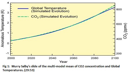
Salby's description of the graph is a little misleading.  To start with, the simulated change over time (evolution) of global temperature has no short term negative trends (is monotonic) only because the curve is the mean of "over two dozen models".  The course of temperature increase of individual models is certainly not without fluctuations.  In the IPCC AR4, all model runs had short term periods with negative trends, some lasting as long as 20 years.  Further, the curves also do not have exactly the same shape (are isomorphic).  If they did have the same shape, they could be overlaid without any portion of the curves failing to correspond, and the relationship between them would be linear, ie, expressable in the form, y = ax + b.

For simplicity, let's treat the relationship as isomorphic.  In that case, the change in global temperature would be a constant fraction of the change in CO2 concentration.  In the graph above, the CO2 concentration increases from 375 to 850 ppmv, an increase of 475 ppmv.  At the same time, the global temperature anomaly increases by 3.3 degrees C.  So , if Salby's claims were accurate, an increase of 10 ppmv of CO2 would result in an increase of 0.069 C in Global Temperature.  That is Salby's ratio.

After a while, Salby continues (32:35):

"In blue is the observed record of global temperature from the satellite MSU.  In green, the observed record of CO2.  The long term evolution of global temperature parallels that of CO2 during the 1980s.  It behaves less so during the 1990s, even accounting for the erruption of Pinatubo in 1992.  But after the El Nino of 1997, CO2 continued to increase.  Global temperature did not.  Their divergence over the last decade and a half is now uneqivocal.  In the model world gobal temperature tracks CO2 almost perfectly.  In the real world, it clearly doesn't."

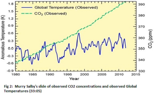
But there is a problem here.  The observed increase in CO2 concentration in the graph is from 338 to 392 ppmv, an increase of just 54 ppmv.  Using Salby's ratio, that suggests an increase in global temperature of just 0.38 degrees.  If, however, global temperature where to track the CO2 increase shown on the chart, it would need to increase by 2.54 degrees C.  Indeed, the  satellite record shows a trend in temperature of 0.14 C per decade, for an increase of 0.43 C since the start of the satellite record.  In other words, the temperature increase is currently tracking nine percent above the increase predicted by Salby's "isomorphic" relationship.

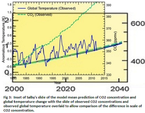
Looking closely, it is not difficult to find the problem.  In the first graph, shows a range of 5.2 degrees C and  710 ppmv, a ratio of 136.5 ppmv/ degree C.  In contrast, in the second graph, the range is 2.8 degrees C, but only 62 ppmv, a ratio of 22 ppmv/ degree C.  The second graph has been rescaled to exagerate the increase in CO2 concentration relative to increase in temperature by 620%. This is clear in Figure 3, which shows the second graph overlaid on an inset of the first graph to allow comparison of the CO2 concentration scales (Temperature and temporal scales, but not position, have been matched.)

To make an honest prediction based on Salby's graph, we need to divide the vertical axis by 6.2, thereby producing a temperature prediction that is correctly scaled for temperatures in the observed graph.  When we do so (in red below), Salby's "unequivocal divergence" evaporates.  The divergence in predicted and observed Global Temperatures turns out to be a consequence of Salby's manipulation of the scales on his graphs, not a property of either data or models.  His rescaling hides the close relationship between predicted and observed increases in temperature. 

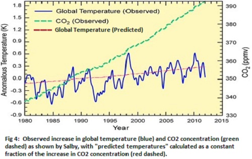
I wonder why he did that?

Revised to correct spelling, 21/10/2012

0 0

Printable Version  |  Link to this page

Comments

Comments 1 to 16:

  1. No excuses. Just a straightforward excursion into ethical la-la land. It remains to be seen whether Salby can be held accountable for it. Yet another test case for the proposition that we're heading deeper into the condition of postmodernity.
    0 0
  2. To misquote a saying from my youth: "Graphs and statistics are like a bikini: what they show is revealing, but what they hide is vital". Mr. Salby may be more crafty than careless. I think his rescaled bikini might have just given him a wedgie.
    0 0
  3. Some supplementary information - Professor John Nielson-Gammon does a nice little "smell test" here to see if temperature rise since 1979 is within the ball-park of what would be expected from CO2. Carbon Dioxide and Climate
    0 0
  4. Nice debunking, Tom. Good to see you back and kicking on SkS after a longish break... The title would be better "Salsby's rescaling", which more adequately describes the misleading distortion by the subject, a central point of the article. BTW, Salsby is not the first one to employ the "graph rescaling trick". I've seen very similar trick on lord Monckton's slides. Unfortunately, I don't remember where Monckton presented it. Quite possibly, he did it on his visit to Australia, in which case Monckton is likely Salsby's inspiration. I dare to add that I share opinions that Monckton's willful deceptions can be considered criminal acts. So can be Salsby, Monckton's follower. It's not our duty to setup the trials here but our very duty is to debunk harmful deceptions. Well done.
    0 0
  5. I've also seen some rescaling tricks while looking around near denialist blogs. Hey, look! There's no relationship between CO2 and temperature: Oh, wait, it turns out there actually is one:
    0 0
  6. Nicely done, Tom. Trivial: "Off these..." Shoyemore, thanks for that link. Now I'm wishing WoodForTrees had a ln ratio function that could be applied. Suppose not hard to do with the graph data itself.
    0 0
  7. The obvious lesson is with use of the correct scales any two near linear curves can be made to match,or to not match.
    0 0
  8. Chris G - WoodForTrees has "Scale" and "Offset" parameters that can be adjusted. Just make sure your changes are to the correct CO2/temperature scales, unlike Salby's.
    0 0
  9. Salby's graph appears to rely on a misrepresentation of IPCC/mainstream climatology, one which I have seen in many a comment thread. This misrepresentation relies on the assumption that the IPCC/mainstream climatologists believe global climate or temperature depends solely on CO2. As Chapter 2 (PDF) of the >IPCC AR4 (Working Group 1) shows, this misrepresentation is clearly false.
    0 0
  10. Have you told Salby? I'm sure he'll be extremely grateful, and will quickly publish a correction/retraction. He must be very embarrassed at having made such an odd error.
    0 0
  11. Daneel@5 You are completely wrong! This shows that CO2 follows temperature, so CO2 does not drive the warming. Or maybe not: The same data, only the relative position is changed. There are so many, simple, ways to trick the human mind that one sometimes wonders the competence of the 'designer'.
    0 0
  12. John Brookes- so far Professor Salby has failed to respond to emails.
    0 0
  13. FWIW I emailed a copy of my blog post to Prof Salby before it was posted for his comment, but received no reply.
    0 0
  14. Chris G @6, spelling error now corrected. Thankyou. John Brooks @10, I did not attempted to communicate with Salby prior to publication. I take the view that if he would not respond to Dikran Marsupials substantial criticisms of an issue on which he is attempting (supposedly) to publish, he would not respond. At first I though I really should attempt to communicate with him to ensure I was not simply mistaking an obscure form of the argument that "we haven't warmed for 15 years, ergo CO2 does not cause warming" for the even worse argument described above. Then, however, I noticed that he said,
    "The long term evolution of global temperature parallels that of CO2 during the 1980s. It behaves less so during the 1990s, even accounting for the erruption of Pinatubo in 1992. But after the El Nino of 1997, CO2 continued to increase. Global temperature did not."
    In fact, while the the 1980s overlap the CO2 record in his graph, they had a temperature trend in the UAH TLT record of 0 degrees C per decade (1980-1989, annual values). As such the 1980s performed worse in tracking CO2 increases than did the 2000s (0.06 C/decade, 2000-2009) or the 1990s (0.26 C/decade, 1990-1999). Indeed, Pinatubo makes the 1990s trend stronger, not worse. It does, however, make the positional mismatch between his temperature and CO2 curves greater. Therefore Salby is without question talking about relative locations of the curve, a function of his rescaling; not about the actual temperature trends. This is so straightforward that, IMO, no clarification was needed. Out of interest, and if anyone thinks it makes a difference, the trend from 1997 to 2011 is 0.1 C per decade, while that from 1998 to 2011 is 0.06 C per decade. So, even with Salby's carefully cherry picked interval, the claim that temperature change "parallels" CO2 increase in the 1980's, but that there is no match after the 1997 El Nino (or even that there was no temperature increase after the 1997 El Nino)pure bunkum with whose only supporting evidence is Salby's manipulation of the scales. Of course, there are straightforward explanations as to why the temperature increases fluctuates over the sort term.
    0 0
  15. I just want to remind you of the new World climate Widget: http://herdsoft.com/climate/widget/ that gives scalable graphics with CO2-Concentration, Temperature and Solar activity. World Climate widget
    0 0
  16. Thanks Tom Curtis. I was being a bit tongue in cheek. I hold no illusions about Salby being particularly interested in doing things right.
    0 0

You need to be logged in to post a comment. Login via the left margin or if you're new, register here.


The Consensus Project Website

THE ESCALATOR

(free to republish)


© Copyright 2024 John Cook
Home | Translations | About Us | Privacy | Contact Us