Climate Science Glossary

Term Lookup

Enter a term in the search box to find its definition.

Settings

Use the controls in the far right panel to increase or decrease the number of terms automatically displayed (or to completely turn that feature off).

Term Lookup

Settings


All IPCC definitions taken from Climate Change 2007: The Physical Science Basis. Working Group I Contribution to the Fourth Assessment Report of the Intergovernmental Panel on Climate Change, Annex I, Glossary, pp. 941-954. Cambridge University Press.

Home Arguments Software Resources Comments The Consensus Project Translations About Support

Twitter Facebook YouTube Mastodon MeWe

RSS Posts RSS Comments Email Subscribe


Climate's changed before
It's the sun
It's not bad
There is no consensus
It's cooling
Models are unreliable
Temp record is unreliable
Animals and plants can adapt
It hasn't warmed since 1998
Antarctica is gaining ice
View All Arguments...


Username
Password
New? Register here
Forgot your password?

Latest Posts

Archives

Still Going Down the Up Escalator

Posted on 3 February 2012 by dana1981

The Escalator, originally created as a simple debunking to the myth "Global warming stopped in [insert date]", turned out to be a very popular graphic.  Going Down the Up Escalator, Part 1 recently surpassed 20,000 pageviews, Part 2 has an additional 4,000+ views, and the graphic itself has been used countless times in other blogs and media articles.  Due to its popularity, we have added a link to The Escalator in the right margin of the page, and it also has its own short URL, sks.to/escalator.

The popularity of the graphic is probably due to the fact that (1) it's a simple, stand-alone debunking of the "global warming stopped" myth, and (2) that particular myth has become so popular amongst climate denialists.  As The Escalator clearly illustrates, it's easy to cherry pick convenient start and end points to obtain whatever short-term trend one desires, but the long-term human-caused global warming trend is quite clear underneath the short-term noise.

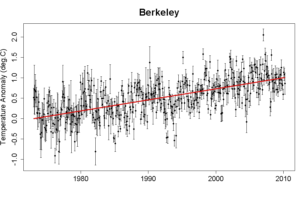
The original Escalator was based on the Berkeley Earth Surface Temperature (BEST) data, which incorporates more temperature station data than any other data set, but is limited to land-only data; additionally the record terminates in early 2010.  We originally created the graphic in response to the specific myth that the BEST data showed that global warming had stopped.

It is interesting to apply the same analysis to a current global (land-ocean) temperature record to determine whether short term trends in the global data can be equally misleading. A global version of the Escalator graphic has therefore been prepared using the NOAA NCDC global (land and ocean combined) data through December 2011 (Figure 1).

ncdc escalator

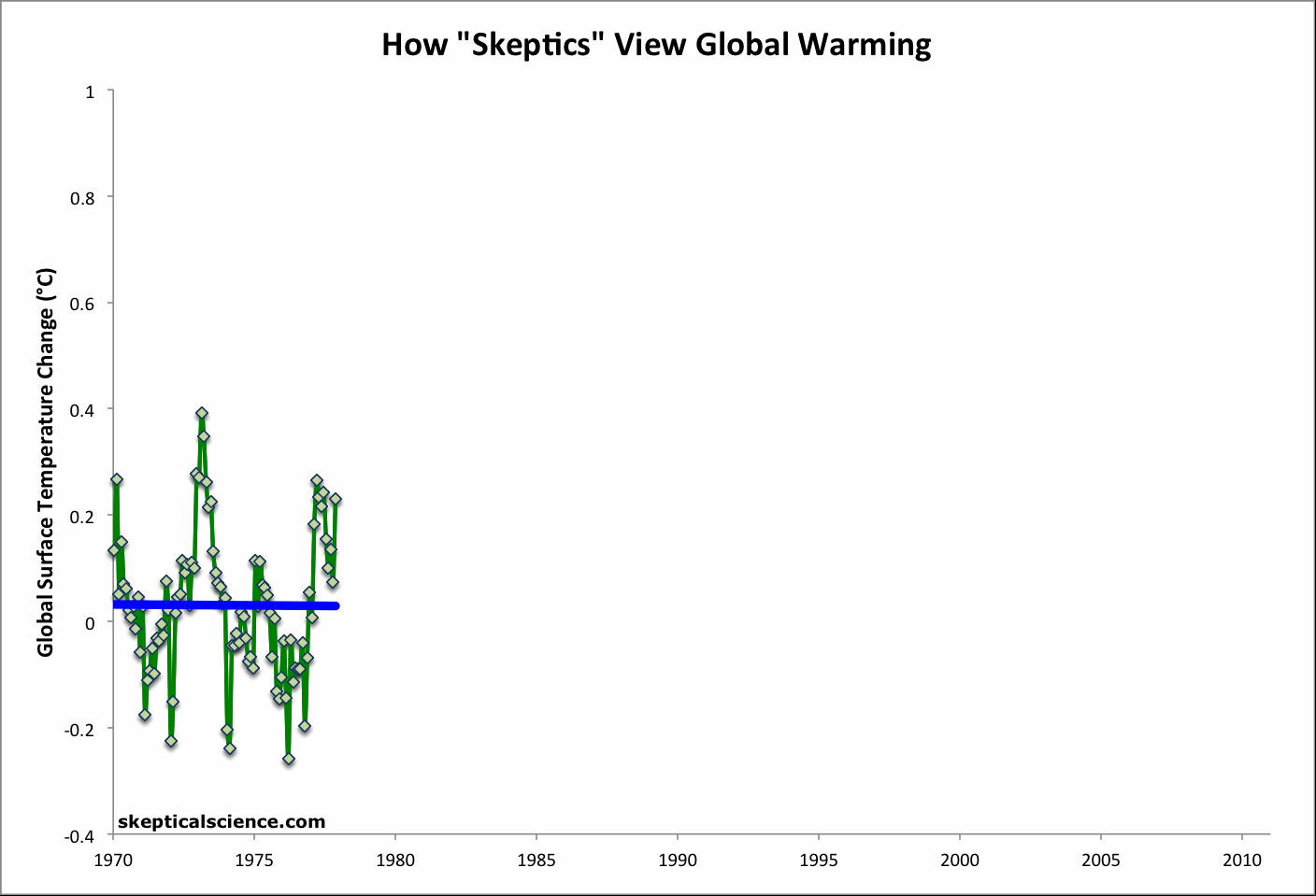
Figure 1: Short-term cooling trends from Jan '70 to Nov '77, Nov '77 to Nov '86, Sep '87 to Nov '96, Mar '97 to Oct '02, and Oct '02 to Dec '11 (blue) vs. the 42-year warming trend (Jan '70 to Dec '11; red) using NOAA NCDC land-ocean data.

The Predictable Attacks

On 31 January 2012, John Cook emailed me about several recent uses of The Escalator, including an inquiry from Andrew Dessler, requesting to use it in one of his lectures.  In the email, John suggested that the graphic had gained so much popularity, it would likely soon be the target of attacks from fake skeptics.

As if eavesdropping on our conversation, the first such attack on the escalator came the very next day, on 01 February 2012.  The graphic had been publshed nearly 3 months earlier, and John predicted the fake skeptic response within a day's margin. 

The Escalator was recently used by a number of sources in response to the denialist plea for climate inaction published in the Wall Street Journal, including Media Matters, Climate Crocks, Huffington Post, and Phil Plait at Discover Magazine's Bad AstronomyStatistician William Briggs took issue with Phil Plait's use of the graphic.  Specifically, he criticized the lack of error bars on the data used in The Escalator, making some rather wild claims about the uncertainty in the data.

"...the models that gave these dots tried to predict what the global temperature was. When we do see error bars, researchers often make the mistake of showing us the uncertainty of the model parameters, about which we do not care, we cannot see, and are not verifiable. Since the models were supposed to predict temperature, show us the error of the predictions.

I’ve done this (on different but similar data) and I find that the parameter uncertainty is plus or minus a tenth of degree or less. But the prediction uncertainty is (in data like this) anywhere from 0.1 to 0.5 degrees, plus or minus."

As tamino has pointed out, calculating an area-weighted average global temperature can hardly be considered a "prediction" and as he and Greg Laden both pointed out, BEST has provided the uncertainty range for their data, and it is quite small (see it graphically here and here).  Plait has also responded to Briggs here.

The Escalating Global Warming Trend

Briggs takes his uncertainty inflation to the extreme, claiming that we can't even be certain the planet has warmed over the past 70 years.

"I don’t know what the prediction uncertainty is for Plait’s picture. Neither does he. I’d be willing to bet it’s large enough so that we can’t tell with certainty greater than 90% whether temperatures in the 1940s were cooler than in the 2000s."

It's difficult to ascertain what Briggs is talking about here.  We're not using the current trend to predict (hindcast) the global temperature in 1940.  We have temperature station measurements in 1940 to estimate the 1940 temperature, and data since then to estimate the warming trend.  Once again, we're producing estimates, not predictions here. 

Moreover, the further back in time we go and the more data we use, the smaller the uncertainty in the trend.  For example, see this post by tamino, which shows that the global warming trend since 1975 is roughly 0.17 +/- 0.04°C per decade in data from NASA GISS (Figure 2).  The shorter the timeframe, the larger the uncertainty in the trend.  This is why it's unwise to focus on short timeframes, as the fake skeptics do in their "global warming stopped in [date]" assertions.  As tamino's post linked above shows, when we limit ourselves to a decade's worth of data, the uncertainty in the trend grows to nearly +/- 0.2°C per decade (Figure 2).
GISS trend uncertainty

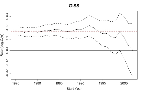
Figure 2: The estimated global temperature trends through July 2011 (black dots-and-lines), upper and lower limits of the 95% confidence interval (black dashed lines), and the estimated trend since 1975 (red dashed line) using GISS land and ocean temperature data (created by tamino)

Foster and Rahmstorf (2011) also showed that when the influences of solar and volcanic activity and the El Niño Southern Oscillation are removed from the temperature data, the warming trend in the NCDC data shown in the updated Escalator is 0.175 +/- 0.012°C per decade.  Quite simply, contrary to Briggs' claims, the warming trend is much larger than the uncertainty in the data.  In fact, when applying the Foster and Rahmstorf methodology, the global warming trend in each of the major data sets is statistically significant since 2000, let alone 1940.

Ultimately Briggs completely misses the point of The Escalator.

"...just as the WSJ‘s scientists claim, we can’t say with any certainty that the temperatures have been increasing this past decade."

This is a strawman argument.  The claim was not that we can say with certainty that surface temperatures have increased over the past decade (although global heat content has).  The point is that focusing on temperatures over the past decade (as the fake skeptics constantly do) is pointless to begin with, and that we should be examining longer, statistically significant trends.

Briggs' post was of course hailed by the usual climate denial enablers (i.e. here and here), despite the rather obvious inflation of the data uncertainty, and utter lack of support for that inflation.  Despite the fake skeptic struggles to go the wrong way down, The Escalator unfortunately continues ever-upward.

0 0

Printable Version  |  Link to this page

Comments

1  2  3  4  Next

Comments 1 to 50 out of 153:

  1. It's pretty telling that Briggs seems to have confused real-world, instrumental data records with climate models and predictions, and then tried to trash it. It's even more telling that Anthony Watts thinks that his obscure flailing is somehow sufficient to "school" Phil Plait on statistics! Over at Open Mind, Briggs tried to backpedal by redefining model as "averages," but this doesn't fly either. Also, I was coincidentally using the graphic on Jan. 30th in another forum (responding to the Daily Mail/Rose claim of no warming since 1997), and instantly caught some denialist flak over it. I didn't realize the picture was getting spread around of late, but it's just so great for beating down arguments of short-term "no warming" crap. Funny how things seem to happen to everybody at once sometimes.
    0 0
  2. IMO the power of graphics such as the "Skeptic Escalator" is so great that people who really ought to know better (such as, say, professional statisticians like Mr Briggs) will make stunningly poor arguments against them. It's amazing how people will argue themselves into incoherent knots when they attempt to argue against clear & compelling visualisations of clear & compelling evidence.
    0 0
  3. Very quick correction -- you've got 2011 when I think you mean 2012 for some discussion of timelines in the text.
    0 0
    Response:

    [dana1981] Thanks, corrected

  4. Composer99: "We don't see things as they are, we see things as we are" Anais Nin. via Frances Moore Lappe's "Ecomind"
    0 0
  5. Dana, As it happens, just today I wrote a program to help with an "escalator" graph using GISS data. I'm not done with the graph, but if you wish I can send you a spreadsheet showing all the negative-slope regressions from each month of 1970-2005 for periods of 60 thru 131 months out. I zeroed out the positive slopes so the negative ones jump right out at you; it's a cherry-picker's dream.
    0 0
  6. Sure keith, if you have my email, pass it along (if not let me know and I'll contact you).
    0 0
  7. Always worth giving Foster and Rahmstorf 2011 a plug whenever using the Elevator graph. The 11 year solar cycles coincide very neatly with the elevator steps (as would be expected). Perhaps someone can superimpose the two onto a single graphic?
    0 0
  8. macoles @7, the apparent "eleven year cycle" is largely coincidental. For example, the peak of the last solar cycle was around 2000, and coincided with the very low (by 21st century standards) temperatures in the years immediately following the 1998 El Nino. While the solar cycle does have an effect, the El Nino Southern Oscillation is far more important in determining year to year variability, as can be seen in the following graph, originally from NASA:
    0 0
  9. It's difficult to ascertain what Briggs is talking about here. We're not using the current trend to predict (hindcast) the global temperature in 1940.
    Try looking here and hereto get a better idea of what Briggs is saying.
    Ultimately Briggs completely misses the point of The Escalator.
    Plait stated that the WSJ authors were "dead wrong" when they claimed that there had been no warming over the last 10 years, and illustrated this point with a static version of the escalator graph. Briggs says they weren't, and that this particular graphic cannot tell us that they were wrong. The goal wasn't to "get" the purpose of the escalator graph. WheelsOC
    It's pretty telling that Briggs seems to have confused real-world, instrumental data records with climate models and predictions, and then tried to trash it.
    No, I think Briggs' biggest problem is that people don't understand what he's talking about. Sloppy and inconsistent terminology abounds, and the Plait critique was apparently written with long-time readers or those intimately familiar with Bayesian predictive techniques solely in mind. And Briggs never "backpedaled." He's remained consistent in his description of averages as models.
    0 0
  10. "And Briggs never "backpedaled." He's remained consistent in his description of averages as models" Defending Briggs by saying he has been consistent about describing measured results as models is absurd. Measured results are measured results. Briggs is attempting to raise doubt (doubt is our product!) by calling the measurements models. This alone proves he is not serious.
    0 0
  11. And Briggs never "backpedaled." He's remained consistent in his description of averages as models Yes, a common tactic with fake-skeptics - no matter how ridiculous their assertion is, they never admit they are wrong. No claim is too ridiculous to be defended by them it seems.
    0 0
  12. Yes, a common tactic with fake-skeptics Consistency is also a common tactic with people who are correct. Who'd have thunk it?
    0 0
  13. RobertS @12, Briggs included in his critique the claim that:
    "Notice old Phil (his source, actually) starts, quite arbitrarily, with 1973, a point which is lower than the years preceding this date."
    To this DeepClimate responded at Open Mind:
    "For greater certainty here are the BEST annual values for 1970s with trend slope to 2009: Year Anom Trend to 2009 1970 0.070 0.271 1971 -0.042 0.277 1972 -0.137 0.277 1973 0.386 0.273 1974 -0.130 0.290 1975 0.166 0.284 1976 -0.213 0.291 1977 0.274 0.276 1978 0.104 0.286 1979 0.023 0.284 So Briggs has got this completely wrong."
    That seems to me sufficient rebutal, but Briggs was "consistent", and wrote,
    "Deep Climate–try this from the 1940s."
    So DeepClimate did:
    "Well, OK: 1940 0.165 1941 0.087 1942 0.084 1943 0.160 1944 0.255 1945 -0.042 1946 0.022 1947 0.165 1948 0.103 1949 -0.044 1973 is still not lower than any of those (and neither is it lower than any year in the 1950s and 1960s). Want to try again? Let me save you the trouble. It turns out 1973 is *higher* than every single year preceding it. So you were utterly, completely wrong."
    This may seem like a trivial matter, but accusations of cherry-picking, even veiled accusations, are not trivial. It is relevant in this case, however, because it shows that Briggs "consistency" is in significant degree merely the inability to admit error. Don't pretend otherwise when the disproof is so straightforward.
    0 0
  14. RobertS @9, I am still working my way through the discussions you link to, but one thing has caught my attention. Specifically, in the second blog by Briggs to which you link, he shows the following graph: Briggs says of the dark grey band that it is "...the classical parametric prediction interval for these new proxy measurements." Earlier he had mentioned that, "The 95% parametric prediction interval for this model happens to be 17.6oC to 20.4oC." Ergo the "prediction interval" shown is the 95% prediction interval, ie, the interval inside which we would expect 95% of values to fall. The problem is, in the graph shown, just 22.6% (7 of 31) of observed values fall within the 95% prediction interval. How is it possible for a measure of the 95% prediction interval fail to include close to 95% of the data from which the prediction interval is calculated? To my mind that only 22.6% the data from which the 95% prediction interval is derived falls inside the 95% prediction interval seems like a contradiction in terms. On the face of it, Briggs has simply miscalculated the 95% prediction interval. His calculated prediction interval performs so badly because it is simply the wrong interval. And given that, he is able to show his calculated interval radically underestimates uncertainty simply because his error causes it to radically underestimate the uncertainty. I am interested in hearing why we should trust a statistician who makes so fundamental error (if he has); or alternatively just why statisticians so distort the language that a 95% prediction interval means (as it must if Briggs has made no error) that interval in which approx 25% of the data will fall.
    0 0
  15. RobertS, how is it correct to call 'averages' (which is not an accurate description either) of temperature measurements "predictions"? Or are you going to pull another semantic absurdity and claim that when Briggs says 'predictions', what he really means is 'measurements'? If the man was using any of the commonly accepted meanings of these words then what he said is flat out wrong. If he wasn't then there really isn't any way to tell what he was actually saying. In any event, if any part of what Briggs said were true it would ironically also contradict all of the 'no warming since XyZ' claims... because those are all based on the 'model predictions' (aka, thermometer measurements) Briggs is saying can't be used that way. Indeed, he is claiming that the entire ~130 year period is too short to establish a trend line... so 10 years would just be pathetic.
    0 0
  16. Tom, I'm not sure what Briggs' thinking was, but DC does indeed provide a convincing rebuttal to that point. Despite what you appear to think, I don't believe Briggs to be the Second Coming, and I won't attempt to defend every statement he has made. But many of the criticisms leveled at him over the past few days come from a simple lack of understanding of precisely what he is saying. In particular, Tamino's entire critique revolves around the idea that Briggs is simply using the words "model" and "prediction" as some sort of semantics ploy in an effort to evoke the instinctual rejection by denialists of any argument which contain those things. This is not true. The planet is not perfectly sampled at every point on its surface, so in creating an average global temperature, you're attempting to "predict" the temperature at unsampled points using data from sampled points. These "predictions" result in uncertainty in the end product, which Briggs alleges is only properly accounted for under Bayes theorem. He fleshes this process out in more detail in the second link I give above. Such terminology is fairly common in certain fields, but not in others. Michael, I had written a response to you earlier, but it disappeared. Let's try again: What exactly do you mean by measured results? Can we measure the temperature at every point on the Earth's surface? If no, how can we combine the data we do have to create a coherent record of global temperature? Is this method completely without error?
    0 0
  17. RobertS @16, if what you say is correct, then the gist of Briggs critique is that he does not know, or chooses to ignore the meaning of the word "index", as in the "GISTEMP Land/Ocean Temperature Index" or the "BEST Land Temperature Index". They are called indices because we do not mistake them for the thing itself. Suggesting the indices have insufficiently quantified the error because the they are presumed to be the thing itself simply shows incomprehension of what is being done.
    0 0
  18. Robert, Your post was deleted as trolling, perhaps this one will be also. Averaging results as described in published papers is not predicting. You claim that in order to know something we must measure it perfectly everywhere. If that were true, then nothing can be measured. Every measurement is an average of several others. You also asked for the error bars which are linked in the OP. If you cannot bother to read the OP, why comment? A brief glance at the error bars shows that the error is much less than the trend. No analysis is needed for such an obvious observation. Briggs is wrong about the error also. It is common to leave off the error bars to make the graph more readable for a general audience. Briggs is trying to artificially manufacture doubt
    0 0
  19. RobertS wrote "And Briggs never "backpedaled." He's remained consistent in his description of averages as models. " which made me think of this: Note I am not saying that Briggs is a screw-up (he isn't), merely that being consistent in promulgating an incorrect argument is not necessarily a good thing. His point seems to be about including the uncertainty in computing the global mean temperature into computing the error bars on the trend is perfectly reasonable. However what he should have done is first demonstrate that it makes a meaningful difference to the conclusion, rather than just hint that it might to spread baseless uncertainty (the uncertainty in computing the means looks pretty small to me compared to the uncertainty in the trend due to weather noise - is internal climate variability) As the regression line is not being used to predict or extrapolate the temperature anywhere, the "prediction" uncertainty is irrelevant.
    0 0
  20. Tom The dark band is a credible interval for the regression line, not for the observations themselves. It is basically saying that with 95% probability the "true" regression line lies in that interval. The credible interval for the observations themselves is a combination of the credible interval for the regression line, plus a component due to the noise in the data (i.e. the spread of data around the regression line). I am not surprised that this misunderstanding should ocurr, Briggs' articles seem rather ambiguous and opaque from what I have read so far.
    0 0
  21. Dikran Marsupial @20, thank you. That explanation makes sense, but is contradicted by Briggs claim that:
    "Notice that most of the old data points lie within the Bayesian interval—as we would hope they would—but very few of them lie within the classical parameter interval."
    We do not expect all the data to fall on the regression line, and there is no reason why it should. Failure of the data to fall within the error bars of the regression line is therefore, irrelevant, contrary to Briggs' claim. I remain uncertain as to whether Briggs is confusing the error of the "predicted" regression line with the error of the predicted data, or is simply hopelessly confusing in his discussion. However, it is not a good model for to great a confidence in temperature indices in that the confidence intervals shown for temperature indices are for the value, not for the regression. Hence absent good reason to think otherwise I shall disregard that blog as irrelevant.
    0 0
  22. Tom Curtis as I said his writing isn't the clearest, I was just opting for the most likely explanation of what he actually meant. I think it would be a good idea to include the dark area on plots of regression lines (I'd plot the most likely line as well) as it would show very clearly that the trend estimate for short timescales were very uncertain. This would prevent skeptics from claiming that the trend was flat as the error bars would show that they could be flat, or cooling or warming, and there isn't enough data to decide which. Which error bars you choose depends on whether you are trying to predict the observations or trying to estimate the rate of warming. In this case it is the latter.
    0 0
  23. Dikran @22, there is considerable doubt as to what Briggs claim is under different circumstances, but in the blog from which the graph @14 comes, he is talking about using one value (New Proxy) to predict another value (Temperature). While deriving the regression line is an important step in that process, the regression line is not what is being predicted. What is being predicted is temperature, given the value of the "new proxy". Therefore, he has either described the error margins of the regression as the "prediction interval" which is simply false, or if your conjecture is incorrect, he has not properly calculated the error margins at all (as shown by the fact that less than 25% of the data used in calculating the regression (and hence the prediction) falls within the "prediction interval". In either case he has made an error, and his argument that classical statistics underestimates errors is based firmly on the consequences of that mistake. This goes directly to RobertS's defense of Briggs. In essence that defense is that Brigg's has been misunderstood because he has been precise. This example shows that the mere use of technical language does not make what you say precise, let alone accurate. If Briggs has been misunderstood, it is because he has been unclear, not because he has been precise.
    0 0
  24. Tom Curtis I have been contributing to Briggs blog, and it seems to me he fundamentally doesn't understand the climatological issues, and apparently doesn't want to, e.g. As interesting and useful of discussions of forced versus unforced “variability” are, they are irrelevant utterly to whether claims (A) and (B) are true. It matters not how the data arose to answer the claims of whether the temperature is higher or lower over the last decade. However claims A and B relate to the statement The lack of warming for more than a decade—indeed, the smaller-than-predicted warming over the 22 years since the U.N.’s Intergovernmental Panel on Climate Change (IPCC) began issuing projections—suggests that computer models have greatly exaggerated how much warming additional CO2 can cause. and the amount of additional warming that CO2 can cause is concerned with the forced component and only the forced component. The key to success in statistics is a willingness to immerse yourself in the data and understand the data generating process and the purpose of the study. If you just wade in thinking you know what is important and what isn't and not listening to those who know the data, it is a recipe for disaster. Well I did try...
    0 0
  25. Just curious, what does the escalator graphic look like for the satellite temperature series? While I'm exceptionally well-aware of the troubles in calibrating the satellite data, it seems that the satellite temperature series could utterly destroy the sampling uncertainty argument, as it completely samples the Earth's surface.....
    0 0
  26. Paul, actually the satellite data just uses a grid with smaller cells. It is impossible to 'completely sample the Earth's surface'. Think about it. You'd need the equivalent of a 'thermometer' measuring the 'temperature' of each individual atom... or each sub-atomic particle within each atom. Anything less than that is inherently an average of multiple sources... i.e. all 'temperature' readings are averages. That said, it would certainly be possible to construct an 'escalator' for the satellite temperature record(s). However, it would likely only have a few steps since the satellite record is comparatively short.
    0 0
  27. 25, Paul, You are very right, but for the wrong reasons. It is much harder to generate negative trends from the UAH data (I didn't try RSS). The tropospheric data is much cleaner, not so much because of the global sampling (it's not global, BTW, it reaches far towards the poles but does miss them -- see the gray areas on the RSS images here – the satellite orbits used are not set up to give a good, downward looking view of the earth at the poles), I think, but because the warming is less impacted by noise. In fact, I couldn't create a negative trend up to the end with the UAH data. Maybe someone else can try. You have to sit and peck around for exactly the right cherry flavored end points to use. It's very hard to do what with all of the consistent and unequivocal warming that's occurred in the past fifteen years.
    0 0
  28. 25, Paul, I was able to get an ending downward trend for the RSS data, thanks to the recent La Niña and by selecting 2002 as a start date.
    0 0
  29. Scientifically, the point really is that the short term trend is not a good indicator of the long-term forced change component of climate. Natural variability is dominant on the decadal timescale as documented in Knight et al., 2010, Easterling and Wehner, 2009 (10?) and Santer et al, 2001. I think your point may be more powerful by showing the opposite escalator too - one where each of the short segments shows much greater rate of warming than the long-term. That is less likely to lead to accusations of partisanship and is making the scientific point more forcibly - that short term trends can be used to indicate anything by any vested interest. Have you tried making such a "running up the up escalator" graph? It would be very interesting to see and I think help strengthen the point and avoid gross partisanship accusations.
    0 0
    Response:

    [dana1981] Thanks for your feedback, Dr. Thorne.  The purpose of The Escalator is to show how 'skeptics' and realists actually view global temperatures.  'Skeptics' constantly look for flattening or cooling trends in short-term data, whereas realists (by definition) don't look for rapid warming trends in short-term data, but rather examine long-term trends.

    However, your point is taken that we could do a 'running up the escalator' graph to show that short-term data can be manipulated in the opposite way, as opposed to the way it's actually manipulated, which is what the current Escalator shows.  We'll take this suggestion under consideration.

  30. Sorry, Santer et al., 2011
    0 0
  31. @Spherica, CBDunkerson True, satellites still are not a 100% perfect sampling, but the entirety of Earth's surface is sampled below a latitude of ~80 deg. While not every single point is measured at infinite resolution, the temperature of every single point combined with its nearest neighbors is, which means that no extrapolation to unsampled areas is necessary to get a global temperature average except at the very poles. Also, I'm not surprised at the result (more going up the down escalator!), but now the pseudo-skeptics can't claim that we're cherry-picking GISS temp because it's warmer or some other such bogus argument.....
    0 0
  32. RobertS - "The planet is not perfectly sampled at every point on its surface, so in creating an average global temperature, you're attempting to "predict" the temperature at unsampled points using data from sampled points." Um, _no_. That is estimation, not prediction. A prediction is a statement about what will happen in the future, possibly conditionally dependent upon various alternatives, while an estimation is an approximate calculation of measurements in the face of uncertainty or subsampling. Briggs conflation of the two indicates either a need for a dictionary in his reference materials or perhaps an attempt to cast temperature estimations as models so that he could take advantage of the 'skeptic' disdain for models in general.
    0 0
  33. Some on Briggs's blog are saying that the observation / averaging uncertainty is around +/- 2.5C. I mean, if it's that big, you'll most likely see it in the data itself. Briggs himself says you can't distinguish between 1940s and 2000s temps, but even in this case, you'll use the decadal average to test the null -- which in turn, make it easier to reject than comparing single year data. Given that thermometers are pretty damn good way of measuring temps, and different averaging methods get really similar results (especially for recent data), I think he is concocting his own uncertainty monster. I'm still confused about the prediction interval of the global average... the global average is what we want to compare...
    0 0
  34. I did not know where to ask but Nikolov and Zeller have managed to really con? the denialist blogosphere with a very strange theory. After wading through the usual partially true glib rubbish. We seem to have a paradigm shift of biblical proportions. Please delete this if it is out of turn. My analysis is that it is a complete hoax or just another delusion? Bert
    0 0
  35. In case anyone is interested, I just computed the credible interval for the (Bayesian) linear regression for the last decade of sensible values in the BEST monthly anomalies (March 2000 to March 2010) As you can see a horizontal(ish) line just about fits into the credible interval, but the bulk of the credible interval suggests we can be confident that there has been some warming. When I get a moment I'll include the uncertainties in the estimates of the anomalies and see if it makes much of a difference.
    0 0
  36. apeescape If you look at the uncertainties for the monthly anomaly estimates in the BEST dataset, the last two months in the dataset have uncertainties of 2.763 and 2.928, however the average for the preceding decade is only 0.096375. ISTR that there is problem (very few stations?) with the last two entries in the BEST data, hence the large uncertainties. I'd say that Briggs is rather overstating the uncertainties somewhat!
    0 0
  37. I'm reminded here of economist Paul Krugman's "very important people" (VIPs), who are individuals that have made very wrong claims about economics, but who are held in high regard, and thus their opinions are taken seriously. When it's demonstrated that their statements make no sense, the VIP defenders say "you must be misunderstanding their arguments, because they wouldn't say something that makes no sense." It certainly appears to me that Briggs' arguments on this matter simply don't make any sense. I suspect it's because, as Dikran has noted, he has not bothered to understand basic climate science concepts before trying to analyze the data. His 'prediction uncertainty' also seems like nonsense, because as discussed in the post above, the groups putting together the global surface temperature estimates include uncertainty ranges, which are not even remotely as large as Briggs suggests.
    0 0
  38. Dikran @36 - yes, the final 2 BEST data points are only based on ~40 Antarctic temperature stations. As you note and as noted in the post above, the uncertainty on the monthly anomaly data is in the ballpark of 0.05 to 0.1°C in recent years, with the exception of those two incomplete data points.
    0 0
  39. There has been a similar strangeness is the US about this kind of what I can only call a sampling issue. The US constitution requires a decennial census. Despite mathetmatical proof that statistical sampling would overcome known and demonstrated problems in trying to count everyone, Republicans (conservatives) have repeatedly rejected any such modernization attempts (presumably because they fear counting more people not like themeselves). Taking temperatures at separated stations can be described as a statistical sampling of the population of temperatures as opposed to getting 'all' the temperatures. Thus one uses a "model" (extrapolation or interpolation) of sorts to infer that the separated stations do provide information about the space around them. Some of this collapses when you use anomolies instead of temperatures, I think...the rest could be demolished by several experiments (probably available already if one looked) showing that a finer grid didn't change the anomoly in any significant degree.
    0 0
  40. Frankly, I find all of Biggs talk concerning predictions vs averages and uncertainty beside the point. The point is that uncertainty will not produce a steady incline of the sort observed in the data. Only bias and cherry-picking will. Doesn't matter if your a Bayesian or a frequentist, either. The uncertainty in those data points is implicit in the spread of the data - as is the natural variability which is much larger. Furthermore, if he is a Bayesian, his priors whould include prior information on the likely parameter values given preexisting knowledge about the system state and the physics of CO2. He should do a real analysis with error structures defined etc. I'd bet 10 bucks that once he explcitly isolated sources of error in the data that there would be even stronger evidence for that trend. I think he has the whole thing backwards. Bottom line? Let's see a real analysis rather than word games and obfuscation.
    0 0
  41. @dana1981-37. Briggs' knowledge of the terminology is weak and misleading. He's looking for the error bars in the predicted temperatures extrapolated from existing site temperatures. It's basically a chest-puffed crowing revival of 'bad data'/'hockey-stick formulas'/'it's all plastic models'. Turn it over to him and the end result of the time, effort, and money, would probably be 'can't really say'. He deals with mathematical precision, not Large Systems Effects.
    0 0
  42. Am I trolling, though? All I'm trying to do is explain what Briggs is actually saying, since many criticisms have missed the mark entirely. Dikran provides the only substantial criticism here and on Briggs' blog as far as I can tell, and it isn't over the use of the words "model" or "prediction." On that point, Briggs apparently feels a [Bayesian] predictive interval better encompasses the uncertainty in averaging techniques, rather than a confidence or credible interval, which leads one to the view that such techniques attempt to "predict" unobservables. This is still, however, beside the point.
    0 0
  43. I think we should not be too hasty in criticising Briggs that the good points he makes are lost. The use of a credible interval on the regression line is a useful suggestion (he could have explained it with greater clarity), see the plot in post 35. It does a good job of illustrating the significance/power issue in a way that is accessible for non-statisticians, and perhaps we should use it. I also think that the point about the uncertainty in the estimates of the anomalies is a fair point, however I rather doubt that these uncertainties change the conclusion very much (just broaden the credible interval a little). Briggs would have been better off if he had discussed this having already performed the analysis. His main problem is not the statistics, it is that he doesn't understand the climatology.
    0 0
  44. Dikran, if you could do a blog post on this subject, basically applying Briggs' points correctly (as your comment #35 begins to do), I think that would be quite interesting.
    0 0
  45. DM...Correct me if I'm wrong. Considering the uncertainty in the averages should increase the credible interval for individual point observations in the time series. But wouldn't it also reducing the interval around the slope parameter, which is what we're really interested in here? I mean, adding in information regarding among-station variability is just going to help you better constrain the separate contributions of measurement variability and uncertainty/variability in the parameter to the overall variability. I guess it would depend on how you structured the error model, for sure, but this is exactly the kind of detail we are not getting from Briggs. That's beside the point that a non-informative prior in this case is basically cheating. What's the point of a Bayesian model if you're not going to include prior information?
    0 0
  46. Since most sceptics agree the world is warming and the overall trend is still warming, shouldn't the caption read "How some skeptics view global warming"? Also, how does the "escalator" compare with IPCC AR4, WG1, Ch3, p253?
    0 0
  47. Dana@44 yes, if I can find the time (better stop commenting on blogs and do something more useful!) Stephen Baines@45 The more uncertainty in the estimates, the more uncertainty there will be in the linear regression model also. I think it is likely that it will make little difference, as the uncertainties in recent anomalies are small, but there is only one way to find out! When I give a talk on Bayesianism, I often use that Rumsfeld quote about there being things we know we know, things we know we don't know, and things we don't know we don't know. The first of these is easy to deal with, the last is impossible to deal with (other than giving the caveat that the almost certainly exist). The real advantage of Bayesianism is that it gives you a sound way of using the expert knowledge that you don't know something. The main advantage is that it makes the conclusions of the anlaysis less certain, and is helpful in avoiding jumping to conclusions. The real problem is that sometimes they are too vague (e.g. a flat prior on the probability of a biased coin coming up heads - in the real world you can only make a slightly biased coin, unless it is one with a head on both sides!).
    0 0
  48. MangoChutney... Could you link to the point in AR4 you're talking about? Here is a link to chaper 3 but it's not organized into page numbers... IPCC AR4 Ch.3
    0 0
  49. http://www.ipcc.ch/publications_and_data/ar4/wg1/en/faq-3-1-figure-1.html
    0 0
    Moderator Response: [RH] Hot linked url.
  50. Mangochutney - the 'realist' view in The Escalator is basically the same as the yellow line in the IPCC AR4 figure you reference, but over a slightly longer timeframe (37 years as opposed to 25, or 42 years in the NOAA version).
    0 0

1  2  3  4  Next

You need to be logged in to post a comment. Login via the left margin or if you're new, register here.


The Consensus Project Website

THE ESCALATOR

(free to republish)


© Copyright 2024 John Cook
Home | Translations | About Us | Privacy | Contact Us