


 Arguments


Surface Temperature or Satellite Brightness?
Posted on 11 January 2016 by Kevin C
There are several ways to take the temperature of the earth. We can use direct measurements by thermometers to measure air or sea surface temperatures. We can measure the temperature of the surface itself using infrared cameras, either from the ground or from space. Or we can use satellites to measure the microwave brightness of different layers of the atmosphere.
In a recent senate subcommittee hearing the claim was made that microwave brightness temperatures provide a more reliable measure of temperature change than thermometers. There are two issues with this claim:
- Microwaves do not measure the temperature of the surface, where we live. They measure the warm glow from different layers of the atmosphere.
- The claim that microwave temperature estimates are more accurate is backed by many arguments but no data.
Scientific arguments should be based in evidence, so the aim of this article is to investigate whether there is evidence for one record being more reliable than the other. If we want to determine which record is more useful for determining the change in temperature over time, we need to look at the uncertainties in the temperatures records.
Trends in surface and satellite data
Let's look at the period 1979-2012, covering the period from the beginning of the satellite record and ending 3 years ago. We will look at two datasets: the satellite data from Remote Sensing Systems (RSS), and a surface temperature dataset from the UK Met Office (HadCRUT4). The satellite data cover several layers of the atmosphere, so we'll use the data for the lowest layer, the 'TLT' or lower troposphere record, which measures temperatures over a region around 4 kilometers above the surface.
As a first step, we will calculate the trend for both the satellite and surface temperature data. The temperature changes and their trends are shown in Figure 1.
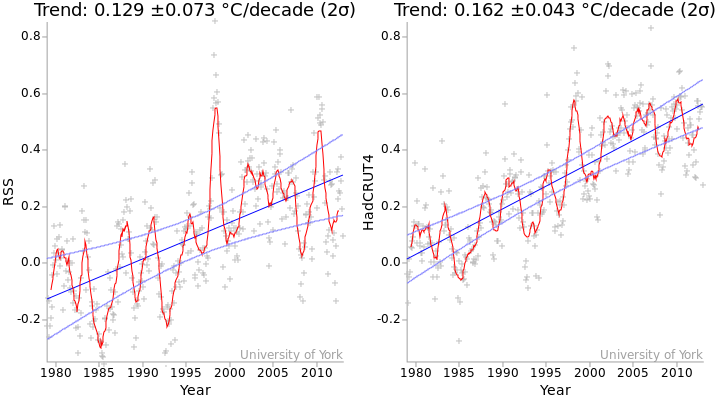
Figure 1: Temperature series for the period 1979-2012 for the RSS satellite record (left) and the HadCRUT4 surface temperature record (right). Grey crosses indicate monthly temperatures. Red lines are 12 month moving averages. The blue lines are the linear trends, and the light blue curves indicate the 2σ confidence intervals for the trends. The values of the trends and their standard errors are shown above the graph (method).
Whenever we calculate a parameter such as a least squares trend, we also try and determine the uncertainty in that parameter. And any software which can calculate the trend in a time series will always produce an error estimate attached to that value. The standard errors in the trends are indicated by the curves in Figure 1, these indicate the spread of likely trend values. The standard error is also given as a number, which is the value after the '±' symbol.
The standard error in the RSS trend is about 70% higher than the standard error in the surface trend. From this we might infer that the satellite data are less reliable. However, that would be an invalid inference. Here's why.
Structural uncertainty versus statistical uncertainty
There is a problem. We tend to assume that the standard error in the trend is a measure of the uncertainty in that trend. But it isn't. The standard error in the trend comes from the 'wiggliness' of the data (i.e the deviation of the data from linearity) It is determined by the size of the error term ε(t) in the equation:
T(t) = α + βt + ε(t)
where t is time, T(t) is the temperature at a given time, α is the average temperature, β is the temperature trend, and ε(t) contains all of the remaining temperature variation which is not accounted for by the linear trend.
The equation says that the data consist of a constant, a linear trend, and everything else - where everything else is noise. In other words the standard error in the trend is not really a measure of uncertainty - it is a measure of deviation from linearity. The two can be equivalent, but only in the case where the data really do consist of a pure linear trend plus noise.
The problem is that the temperature data do not obey this assumption. The temperature data contain wiggles due to weather, El Niños, volcanoes and other factors. So the deviation from linearity is not just a function of the limitations of the measurement system, it also depends on the variations in the thing we are measuring. And because the two datasets are measuring different temperatures at different heights in the atmosphere, the variations are different - we know for example that the satellite data show a stronger El Niño variation than the surface data (Foster & Rahmstorf 2011).
So the standard error in the trend is not telling us primarily about the reliability of the data, but rather about variability in the observed part of the atmosphere. We can call this 'statistical uncertainty'. It is a good indication of the kind of variation we will see in future, but it is not a measure of the uncertainty in the observations.
The uncertainty in the observations and the way we use them to produce a surface temperature record is referred to as "structural uncertainty". Uncertainties in the observations play a role in the statistical uncertainty in the trend, but a secondary one.
Thought experiments
We'll use a couple of thought experiments to clarify this issue.
Firstly imagine a planet with a perfect temperature observation system. We can measure the temperature of every point on the planet surface with perfect accuracy. So we also know the global mean temperature with perfect accuracy. And for any period, we can determine the trend in the temperatures with perfect accuracy.
But this planet still has weather, an El Nino cycle, and other temperature variations. So the temperature series has wiggles. Any trend we calculate will therefore also have a non-zero standard error, despite the fact that there is no uncertainty in the trend. In this case, the standard error in the trend overestimates the uncertainty in the observations.
Now let us consider a distant asteroid. It has no atmosphere and is in a circular orbit, so the temperature is constant. We have a real instrument on the asteroid, but the power supply is running down so there is some drift in the readings. The readings show a linear trend. Because the temperature history is linear, the standard error in the trend is zero. And yet we know that the observed trend is wrong. In this case the standard error in the trend underestimates the uncertainty in the observations.
So the standard error in the trend can overestimate or underestimate the observational uncertainties. It tells us something about the likely future variations in the trend, but not how much of that variation comes from uncertainties in the observations. So why do we use it? Because sometimes it is all we have.
Can we do better?
If we really want to understand whether the satellite data are more reliable than the surface data or vice versa, we can't get that information from the temperature data alone, because they are not measuring the same thing and because some kinds of errors simply can't be detected from the global record alone. Instead we need to analyze the uncertainties in the observations themselves and in how they are combined to produce the temperature record.
This requires a detailed understanding of how the temperature records are put together, and so are generally performed by the temperature record providers.
The surface temperature record is comparatively simple - land temperatures, sea surface temperatures and weather station homogenizations can all be produced with a few hundred lines of computer code. By analyzing the source data we can estimate some of the uncertainties for ourselves. I outline one such test in this lecture:
This analysis must be combined with other techniques to assess the uncertainties in the surface temperature record arising from issues such as incomplete coverage or incorrect homogenization. The UK Met Office assesses these sources of uncertainty and uses them to produce an ensemble of 100 possible versions of the temperature record (Morice et al. 2012). By looking at the variation between members of the ensemble, we get an indication of the uncertainty in the record over the region covered by the observations. (Additional sources of uncertainty including changes in coverage and partially correlated errors slightly increase the uncertainties.)
The satellite record is much more complex, requiring multiple corrections to the records from individual satellites, as well as cross calibration between the different satellites. The complexity of the calculation (Figure 2) makes it harder for us to assess it for ourselves. However RSS, one of the satellite record providers, also produce an ensemble of temperature records (Mears et al. 2011). By comparing the spread of the ensembles, we can compare the scale of the known uncertainties in the HadCRUT4 surface temperatures and the RSS satellite temperatures.
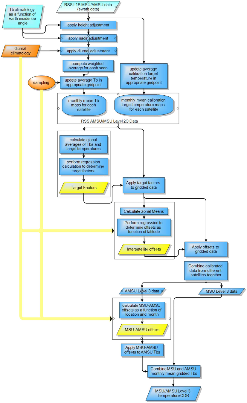
Figure 2: Flowchart of the processing algorithm for the RSS satellite data, from Mears et al. (2011)
All of the ensemble members for the two datasets are shown in Figure 3 for the period 1979-2012 (i.e. the end of the RSS ensemble data). The RSS satellite ensemble shows a much greater spread than the surface temperature ensemble. The ensemble spread also shows some interesting variations, mostly associated with the introduction or withdrawal of different satellites.
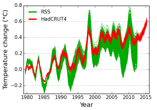
Figure 3: Spread in the satellite and surface temperature ensembles over time. Each line shows one possible temperature reconstruction from the ensemble (12 month moving average). All of the series have been aligned to a zero baseline for the 10 year period 1979-1988, so that the increasing spread after that period gives an indication of the variability in the trend. The HadCRUT4 ensemble omits some sources of uncertainty: I estimate the spread in the trends should be increased by 7%. (Stand-alone version of this graph)
We can also compare the spread in the trends for the two ensembles for the period 1979-2012 (Figure 4). We don't expect the trends to be the same because they are measuring different things. However the spread of the ensemble trends tells us about the known uncertainties in the trends produced by that method. The spread of the trends in the satellite temperature ensemble is about five times the spread of the trends in the surface temperature ensemble. The known uncertainties in the observations and processing method suggest that the surface temperature trends are much more reliable than the satellite temperature trends.
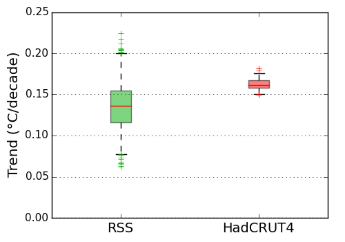
Figure 4: Uncertainty in the temperature satellite and surface temperature trends, estimated from the RSS and HadCRUT4 ensembles. The boxes show the mean and interquartile range of the trends on 1979-2012 in each ensemble. Whiskers indicate the 95% interval (2.5%-97.5%). Crosses indicate outliers. The HadCRUT4 ensemble omits some sources of uncertainty: I estimate the spread in the trends should be increased by 7%. (Stand-alone version of this graph)
Of course the validity of the ensemble trend uncertainty estimates is dependent on the record providers having correctly identified all of the sources of uncertainty in the observations and methods. It is possible that currently unknown sources of uncertainty might change the picture. Different versions of the temperature record from NASA and NOAA show differences with the HadCRUT4 record, only some of which are explained by the HadCRUT4 ensemble.
More recently, corrections have been made to the sea surface temperature record to correct for the introduction of weather buoys as a major source of data. The UK Met Office and NOAA have both produced their own corrections which differ in some fine details. These will therefore increase the uncertainty in the surface record.
Carl Mears of RSS has produced some new work on uncertainties in the satellite temperature record which are likely to increase rather than decrease the uncertainties. There are also significant differences between versions of the satellite record from different providers, and even between different versions from the same provider. So it currently looks as though uncertainties in the satellite trends will continue to be substantially higher than the uncertainties in the surface temperature trends.
To summarize, on the basis of the best understanding of the record providers themselves, the surface temperature record appears to be the better source of trend information. The satellite record is valuable for its uniform geographical coverage and ability to measure different levels in the atmosphere, but it is not our best source of data concerning temperature change at the surface.
I would like to thank Carl Mears of Remote Sensing Systems (RSS) for reviewing this article, and the Skeptical Science team for helpful comments.
John Kennedy of the Hadley Centre has noted that the HadCRUT4 ensemble doesn't include all the known uncertainties. I estimate the additional uncertainties increase the spread in the trends in the HadCRUT4 record by about 7%. The text has been updated as noted here.


Above is a comparison of RSS with balloon observed RATPAC-A @ 750mb atmospheric pressure in the atmosphere.
Senator Cruz made inaccurate claims about balloon observed temperatures also, as far as I can see.
Excellent post.
Thanks for addressing this issue. Good post.
Very useful. TLT and surface records have been much compared and contrasted, with predilections in Climateball fostering tribal affiliations with either. I can't remember seeing a post that laid out the differences in much detail until now.
Were Spencer or Christy approached for input?
No, I didn't contact any other record providers (although I've talked to Hadley people about the ensemble in the past). As far as I am aware only Hadley and RSS have published the relevant analysis to allow the estimation of structural uncertainty.
Doing so for trends requires either a covariance matrix of every month with every other month (which is unwieldy), or an ensemble of temperature realisations. Fortunately Hadley and RSS have done this - it's a killer feature, and sadly underused - but the other providers haven't.
"but it is not our best source of data concerning temperature change at the surface." Which, coincidentally, is where most of us live...
Thanks Kevin for an excellent post.
But what about UAH?
Version 6 is a strongly adapted version that shows less warming than before, especially in the past 20 years. The LT trend, according to Spencer, is only 0.11 degrees per decade since 1979, which result in a large gap with 2m observation and also RSS.
I found a comment here, that says, among others, "They [Spencer and Christy] have continued this lack of transparency with the latest TLT (version 6), which Spencer briefly described on his blog, but which has not been published after peer review." and also with respect to TMT: "I think it's rather damning that Christy used the TMT in his committee presentation on 13 May this year. He appears to be completely ignoring the contamination due to stratospheric cooling."
I am interested in you view on this.
Bart S
No matter how solid the science showing the unacceptability of a potentially popular and profitable activity may be, the ability to deceptively create temporary perceptions contrary to the developing better understanding can be very powerful. Especially if 'fancier more advanced technology' can be used as justification for the desired temporary perceptions.
Many people are clearly easily impressed by claims that something newer, shinier and 'technologically more advanced' is superior to and more desireable than an older thing.
The socioeconomic system has unfortunately been proven to waste a lot of human thought and effort. The creative effort and marketing effort focuses on popularity and profitability. Neither of those things is actually real. They are both just made-up (perceptions that may not survive thoughtful conscientious consideration of their actual contribution to the advancement of humanity).
The entire system of finance and economics is actually 'made-up'. The results simply depend on the rules created and their monitoring and enforcement. And conscientious thoughtful evaluation of whether something actually advances humanity to a lasting better future is 'not a required economic or financial consideration' (and economic games are played by a sub-set of a generation of humanity that in their minds can show that they would have to personally give up more in their time than the costs they believe they are imposing on others in the future. That twisted way of thinking, that one part of humanity can justify a better time for themselves at the expense of others ... taken to the extremes that personal desired perception acan take such thinking, is all too prevelant among the 'perceived winners' of the current made-up game)
That can be understood, especially by any leader in politics or industry. And yet the popularity, profitiability and perceptions of prosperity that can be understood to only be made-up can easily trump the development of better understanding of what is actually going on.
That push for perceptions of popularity, profit and prosperity has led many people be perceive 'technological advancements' to be desired proofs of prosperity and superiority. These unjustified thoughts develop even though those things have not actually advanced human thoughts or actions toward a lasting better future for all life. Those thoughts even persist if it can be understood that the developments are contrary to the advancement of humanity (the collective thoughts and actions), to a lasting better future for all life. And in many cases the focus on perceptions of success can distract or even cause a mind to degenrate away from thoughts of how to advance to a lasting better future for all of humanity.
That clear understanding that everyone is capable of developing is actually easily trumped by the steady flood of creative appeals attempting to justify and defend the development of new 'more advanced and desired technological things' that do not advance the thinking and action of humanity.
So, the most despicable people are the ones who understand things like that and abuse their understanding to delay the development of better understanding in global humanity of how to actually advance global humanity.
The Climate Science marketing battle is just another in a voluminous history of clear evidence regarding how harmful the pursuit of popularity and profit can be. Desired perceptions can trump rational conscientious thought.
Technological advancement does not mean better (the advancement of humanity being better), except in the minds of people who prefer to believe things like that. And such people will want to believe that more ability to consume and have newer more tehnologically advanced things (or simply more unnecessarily powerful or faster things like overpowered personal transport machine that can go faster than they are allowed to safely go in public). They will willingly believe anything that means they don't have to develop and accept the better understanding of how unjustified their developed desired perceptions actually are.
Bart: I'm not very interested in behaviour I'm afraid. You are as qualified as me (probably more) to discuss ethics and motivation.
With respect to the UAH data, as far as I am aware they have not presented an analysis capable of quantifying the structural uncertainties in the trend in their reconstruction. However they are working from the same source data as RSS, with the same issues of diurnal drift, intersatellite corrections and so on. While their method might be better or worse than the RSS method in constraining these corrections, in the absence of any analysis I think all we can do is assume that the uncertainties are similar.
Unfortunately uncertainty analysis is hard, and it very easy to do it badly. Given multiple sources of uncertainty analysis for a particular set of source data, in the absence of any other information I would generally trust the one with the greatest uncertainties. It is disappointing that we only have one analysis each of the surface and satellite record for which a comprehensive analysis of uncertainty has been attempted. Hopefully that will change.
Kevin,
Thanks again for a great post. I understand a covariance matrix, can you explain what you mean by an "ensemble of temperatures realisations". Why is that only RSS and HADCRUT have done this? Thanks.
OK, I'll try, but I don't have time to draw the pictures.
Suppose we just have temperature measurements for 2 months. Then the trend is easy: (T2-T1)/t, where t is the time difference between the measurements.
But what is the uncertainty? Well, if the errors in the two observations were uncorrelated, then it would be σdiff/t, where σdiff = (σ12 + σ22)1/2
But suppose the errors are correlated. Suppose for example that both reading have an unknown bias which is the same for both readings - they are both high or both low. That contributes to the error for the two readings, but it doesn't contribute to the trend.
In terms of covariance, the errors have a positive covariance. The equation for the uncertainty in the difference with non-zero covariance is σdiff = (σ12 + σ22 - 2σ12)1/2 where σ12 is the covariance. And as expected, the uncertainty in the difference, and therefore the trend, is now reduced.
Now suppose we have a long temperature series. We can again store the covariance of every month with respect to every other month, and we can take those covariances into account when we calculate the uncertainty in an average over a period, or the uncertainty in a trend. However the covariance matrix starts to get large when we have a thousand months.
Now imagine you are doing the same not with a global temperature series, but with a map series. Now we have say 5000 series each of 1000 months, which means 5000 matrices each of a million elements. That's getting very inconvenient.
So the alternative is to provide a random sampling of series from the distribution represented by the covariance matrix. Let's go back to one series. Suppose there is an uncertain adjustment in the middle of the series. We can represent this by a covariance matrix, which will look a bit like this:
1 1 1 0 0 0
1 1 1 0 0 0
1 1 1 0 0 0
0 0 0 1 1 1
0 0 0 1 1 1
0 0 0 1 1 1
But an alternative way of representing it is by providing an ensemble of possible temperature series, with different values for the adjustment drawn from the probability distribution for that adjustment. You give a set of series: for some the adjustment is up, for some it is down, for some it is near zero.
Now repeat that for every uncertainty in your data. You can pick how many series you want to produce - 100 say - and for each series you pick a random value for each uncertain parameter from the probability distribution for that parameter. You now have an ensemble of temperature series, which obey the covariance matrix to an accuracy limited by the size of the ensemble. Calculating the uncertainty in an average or a trend is now trivial - we just calculate the average or the trend for each member of the ensemble, and then look at the distribution of results.
If you want maps, then that's 100 map series. Which is still quite big, but tiny compared to the covariance matrices.
I see that Spencer and Christy at UAH have a new (and, I believe, as yet unpublished) version of their satellite temperature record that makes the warming trend go away altogether, at for 2000-present. The are pushing this as an improvment to te earlier version which is used in the Skeptical Science trend calculator (as well as the very similar calculator at Kevin Cowtan's University page). Does anyone have further information on this new version of the data? I had a denier throw this at me with no sense of irony about all the noise being made about the Karl corrections constituting data manipulation. Also, any speculation about why the satellite data shows such a huge peak for the 1998 el nino, much higher than the 2015 el nino despite other evidence that their magnitude is similar?
Thank you for the excellent, clear, and concise article. I've been trying to wrap my head around the uncertainties of satellite versus surface temperature readings, and thanks to you that wrapping is approaching, oh, let's estimate about 270º ± 5º ...
rocketeer,
I've seen comments about the satellite data having a delay (don't know why). Just as the 1997/1998 El Nino shows up clearly in the satellite data only in 1998, we might expect that the 2015/2016 El Nino will spike the satellite data in 2016. So watch out for this year's data. The British Met Office expect 2016 to be warmer than 2015, at the surface, so that tends to support the idea of the satellite data spiking this year.
Tamino analysed various data sets in this post. It did seem to me that the RSS data appeared to deviate markedly from the RATPAC data around 2000, which leads me to guess that something started to go wrong with the data collection or estimations around then. I don't know yet but this article did mention a study into UAH data which suggests they are wrong.
Just so people know ...
Jastrow, Nierenberg and Seitz (the Marshall Institute folks portrayed in Merchants of Doubt) published Scientific Perspeftives on the Greenhosue Problem(1990), one of the earliest climate doubt-creation books. One can find a few of the SkS aerguments there.
So, with just the first 10 years of data (19790=-1988), they *knew* they were more precise, 0.01C (!) for monthly, and this claim has been marketed relentlessly for 25 years .. despite changes in insturments and serious bugs often found by others.
Contrast that with the folks at RSS, who actually deal with uncertainties, have often found UAH bugs, and consider ground temperatures more reliable. Carl Mears' discussion is well worth reading in its entirety.
Kevin c #10,
Many thanks, pictures not required! :)
rocketeer @11.
I've posted a graph here (usually two clicks to 'download your attachment') which plots an average for monthly surface temperatures, an average for TLTs & MEI. As TonyW @13 points out (& the graph shows) there is a few months delay between the ENSO wobbling itself & the resulting global temperature wobble. The relative size of these surface temp & TLT wobbles back in 1997-98 is shown to be 3-to-1. So far there is no reason not to expect the same size of temperature wobble we had back in 1997/8, which would mean the major part of the TLT wobble has not started yet.
John Kennedy of the UK Met Office raised an interesting issue with my use of the HadCRUT4 ensemble. The ensemble doesn't include all the sources of uncertainty. In particular coverage and uncorrelated/partially correlated uncertainties are not included.
Neither RSS and HadCRUT4 have global coverage, and the largest gaps in both cases are the Antarctic then the Arctic. Neither include coverage uncertainty in the ensemble, so at first glance the ensembles are comparable in this respect.
However there is one wrinkle: The HadCRUT4 coverage changes over time, whereas the RSS coverage is fixed. To estimate the effect of changing coverage I started from the NCEP reanalysis (used for coverage uncertainty in HadCRUT4), and masked every month to match the coverage of HadCRUT4 for one year of the 36 years in the satellite record. This gives 36 temperature series. The standard deviation of the trends is about 0.002C/decade.
Next I looked and the uncorrelated and partially correlated errors. Hadley provide these both for the monthly and annual data. I took they 95% confidence interval and assumed that these correspond to the 4 sigma width of a normal distribution, and then generated 1000 series of normal values for either the months or years. I then calculated the trends for each of the 1000 series and looked at the standard deviations of each sample of trends. The standard deviation for the monthly data was about 0.001C/decade, and for the annual data about 0.002C/decade.
I then created an AR1 model to determine what level of autocorrelation would produce a doubling of trend uncertainty on going from monthly to annual data - the autocorrelation parameter is about 0.7. Then I grouped the data into 24 month blocks and recalculated the standard deviation of the trends - it was essentially unchanged from the annual data. From this I infer that the partially correlated errors become essentially uncorrelated when you go to the annual scale. Which means the spead due to partially correlated errors is about 0.002C/decade.
The original spread in the trends was about 0.007C/decade (1σ). Combining these gives a total spread of (0.0072+0.0022+0.0022)1/2, or about 0.0075 C/decade. That's about a 7% increase in the ensemble spread due to the inclusion of changing coverage and uncorrelated/partially correlated uncertainties. That's insufficient to change the conclusions.
However I did notice that the ensemble spread is not very normal. The ratio of the standard deviations of the trends between the ensembles is a little less than the ratio of the 95% range. So it would be defensible to say that the RSS ensemble spread is only four times the HadCRUT4 ensemble spread.
Kevin, Good demonstration of the uncertainty in satellite and surface records..
I want to highlight another aspect of uncertainty associated with the new multilayer UAH v6 TLT and similar approaches. UAH v6 TLT is calculated with the following formula (from Spencers site):
LT = 1.538*MT -0.548*TP +0.01*LS
MT, TP, LS is referring to the MSU (and AMSU equivalents) channels 2,3 and 4 respectively.
There are other providers of data for those channels, NOAA STAR and RSS, with the exception that they do not find channel 3 reliable in the early years. STAR has channel 3 data from 1981 and RSS from 1987..
As I understand, each channel from each provider are independent estimates, so it should be possible to choose and combine data from different providers in the UAH v6 TLT formula.
Some examples as follows:
UAH v6 TLT 1979-2015, trend 0.114 C/decade
With STAR data only 1981-2015, trend 0.158 C/dec.
STAR channel 2&4, UAH v6 channel 3, 1979-2015, trend 0.187 C/dec.
UAH v5.6 channel 2&4, STAR channel 3, 1981-2015 trend 0.070 C/dec
So, with different choices of channel data, it is possible to produce trends from 0.070 to 0.187, and interval as large as the 90% CI structural uncertainty in RSS..
Here is a graph with the original UAH v6 and the combination with the largest trend:
If anyone wonders if it is possible to construct a UAH v6 TLT equivalent in this simple way from the individual channel time series, I have checked it and the errors are only minor:
Original trend 0.1137
Trend constructed from the three channels 0.1135
#17 Kevin, If you replace the uncertainty ensemble of Hadcrut4 with that of your own Hadcrut4 kriging, what happens with the spatial uncertainty?
Is there any additional (unexpected) spatial uncertainty in Hadcrut kriging, or is the uncertainty interval of RSS still 5.5 times wider, which it was according to my calculation (0.114 vs 0.021 for 90% CI)?
[RH] Image width fixed.
Olof R
Interesting....
There seems to be a fundamental need here. Before proceeding to the adjustments such as for Diurnal Drift etc, there needs to be a resolution of the question: 'does the STAR Synchronous Nadir Overpasses method provide a better or worse method for stitching together multiple satelite records'?
Olof #18: Nice work.
On the coverage uncertainties, I hadn't really thought that through well enough when I wrote the end of the post. The RSS and HadCRUT4 ensembles don't contain coverage uncertainty, so infilling won't reduce the uncertainty. I'll update the end of the post (and post the changes in a comment) once I've thought it through some more (in fact I'll strike it through now).
If we are interested in global temperature estimates, we have to include the coverage uncertainty, at which point the infilled temperatures have a lower uncertainty than the incomplete coverage temperatures. For the incomplete temperatures, the uncertainty comes from missing out the unobserved region. For the infilled temperatures, the uncertainty comes from the fact that the infilled values contain errors which increase with the size of the infilled region. In practice (and because we are using kriging which does an 'optimal' amount of infilling) the uncertainties in the infilled temperatures are lower than the uncertainties for leaving them out.
Recommended supplemental reading/viewing:
Experts Fault Reliance on Satellite Data Alone by Peter Sinclair, Yale Climate Connection, Jan 14, 2016
Glenn Tamblyn #19,
Po-Chedley et al 2015 use and praise the methods of NOAA STAR, and together with their own new diurnal drift correction, they can reduce the error/uncertainty substantially. They do a Monte Carlo uncertainty simulation, like that of RSS. From table 3 in that paper:
Trends ± 95% CI in tropical TMT (20 S-20 N)
Po-Chedley 0.115±0.024 °C/decade
RSS 0.089±0.051 °C/decade
Thus, Po-Chedley et al can reduce the uncertainty by half compared to RSS, and their narrower interval fits almost perfectly to the upper half of the RSS uncertainty interval.
There is other evidence that the true temperature trends of the free troposphere should be in the upper part of the RSS uncertainty interval. One example is this chart , an investigation of the claim "No warming for 18 years", with a collection of alternative indices from satellites, radiosondes and reanalyses.
Some of you are undoubtedly already aware of the excellent video on satellite temperatures recently released by Peter Sinclair:
There is now some denier pushback against that video, led by the infamous James Delingpole, ;at Breitbart.
Some of the pushback (typically of Delingpole) is breathtaking in its dishonesty. For instance, he claims:
It turns out the basis of this claim, is not, however, a NASA report. Rather it was a report in the The Canberra Times on April 1st, 1990. Desite the date, it appears to be a serious account, but mistaken. That is because the only information published on the satellite record to that date was not a NASA report, but "Precise Monitoring of Global Temperature Trends" by Spencer and Christy, published, March 30th, 1990. That paper claims that:
A scientific paper is not a "NASA report", and two scientists bignoting their own research does not constitute an endorsement by NASA. Citing that erronious newspaper column does, however, effectively launder the fact that Delingpole is merely citing Spencer and Christy to endorse Spencer and Christy.
Given the history of found inaccurracies in the UAH record since 1990 (see below), even if the newspaper column had been accurate, the "endorsement" would be tragically out of date. Indeed, given that history, the original claim by Spencer and Christy is shown to be mere hubris, and wildly in error.
Delingpole goes on to speak of "the alarmists’ preference for the land- and sea-based temperature datasets which do show a warming trend – especially after the raw data has been adjusted in the right direction". What he carefully glosses over is that the combined land-ocean temperature adjustments reduce the trend relative to the raw data, and have minimal effect on the 1979 to current trend.
He then accuses the video of taking the line that "...the satellite records too have been subject to dishonest adjustments and that the satellites have given a misleading impression of global temperature because of the way their orbital position changes over time." That is odd given that the final, and longest say in the video is given to satellite temperature specialist Carl Mears, author of the RSS satellite temperature series, whose concluding point is that we should not ignore the satellite data, nor the surface data, but rather look at all the evidence (Not just at satellite data from 1998 onwards). With regard to Spencer and Christy, Andrew Dessler says (4:00):
Yet Delingpole finds contrary to this direct statement that the attempt is to portray the adjutments as dishonest.
Delingpoles claim is a bit like saying silent movies depict the keystone cops as being corrupt. The history of adjustments at UAH show Spencer and Christy to be often overconfident in their product, and to have made a series of errors in their calculations, but not to be dishonest.
The nest cannard is that satellites are confirmed by independent data, in balloons - a claim effectively punctured by Tamino:
Finally, Delingpole gives an extensive quote from John Christy:
Here is the history of UAH satellite temperature adjustments to 2005:
Since then we have had additional corrections:
There were also changes from version 5.2 to 5.3, 5.3 to 5.4 and 5.5 to 5.6 which did not effect the trend. Finally we have the (currently provisional) change from 5.6 to 6.0:
Against that record we can check Christy's claims. First, he claims the problems were dealt with 10-20 years ago. That, of course, assumes the corrections made fixed the problem, ie, that the adjustments were accurate. As he vehemently denies the possibility that surface temperature records are accurate, he is hardly entitled to that assumption. Further, given that it took three tries to correct the diurnal drift problem, and a further diurnal drift adjustment was made in 2007 (not trend effect mentioned), that hardly inspires confidence. (The 2007 adjustment did not represent a change in method, but rather reflects a change in the behaviour of the satellites, so it does not falsify the claim about when the problem was dealt with.)
Second, while they may now do model validation against TMT, comparisons with the surface product are done with TLT - so that represents an evasion.
Third, satellite decay and diurnal drift may be closely related problems but that is how they are consistently portrayed in the video. Moreover, given that they are so closely related it begs the question as to why a correction for the first (Version D above) was not made until four years after the first correction for the second.
Moving into his Gish gallop we have balloons (see link to, and image from Tamino above). Next he mentions two adjustments that reduce the trend (remove spurious warming), with the suggestion that the failure to mention that the adjustments reduce the trend somehow invalidates the criticism. I'm not sure I follow his logic in making a point of adjustments in the direction that suites his biases. I do note the massive irony given the repeated portrayal of adjustments to the global land ocean temperture record as increasing the trend relative to raw data when in fact it does the reverse.
Finally, he mentions that the adjustments fall within the margin of error (0.05 C per decade). First, that is not true of all adjustments, with two adjustments (both implimented in version D) exceding the margin of error. Second, the accumulative adjustment to date, including version 6.0, results in a 0.056 C/decade increase in the trend. That is, accumulative adjustments to date exceed the margin of error. Excluding the version 6 adjustments (which really change the product by using a different profile of the atmosphere), they exceeded the margin of error by 38% for version 5.2 and by 64% for version 5.6 (as best as I can figure). If the suggestion is that adjustments have not significantly altered the estimated trend, it is simply wrong. Given that Christy is responsible (with Spencer) for this product, there is not excuse for such a mistatement.
To summarize, the pushback against the video consists of a smorgazbord of innacurate statements, strawman presentations of the contents of the video, and misdirection. Standard Delingpole (and unfortunately, Christy) fare.
We can also check different subsets of the weather stations against each other, as I do in the video. We can check different SST platforms against each other, such as weather buoys against Argos. We can check island weather stations against surrounding SSTs. We can check in situ observations against skin temperature data from infrared satellites. We can check in situ observations against reanalyses based on satellites (including MSUs) or barometers and SSTs. All of these have been done, and more such comparisons are in the pipeline.
The UKMO Eustace project will be relevant in future too.
Tom's comment above might be used as an OP to counter the claims he refutes, if the incorrect claims by Christy and Dellingpole start to be widely cited. It will be hard to find his specifics if they are left as a comment.
Is there a map of where around the planet the balloon measurements have been made over the past 15-20 years? Do those data points get matched closely with satellite data points for the same location/date/time? I've been wondering if the dramatic change in air quality over India and China during that period makes any difference in how the atmosphere looks to the satellites. If the balloon and satellite data match up, that would rule that speculation out. (I know, this amounts to a "please prove me wrong" but speculation is all I have.)
Kevin,
I'm reading through Mears et al. (2011), and find Table 2 reports 2-sigma trend uncertainty estimates for TLT as 0.044 K/decade, whereas Figure 4 of this note puts the 95% CI for RSS TLT at about 0.13 K/decade. Explanation for that nearly 3x difference is not readily apparent to me from reading the paper as both calculations appear to be estimating the same thing. Could you please explain my error in understanding and/or give a justification for the difference in estimates?
hank:
Does this help?
https://www.wmo.int/pages/prog/www/OSY/Gos-components.html
Brandon: The 2sigma for the RSS ensemble is 0.067C/decade, so about 50% higher than the value from the paper. The 95% range would correspond to a 4sigma range, which leads to a similar conclusion.
Mears (2011) only included data to 2009. The 2sigma spread of the ensemble I plotted on that period is 0.059C/decade, which explains a part of the discrepancy. I am assuming that the remaining difference comes from the ensemble I plotted being from a later revision, but I'll ask Carl Mears.
I've made the following changes to the article to address the issue of the HadCRUT ensemble not including all of the uncertainies (as far as I can).
Figure 3 and 4 captions now include the following additional text:
Neither the Hadley or RSS data are global in coverage, both omitting a large area of the Antarctic and a smaller region of the Arctic, however differeng in other regions. The uncertainty is therefore only evalauated for the region covered. I've changed:
to:
Since neither record is global in coverage, discussion of the new infilled record and its effect on the uncertainties is irrelevant. I've removed the following sentences:
and:
Kevin, Thanks for setting me straight as well as for your further explanations, and of course the article itself which has helped me better understand a number of other things regarding uncertanties in all temperature anomaly time series.
Olof reports at Moyhu:
Olof February 7, 2016 at 9:55 PM
The latest Ratpac A data is out now. The troposphere temperature 850-300 mbar is skyrocketing, winter (2 months of 3) is up by 0.25 C from autumn.
At the peak of the 1998 el Nino (spring season), Ratpac and UAH v6 were quite similar in 1981-2010 anomalies. Now,in the present winter season Ratpac leads by 0.4 C...
I've never seen an adequate explanation from Christy or Spencer, of exactly which balloon indices are shown in that graph they keep showing. The graph says "NOAA," but NOAA's web site presents NOAA's RATPAC-A as NOAA's radiosonde index that is appropriate for looking at global trends. And RATPAC-A well matches surface trends and not RSS or UAH. The graph says it uses the "UKMet" balloon data from about 1978, but the UKMet's web site says its global index contains data only from 1997 forward, so Christy's graph must be using only the European index. RAOBCORE goes up to only 2011, its authors warn that its homogenization can be biased by satellites and I don't know if it's global. RICH uses only other radiosondes for homogenization, but I believe has the same time span and geographic span as RAOBCORE.
Maybe Olof or shoyemore know?
Olof has found details on radiosonde datasets other than RATPAC. None of them continues past 2013. Usefully, he has plotted them. See his comment at Moyhu.
Tom Dayton @34, the plot in the comment to which you link is of one set of radiosonde data (RATPAC A), two versions of reanalysis (ERAi, and NCEP/NCAR) , and two satellite records.
Olof now reports at Moyhu that RAOBCORE and RICH balloon radiosonde datasets in fact are kept up to date.
The preference of Christy, Curry, and Cruz for the mid-troposphere can be explained:
The Earth's surface temperature is in an upward trend. Above the troposphere, the stratosphere is in a downward trend. So by interpolation, in the troposphere is a "Goldilocks Layer" with a level temperature graph. So, "No warming forever!"
"Microwaves do not measure the temperature of the surface, where we live. They measure the warm glow from different layers of the atmosphere."
Another article on SkS says that "T1, MSU Channel 1" peaks "near ground level." Is there some reason it could not be used to measure surface temperatures?
Qwertie @38, the peaking "near ground level" is a relative term. Relative to the even higher altitude measurements of the other channels.
It is misleading to make any real equivalence of T1 channel to actual surface temperatures. Humans plants & animals live down at ground-level/sea-level. Not thousands of feet up in the air (where T1 applies). Sadly, the satellite-measured temperatures have little or no relevance to real surface temperatures.
It also suffers from a lot of surface contamination, which varies with surface type. So turning the brightness signal back into a temperature signal is even harder than for the other channels. For surface temperature, infrared satellites are probably more useful, although you still need to deal with the differing surface properties.