Climate Science Glossary

Term Lookup

Enter a term in the search box to find its definition.

Settings

Use the controls in the far right panel to increase or decrease the number of terms automatically displayed (or to completely turn that feature off).

Term Lookup

Settings


All IPCC definitions taken from Climate Change 2007: The Physical Science Basis. Working Group I Contribution to the Fourth Assessment Report of the Intergovernmental Panel on Climate Change, Annex I, Glossary, pp. 941-954. Cambridge University Press.

Home Arguments Software Resources Comments The Consensus Project Translations About Support

Twitter Facebook YouTube Mastodon MeWe

RSS Posts RSS Comments Email Subscribe


Climate's changed before
It's the sun
It's not bad
There is no consensus
It's cooling
Models are unreliable
Temp record is unreliable
Animals and plants can adapt
It hasn't warmed since 1998
Antarctica is gaining ice
View All Arguments...


Username
Password
New? Register here
Forgot your password?

Latest Posts

Archives

Satellites find over 500 billion tons of land ice melting worldwide every year, headlines focus on Himalayas

Posted on 25 February 2012 by MarkR

The GRACE program is a triumph of our technology – a pair of satellites nicknamed ‘Tom’ and ‘Jerry’ that act like a pair of scales for the Earth below them. They have weighed Australia getting heavier as floodwaters rose, the Earth getting fatter thanks to ice cap melt, and the drying up of Texan water supplies.

Now scientists have produced the first global map of change in the mass of land ice on Earth for 2003-2010 (Jacob et al, 2012), see it in all its glory in Figure 1. Unfortunately the resolution of the GRACE satellites means they can't reliably measure ice areas smaller than 100 km2 (almost 40 square miles), so these are not included in the study.


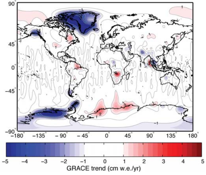
Figure 1 - map of changes in ice thickness estimated by Jacob et al. Blue means losing ice and red means gaining ice. Changes in geology and groundwater have been accounted for (supplementary information). The red spot in Africa is an artifact. The units are 'centimetres of water equivalent per year': the change in water thickness that would be needed to cause the measured mass change.

Biggest ice sheets: melting faster than 2007 UN figures, no surprise there!  

The first things that jump out at you are probably the big blue areas around Greenland and Antarctica. The new results are similar to those already covered at skepticalscience, such as Garder et al, 2011's work on Baffin & Ellesmere islands, plus other measurements of Greenland and Antarctica. It's no longer news that the 2007 UN Intergovernmental Panel on Climate Change (IPCC) computer simulations were far below what has happened.

Greenland and Antarctica have lost almost 400 billion tons of ice every year according to these measurements, twice the loss expected from all the world's other glaciers. This helps to explain why sea levels are rising at the high end of IPCC expectations.

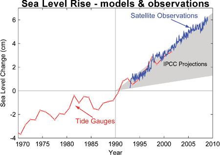
 Figure 2 - tide gauges (red), satellite measurements of sea level (blue) and IPCC computer model expectations (grey area) from Allison et al, 2009.

Worldwide glaciers mostly in retreat - down 1.2 trillion tons in 8 years

For the first time entire mountain ranges of glaciers have been weighed. There are at least 160,000 glaciers worldwide and in the World Glacier Monitoring Service's last update only 136 were weighed. Thousands have been pictured by satellites (e.g. Le Bris et al, 2011, Paul & Svoboda, 2011, Narozhney & Zemtsov, 2011) and found to be mostly shrinking in area, but photos can't measure thickness and therefore total weight.

GRACE shows about 150 billion tons a year of glacier melt which is actually less than some expected. It seems that glaciers in the high mountains of Central Asia (around the Himalayas) only lost about 4±20 bn tons of ice a year. Previous work expected closer to 50 billion tons of loss.

Relative stability in Asia is the surprise, and steals the media spotlight

500 billion tons of ice a year of land ice is being lost, whilst one region is doing about 50 bn tons/yr better than expected. Naturally, the anti-climate science editorial policies of Fox News, the UK Telegraph and Daily Mail ensured headlines focused on the Himalayas result, while some others like Reuters took a more complete view.

At Skeptical Science we think it is important to look at all of the data, which is why this post started with the big view. However, the Asian result is interesting and new so it's definitely worth exploring.

What's going on in Asia?

In 2010, Matsuo & Heki used GRACE to calculate a loss of almost 50 billion tons a year in the same region until 2009, compared with 4 billion in the new study (with a large range of possible values).

The new work includes some extra areas which Matsuo and Heki didn't, so if you do an apples-to-apples comparison then the difference is 47 versus 11 billion tons a year.

It appears that North India has been using more groundwater than expected and this has now been better measured, explaining about 25 bn tons of the difference. The rest might be because of extra heavy snowfalls in 2010, data which wasn't available to Matsuo & Heki.

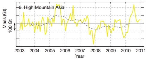
Figure 3 - Change in mass of glaciers in High Mountain Asia as measured by GRACE. 1 Gt = Gigaton, or billion tons. Matsuo & Heki calculated 50 billion tons/year of ice loss, but they didn't have the 2010 data which saw 400 billion tons of accumulation in one season: more than the total loss they expected over 8 years! This shows that short term trends are not reliable indicators.

GRACE weighs everything and the scientists subtract the effect of changes in the Earth's crust or stored water, which introduces the possibility of error. The new study considers changes in melt lakes, plus underground water storage and erosion and conclude that they don't make a big difference. The effect of rising or sinking rock due to tectonic activity or changes in glaciers is included by the scientists using a computer model - if this is found to make mistakes then the results could change (possibly drastically) in future. This is why other measurements are needed to confirm these results, and why other methods are often considered more reliable than GRACE only measurements.

We can also see that 8 years isn't necessarily enough to make solid conclusions about the long term response of a single area, especially when weather can cause glaciers to grow or shrink by hundreds of billions of tons in a season.

The results aren't a complete surprise: scientists had already reported that the westerlies which feed the Karakoram have brought cooler, cloudier and snowier conditions to some regions (Archer & Caldeira, 2008) which may or may not be a long term effect but could partly explain how the very highest glaciers are storing water (Scherler et al, 2011).

The big picture

We now have the first global map of glacier weight change. The ice sheets are doing much worse than 2007 predictions and glaciers in most of the world are doing just as badly as thought. However, glaciers in the high mountains of Central Asia appear to have been stable for 8 years when old measurements would have expected 400 billion tons of ice loss. Meanwhile, over 4.2 trillion tons of ice have melted worldwide over 8 years.

2003-2010 is a short time though, so it's too soon to say anything about what will happen next here.

Seas are rising faster than computer simulations had expected, and these simulations are also lower and slower than has happened in the past (Vermeer & Rahmstorf, 2009). It's possible that the simulations didn't properly include the processes that shrink ice sheets so these results are consistent with faster future sea level rise. Figure 4 shows that the rate of melt in the big ice sheets is much larger than the swings caused by seasonal weather and the long term trend is obvious.


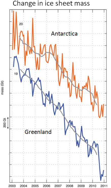
 Figure 4 - Change in the ice mass of Greenland (blue) and Antarctica (orange). Notice how the trend is much larger than seasonal changes, and how each vertical dash is now 200 billion tons, versus 100 billion for the glacier graph in Figure 3.

Many of those gushing over this new scientific work have also claimed that global warming has stopped. In Figure 5 we've worked out how much energy was needed to melt the ice that's gone since 2003 and wondered what would happen if that heat had been put into the atmosphere instead. The calculation assumed a constant rate of ice loss and used the latent heat of fusion for water. The heat is enough to warm the atmosphere more than 0.3 C in 8 years - faster than atmospheric global warming since the 1970s.

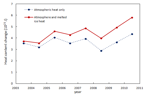
 Figure 5 - The blue circles are the changes in heat content of the atmosphere (estimated from NASA GISTemp global data) over a period that some say global warming has 'stopped'. The red line adds the heat that has been used to melt ice over the same period.

When you look at the full picture, you see that the Earth is still building up heat and claims to the contrary rely on selectively ignoring data. The good news is that the highest mountains in Asia seem to be almost 50 billion tons a year better off than expected. But this is small change next to the 500 billion tons a year being lost elsewhere.


A calculation error was pointed out by the commenters Eric (skeptic) and Sphaerica. This was noted and corrected on 25/02/2012. Figure 5 was changed and the penultimate paragraph also corrected.


0 0

Printable Version  |  Link to this page

Comments

1  2  Next

Comments 1 to 50 out of 100:

  1. So... 500 billion tons = 5 x 10¹⁷ grams. 333 Joules to melt 1 gram of ice, or 5 x 10¹⁷ grams * 333 J/g = 1.665 x 10²⁰ J Surface of the oceans of the earth is 360,000,000 km2, convert to square centimeters multiply by 10,000,000,000, or 3.6 x 10¹⁸. So Joules per square centimeter of ocean = 1.665 x 10²⁰ J /3.6 x 1018 cm2 = 46.25 J, per year, per square centimeter of ocean. Energy to raise 1 g (roughly 1 cm3 of ocean at 4˚C) by 1˚C = 4.2 J. 46.25 J/cm2 / 4.2 J˚/cm3 = 11 ˚-cm Or enough energy per year to raise the top 11 centimeters of every inch of ocean on the surface of the earth by 1 degree. Alternately, enough energy to raise the temperature of roughly the top meter of the earth's oceans by 0.1˚C per year. Ten years of that and you've raised the temperature of the top meter of the ocean by a full degree.
    0 0
  2. Wow the takeaway of 2C from just 8 years of ice melt is actually the scariest number I've ever heard about actual climate change (as opposed to predicted). At some point the ice will be gone, or reduced so much it doesn't act as the flywheel of temperature stabilization.
    0 0
  3. Sounds like critical information for AR5. One of the early caveats about AR4 was the lack of information about how melting ice would impact sea level rise, keeping their projections for the future relatively low. Just be sure I've got this totally straight. Over the study period: *Globally, the net change in land ice is about -500 billion tons per year? Every couple of years we wound up with a trillion tons of total glacier mass less than before? *The Antarctic as a whole is undergoing a net loss of land ice at a pace that's very similar to Greenland?
    0 0
  4. I've been wondering why there hasn't been a denier meme that runs like this: So 90% of the heat goes into the oceans and may be melting glaciers... that saves us from global warming. We'll run out of fossil fuels before we can overwhelm the natural buffers to the system. You warmists are worried for nothing. (these being the people who are happy watching other people drown).
    0 0
  5. 2. actually thoughtful - the point I'm making is that a HUGE amount of heat has been absorbed over the past decade and concentrating on atmospheric temperatures, whilst popular for 'skeptics' is not what a proper skeptical scientist would do. A real skeptic would look at everything, not just cherry pick individual data. There's a really easy mistake to make though: if there were no ice at all and we had the same heating that we've had for 2003-2010 then the atmosphere wouldn't actually warm by ~2 C. It would warm by much less, because as it warms it emits more and acts to cool. To calculate the warming you have to use the heating imbalance in W m-2, which is about 0.1 W m-2 for the heating. That's actually very small, less than a tenth of a degree of warming by the time it balances out.
    0 0
  6. Many people I have the pleasure of interacting with, assume very naively that because temperature increase to date has been less then a degree there's really not that much to worry about. There's no cause to reform our current economy. If only they understood the bigger picture and could grasp the importance of calculations like these, which give a sense of the planet's limited, one-time ability to buffer warming from our emissions. It's shaping up to be a riveting real life science fiction horror. If our present situation was fiction rather than reality it would make one hell of a sci-fi blockbuster. It's just happening a little too slow to hold the audience's attention. Despite some of the valid dislike of Gore because of his hypocritical talk vs. personal walk, his analogy of the frog in the pot of water, is playing out to a T in reality. Half of the people in the world seem content to sit and find out if the water really will get hot enough to kill.
    0 0
  7. Just so as to ensure that nobody misunderstands the numbers below: caveat: there is no direct connection between human heat emissions and ice melting. The numbers are merely shown so as to give a sense of scale. Each year the Arctic ice retreats and then regrows. The problem is that it has not been regrowing as much as it has been melting. Here are some figures for the amount of heat it takes to melt the net lost ice. To melt the additional 280 km3 of sea ice, the amount we have have been losing on an annual basis based on PIOMAS calculations, it takes roughly 8.6 x 10¹⁹ J or 86% of U.S. energy consumption. Perspective: Ice Loss and Energy
    0 0
  8. MarkR#5: "as it warms it emits more and acts to cool." If that was the entire system, wouldn't we be guaranteed stable temperatures? More realistically, as it warms, there's also more evaporation and thus more water vapor available to trap energy. And a larger area of ocean is exposed due to ice melt each summer, there's more open ocean to absorb solar input.
    0 0
  9. It is interesting to see that another significant property of ice i.e. its large latent heat of fusion is getting more attention. This point has often been highlighted by James Lovelock but I have not seen its implications discussed much on any 'climate blogs' until now. Although the Arctic has its annual melt/freeze cycle we can expect this to change with the global warming trend, with the refreezing over autumn/winter taking longer as the stored heat from the previous summer has to be removed. I think this is what we have seen in the northern hemisphere over the last few years and is clearly depicted in this post on Climatecrocks Arctic Anomaly I think we could even coin a new acronym - AAPCA - Annual Arctic Phase Change Anomaly. Well done to John and colleagues on running such a good science based site. I notice even here it's names like Heartland and Monckton that attract the most comments, unfortunately.
    0 0
  10. Does GRACE give us sufficient resolution to determine if the rate of global ice loss is slowing, steady, or increasing? I would expect the rate to increase over time, as global surface temperatures rise and ice mass decreases, but with significant noise over the signal (as is seen in and possibly tracking with global temperature records). It will be interesting to see if a steady or increasing rate of melt is reflected in AR5. I am still enough of a kid to look at science like the GRACE program and say "Gee ... that's pretty neat! Measuring mass on Earth indirectly, by measuring the distance between two satellites travelling in formation ... someone really smart thought that one up!" ... then I look at how some other really smart people are using their extraordinary gift of human intelligence purely to undermine popular confidence in the results of such science and the warm glow fades from my heart.
    0 0
  11. Does anybody have an equivalent to Figure 2 that uses AR4 projections rather than TAR, and which has current observations?
    0 0
  12. Doug H: See the thread Greenland ice loss continues to accelerate. And you're quite right, the GRACE system is very cool.
    0 0
  13. Am I reading figure 5 correctly? As Sphaerica pointed out the heat needed to melt 500 Gt of ice is about 1020 J, but the chart shows about 1021 J per year which is about an order of magnitude more. In perspective http://en.wikipedia.org/wiki/Orders_of_magnitude_%28energy%29 that amount of energy is less than annual human energy consumption and two orders of magnitude less than the daily incident solar radiation.
    0 0
  14. #13 Eric: I think I made an error. I'll double check tomorrow and correct the graph if so. I think I might have multiplied the annual loss rate by 8 (i.e. I used total ice loss rather than annual, and added that each year). I'll double check, but if so that's horribly horribly embarassing!
    0 0
  15. @Charlie 11 "Model-based projections of global average sea level rise at the end of the 21st century (2090–2099) are shown in Table SPM.3. For each scenario, the midpoint of the range in Table SPM.3 is within 10% of the TAR model average for 2090–2099. The ranges are narrower than in the TAR mainly because of improved information about some uncertainties in the projected contributions.[15] {10.6} " http://www.ipcc.ch/publications_and_data/ar4/wg1/en/spmsspm-projections-of.html
    0 0
  16. @owl905 #15: thanks, but both your ref and everything in AR4 WG1 Ch 10.6 mention only the projection to 2090-2099 decade. I have also found some short term projections for steric rise vs. emission scenario, but no projections for GMSL before 2090. Surely I'm just overlooking something and AR4 has short term projections that can be used to generate figures such as Fif 2 of this SkS post. The SkS author listed Allison et al, 2009 as the source, without further detail. Allison 2009 is the Copenhagen Report, which is not a peer reviewed article and seems to reference TAR, not AR4, even though it was written two years after AR4. Figure 2 is a comparison of IPCC projections vs. observations. Surely there is something more up to date than a 2009 comparison to TAR.
    0 0
  17. #1 Sphaerica #13 Eric (skeptic) Thanks for your comments guys, I re-ran my calculations and found out where I'd gone wrong. The graph and comments relating to the graph have been corrected and a note added to the post. An embarrassing mistake on my part, I corrected it as soon as possible and I hope you'll all accept my apologies.
    0 0
  18. @ Spherica 1 "Ten years of that and you've raised the temperature of the top meter of the ocean by a full degree." At the detail level, why is there an implied assumption that all of that heat will get from the glaciers and sheets to the surface layers of the ocean? In the bigger picture, surface layers of the oceans have been stable during this period. Likewise lower troposphere temperatures. Much faster rises in the 90s were in a world with greater exposures of all forms of permanent ice at lower latitudes and altitudes. If anything, the clues could claim an even greater dropoff in warming for this 00s. The true value of GRACE monitoring is to get a real established baseline for the ice sheets. Maybe the pro-pollutionists will spend less time trying to fake a 'not happening' comment.
    0 0
  19. @Charlie A - if you can't join the dots between the TAR graph and the AR4 statement that there's less than a 10% divergence from that graph by century's end, I'm not sure finding a graph that looked visually like the TAR would satisfy you.
    0 0
  20. Correction from 18 - it shouldn't say 'all of that heat' ... unsure what the right reference point is ('energy', 'cooling factor'?).
    0 0
  21. Hansen, Earth’s Energy Imbalance and Implications, states that 1 Watt-yr over the full Earth surface corresponds to about ~1.61 x 10²² Joules. He infers that the Earth’s energy imbalance over the period 2005 – 2010 was 0.58 W m-2. He estimates that over a full solar cycle the figure would be somewhat greater, about 0.75 W m-2. Converting to Joules, I get 0.75 W m-2 = 1.2 x 10²² Joules. In comparison, he summarized his understanding of the data in his preferred sources in the literature for absorption of heat by ice on land, where "most of the energy is used in the phase change from ice to water" in this (Figure 8c) chart: Which appears to show a total of about a bit more than ~0.02 W m-2 worth of heat going into land ice by 2006 - 2007 or so. Its a massive amount of heat compared to what I use to boil coffee in the morning, but if it is compared to the heat that is accumulating each year in the planetary system, which goes primarily into the oceans, it is less than 3%. Convert that into Joules, and it seems you have 3.22 x 10²⁰ Joules.
    0 0
  22. Peter Hadfield a.k.a. Potholer 54 has a good video on this topic on YouTube: 'Himalayan glaciers -- no melt in 10 years - YouTube'.(Sorry, haven't mastered this new fangled linking process!)
    0 0
  23. Excuse my ignorance, what does,"the red spot in Africa is an artifact" mean and why do we have blue spot in the Pilbara region of WA,yes there is geological evidence of ice sheets at Marble Bar, but certainly not in the time these satellites have been recording data?
    0 0
  24. One thing perplexes me: How can ocean mass sea level rise be accelerating (due to accelerating melt in Antartica and Greenland) while total sea level rise has not done the same thing? During 1993-2011, we have had a nearly constant rate of 3.2 mm/yr of SLR: Even worse, for 2003-2011 the linear trend dropped to 2.55 mm/yr: Source: AVISO One could think that steric sea level rise (a change in sea level caused by temperature and salinity changes)has slowed, balancing the ocean mass sea level rise acceleration, but that is not true: Source: NODC Where is the missing sea level rise?
    0 0
  25. From Peru @24, your third chart shows a clear reduction in the rate of seal level rise due to the warming of the oceans in 2004 (steric sea level rise). As steric sea level represented more than half of the total contribution to sea level rise up to that point, the surprising thing is that the rate of sea level rise did not (approximately) halve at that time. Clearly an increase in ocean mass has partially countered a decrease in steric sea level rise. It should be noted that the massive and wide spread flooding in 2010 resulted in a decrease in ocean mass, also adding to the reduced trend.
    0 0
  26. Tom Curtis @ 25, What impact on sea level have the following had over the last few years?
    1. Increased atmospheric water vapour, due to increased temperatures
    2. Increased precipitation over land, resulting from increased atmospheric water vapour
    Here is a jpg map of the Earth, showing how GRACE measured various places gaining water mass over a recent year. Would these have a measurable impact on sea levels?
    0 0
  27. Doug H @26, as I said, "...the massive and wide spread flooding in 2010 resulted in a decrease in ocean mass, also adding to the reduced trend." But thank you for the graphic illustrating the point.
    0 0
  28. Tom Curtis: After seeing the curve again, I realized that in effect thermo-steric sea level rise slowed down after 2003. So after all,the ocean warmed less after 2004 than in 1992-2003 period? The slowdown in global warming during the last decade was real and not an ENSO + Solar driven (because of the big La Niñas + reduced solar activity in recent years) artifact?
    0 0
  29. From Peru - "The slowdown in global warming during the last decade was real and not an ENSO + Solar driven (because of the big La Niñas + reduced solar activity in recent years) artifact? I hope you realize that none of those are mutually exclusive. We've been down this road with comments before. Some readers, for whatever reason, seem to want to pin this on one factor alone, when in fact it may be due to multiple factors. The trend toward more intense and dominant La Nina at the end of the 'noughties' has clearly affected global surface temperatures, but so too has the solar cycle, and maybe those Asian aerosols (reflective particles of pollution). The slower rate of ocean heat uptake is partially a result of the downward trend in the solar cycle through the 'noughties'. Not only did it (solar output) reach the lowest solar sunspot cycle in a century, but it also lasted 2 years longer than normal. But the solar cycle trend is now upwards, and due to the 18 month-24 month thermal lag of the oceans, we will soon see this manifest itself in global surface temperatures. See SkS posts: NASA scientists expect more rapid global warming in the very near future Personally I find it a little troubling that all these factors lined up to cool the Earth, and yet it keeps absorbing more heat. That heat will make soon make itself felt in the next El Nino. It's lurking down there below the 100 metre layer of the surface ocean ready to pounce!
    0 0
  30. From Peru @28, "Global warming" refers to the background trend, not to annual fluctuations. Therefore, while the rate of increase of temperatures has slowed down, but there is no evidence that the pace of global warming has slowed. To determine whether or not Global Warming has slowed down, you need to determine what the change of temperature would have been without the effect of known short term influences such as ENSO, and the solar cycle. Foster and Rahmstorf have done exactly that and shown no reduction in the global warming trend. Therefore, in the near future when we are at a solar maximum and have an El Nino we can expect global temperature records to be smashed again. After that, of course, we can expect so-called climate skeptics to write endless blogs about how there has been no warming since 2013 or 2014.
    0 0
  31. Tom Curtis: You said: "you need to determine what the change of temperature would have been without the effect of known short term influences such as ENSO, and the solar cycle.Foster and Rahmstorf have done exactly that and shown no reduction in the global warming trend" I believed exactly that just an hour before, but after seeing the 0-2000 meters ocean heat content/thermosteric sea level timeseries with more attention(as your previous comment suggested me to do) I realized that I was wrong. The nearly constant warming that Foster and Rahmstorf found covers just the Earth surface and the atmosphere. However 90% of the warming occurrs in the oceans... and there the 1992-2003 warming was bigger than the 2004-2011 one. That explains the non-acceleration of sea level rise despite the ongoing accelerating meltdown. You told me that in the previous comment...why you are now telling that global warming has not slowed down?
    0 0
  32. From Peru @31, the chart you show shows a trend of increasing Earth Total Heat Content of approximately 6.4 x10^21 Joules per annum. That is the equivalent of a 1.1 W/m^2 energy imbalance globally averaged. The question is, does the currently reduced energy imbalance indicate the imbalance will be reduced into the future, ie, is global warming slowed down? Well, as it happens the plateau in ETHC around 1974/75 associated with one of the largest La Nina's on record did not indicate that. Neither did the plateau around 1984 associated with the El Chichon volcanic eruption and one of the largest El Nino's on record. Nor did the plateau in the early 1990's associated with the Pinatubo eruption. Nor did the decline in ETHC in the late 1990s associated with the other of the two largest El Nino's on record. Despite this, you now want to tell me the reduction in gain in ETHC around 2008/9 represents a slow down of global warming, even though it is associated with the deepest solar minimum since 1910 and a strong La Nina? Are you really going to conclude that a Foster and Rahmstorf style analysis of ETHC must fail simply on the basis that it has not been done yet, and that it succeeded when applied to temperatures?
    0 0
  33. Tom Curtis: I am just trying to find the solution to the apparent contradictory findings that: 1)sea level rise has slowed slightly while the ice sheets in Antartica, Greenland and most of the land glaciers are suffering accelerating melting due to surface warming. 2)To explain 1, thermosteric sea level rise must had slowed down (i.e. the oceans are warming more slowly since 2004), while surface and atmospheric temperatures have continued to warm without slowing (the rate of warming has been nearly constant, as Foster and Rahmstorf found). 3)In effect, temperature mesurements of the deep sea have shown us that ocean warming has continued, but at a slower rate. The contradiction with the surface record was partly reduced when the 0-2000 meter deep ocean heat content data was published, (not long ago only the 0-700 m Ocean heat content(OHC) was avaivable, and it showed almost no warming since 2004) but still show significantly less warming in the last decade than in the previous decade. How can happen that: I)The atmosphere and land surface are warming steadily II)The 700 upper meters of the sea are warming a lot more slowly since 2004 than in the few decades before III) The deep ocean is warming steadily What is happening in the shallow ocean?
    0 0
  34. A different way of looking at sphaerica's calcs. Total heat from melting ice is 1.665 x 10^20 J Mass of the atmosphere is around 5 x 10^21 grams. Specific heat of Air as about 1 j/gK So the heat of ice melt is the equivalent of a uniform rise in Air temps of 1.665 x 10^20/5 x 10^21 which equals 0.0333 K/year or 0.333 K/decade. And we are seeing air temperature rises of the order of 0.15 K/decade. That seems to say that ice melt is consuming twice as much heat as atmospheric warming. Or if ice wasn't melting, the atmosphere might be warming 3 times as fast. So what happens when we run out of ice?
    0 0
  35. From Peru @33: I) The atmosphere and land surface have not been warming more steadily than the ocean. It is just that because most heat goes into the ocean, fluctuations in the land/atmosphere/cryosphere heat content are difficult to see on the chart. III) Again, the deep ocean has also experience fluctuations in heat gain, more or less coincident and opposite in direction to those of the surface ocean. Having said that, there is a far more detailed discussion of just this issue here. I recommend you read it, and then post any further comments on that thread.
    0 0
  36. From Peru - Go to the thread suggested by Tom Curtis & we'll discuss it there. I understand why you are confused, but you are making some assumptions that are simply not valid.
    0 0
  37. From Peru: So we know that he total heat budget should be pretty closely tied to the total radiative balance. 2004-2011 saw an exceptionally low level of solar activity, knocking around a tenth of a W m-2 off the heating rate. That explains some of it. Other recent work showing an increase in aerosol optical depth thanks to China and decreasing statospheric water vapour would also reduce the heating. Cyclical or random 'weather' factors could also be involved. Accounting for this in the way that The aerosol optical depth effect won't stay forever. I suspect it won't continue to grow for that much longer. The drying of the stratosphere is a weird one. It has to continue to dry to carry on cancelling out the growing greenhouse heating, and I've no idea what'll happen to that!
    0 0
  38. 18, owl905, My calculations were simply a "for instance" intended to give some measure of contrast to what the energy that melts 500 Gt of ice is capable of doing. Obviously this would be spread through the entire system (ocean/atmosphere) and eventually deeply into the ocean... although all of that would take time, and because of the high specific heat of water compared to air, the ocean is what really matters. The point isn't to demonstrate how much warming would have been caused if the ice hadn't been available to melt, but rather simply that 500 Gt of ice translates into a huge amount of energy.
    0 0
  39. In the high mountains of Central Asia detailed glacier mapping inventories, such as from (GLIMS: Global Land Ice Measurements from Space) using ASTER, Corona, Landsat and SPOT imagery, of thousands of glaciers have indicated increased strong thinning and area loss since 2000 throughout the region except the Karokoram. Links to below papers. In the Russian Altai mapping of 126 glaciers indicate a 19.7 % reduction in glacier area 1952-2004, with a sharp increase after 1997 (Shahgedanova et al., 2010). In Garhwal Himalaya, India, of 58 glaciers examined from 1990-2006 area loss was 6% (Bhambri et al, 2011). In the Nepal Himalaya area loss from 1963-2009 is nearly 20%, (Bajracharya et al., 2011), volume losses increased from an average of 320 mm/a 1962-2002 to 790 mm/a from 2002-2007 in the Khumbu region, including area losses at the highest elevation on the glaciers (Bolch et al., 2011). In the Tien Shan Range over 1700 glaciers were examined from 1970-2000 glacier area decreased by 13%, from 2000-2007 glacier area shrank by 4% (Narama et al, 2010). An inventory of 308 glaciers in the Nam Co Basin, Tibet, noted an increased loss of area for the 2001-2009 period, 6% area loss (Bolch et al., 2010). GRACE estimated Himalayan glacier losses at 10% of that found in the aforementioned examples for volume loss for the 2003-2010 period the (Jacobs et al, 2012). At this point the detailed inventories are better validated.
    0 0
  40. mspelto#39: "At this point the detailed inventories are better validated." Are you saying that GRACE is under-reporting ice mass loss in these areas?
    0 0
  41. Tom Curtis and Rob Painting: I will continue where you have indicated.
    0 0
  42. muoncounter that is a safe assumption. What looks more reliable detailed mapping of thousands of glaciers indicating large net losses, or a mountain wide assessment that does not fit other observations and is at odds with the Matsuo and Heki (2010) analysis of the same are using GRACE just a year ago.
    0 0
  43. Numbers aside, am I the only person here troubled by the choice of map projection used in Figure 1 for the GRACE trend? I thought we had long ago abandoned using projections that showed Greenland as almost the same area as Africa! They were first used to make Europe and the USA seem bigger and more important than they really are. In this instance it makes the "blue" areas of ice loss closer to the poles much larger and more important than they warrant, and the "pink" areas of ice gain closer to the equator smaller and less important. Also, can somebody explain where the ice is that appears to have accumulated in the Amazon basin, Zambia and Singapore? I think the problem for this map is that it is mapping ALL changes in gravity, not just ice loss. I was under the impression that India was still slowly crashing into Asia and pushing up the Himalayas. If that is the case could the growth in mass there be down to accumulated build up of crust material rather than ice in glaciers?
    0 0
  44. mspelto#42: That's what I was afraid of. As with Arctic ice melt, this is another one of those 'its worse than we think' moments. Would it be possible to do a 'ground truth' calibration, bringing the GRACE-derived ice loss computations into better agreement with what you actually see? (I'm old enough to remember the world before satellites, when you actually had to use measurements made by folks in the field).
    0 0
  45. I recently had an e-mail exchange with Dallas Masters at the CU Sea Level Research Group at the University of Colorado. I was interested in creating a graph of the trend in sea level rise over the period of the satellite record. I calculated a 12 month moving average and then applied a 5 year linear regression analysis to arrive at the following chart. He confirmed that it was a reasonable representation of the trend. Global mean sea level reducing trend My problem with the missing heat being at the bottom of the ocean is that heat will expand the sea wherever it is hidden. Surely the sea would be expanding more quickly rather than less if both the temperature of the deep oceans was rising and the glaciers melting? I have seen the explanation of recent flooding due to La-Nina but am sceptical that this could account for such a large and sustained decline in the rate of sea level rise. Is it possible to calculate how extra water must be located on the Earth to explain the slow-down in sea levels?
    0 0
  46. Apologies for a couple of issues with that last post (new here!). I could not get the image to embed properly from Photobucket despite resizing it to a width of 450. Just click on the link below the broken image to see it. Also the final question should be: Is it possible to calculate how much extra water must be located on land to explain the slow-down in sea level rise?
    0 0
    Response:

    [DB] Photobucket is notoriously difficult to link to from this Forum, with images sometimes appearing for a time and then disappearing.  Proper linking syntax is here.

    Fixed image, for now.

  47. 45, Matthew L,
    My problem with the missing heat being at the bottom of the ocean is that heat will expand the sea wherever it is hidden.
    I think the problem with this premise is two-fold. First, the volume of water involved in this in the deep ocean is huge, so you are distributing that heat over a very, very large volume of water. As such, the per-mole addition of heat, and hence any expansion, is very, very small. Second, the water in question is under intense pressure, so I think the percentage increase in volume will be greatly reduced. I know very little about the behavior of liquids, however, so this last is an assumption on my part, not a fact.
    0 0
  48. ”First, the volume of water involved in this in the deep ocean is huge, so you are distributing that heat over a very, very large volume of water. As such, the per-mole addition of heat, and hence any expansion, is very, very small.” I don’t think that is the case. The sea is constrained on all sides by the crust of the earth, except at its top where it meets the atmosphere. Therefore any expansion or contraction can only happen in a vertical dimension (if you ignore the minor effect of flood plains and deltas). This negates the effect of an expansion in a larger volume being less than that of a smaller volume. For instance if you increase the heat content of water in a test tube by a fixed amount it will rise the same distance whether the test tube is 1m long or 10m long. Think about it! In that situation, as I understand it (happy to be corrected) if you increase the heat content of the top 10% of the ocean by 20 gigajoules (totally made up number!) it will expand vertically just as much as if you use that same energy to increase the heat content of the bottom 90% of the ocean. Sure, the temperature will rise much less, but there is much more of the sea being heated. ”Second, the water in question is under intense pressure, so I think the percentage increase in volume will be greatly reduced. I know very little about the behaviour of liquids, however, so this last is an assumption on my part, not a fact.” Actually the volume of water changes very little, even under very high pressures. That is the whole basis of hydraulic control systems. The exact formula is 5.1×10⁻¹⁰ Pa−1 . This is the formula at 0c, it changes even less at higher temperatures. At the average ocean depth of 3790m the pressure is 38.2 million Pascal so the water is compressed by very roughly 2%. Therefore a rise of water at sea level of 3mm translates to roughly 2.94mm at the average sea depth. Overall I think we can discount the effect of pressure on the expansion of water at deep ocean levels. So, if my assumptions are correct, and taking the reduction in the rate of sea level rise at face value, either a falling amount of water is entering the seas or the heat content is rising less quickly. Or, as has been hypothesised elsewhere, there is more water on the land. My scepticism of that final hypothesis remains, as does my final question.
    0 0
  49. 48, Matthew L, I'm not at all certain of myself here, but my initial point was that if you add enough energy to a bucket of water to raise it by 1 degree, will that expand as much as if you added that same amount of energy to a pool of water? We're not increasing the temperature by the same amount... we're adding the same amount of energy, which because one body is larger (pool vs. bucket, ocean depths versus surface) will not increase by the same amount in temperature. As to your formula for the volume of a liquid, I was hoping to see something with both pressure and temperature terms. The question was, given that level of pressure, would an increase in temperature result in an equivalent or lesser increase in volume compared to a liquid at a lower pressure. Stated more clearly, if you apply X joules of energy to a small volume of water at a low pressure, how will the difference in volume compare to adding that same amount of energy to a larger volume of water under high pressure. All of this may be moot, however... your graph of decreasing sea level trend does not seem to take into account other "noise" factors, such as the effects of ENSO events. Are you certain that the decreasing trend you see is real?
    0 0
  50. Sphaerica @49: ENSO has no effect on the volume of water in the ocean. The THC of the ocean does not change with an ENSO event, it is distributed differently. AS Matthew L. pointed out, the volume of a liquid changes very little under pressure. The basis of working hydralic usage depends on this fact. A change in pressure, such as increaseing pressure in hydralics, will generate heat. The ocean bottom pressure has to be stable, as the actual volume of water does not change significantly. The top thermal layer may expand and contract, but the volume by density would stay the same unless one adds volume. The little percentage change of water on land on a long term basis as a percentage of volume of the ocean is insignificant.
    0 0

1  2  Next

You need to be logged in to post a comment. Login via the left margin or if you're new, register here.


The Consensus Project Website

THE ESCALATOR

(free to republish)


© Copyright 2024 John Cook
Home | Translations | About Us | Privacy | Contact Us