Climate Science Glossary

Term Lookup

Enter a term in the search box to find its definition.

Settings

Use the controls in the far right panel to increase or decrease the number of terms automatically displayed (or to completely turn that feature off).

Term Lookup

Settings


All IPCC definitions taken from Climate Change 2007: The Physical Science Basis. Working Group I Contribution to the Fourth Assessment Report of the Intergovernmental Panel on Climate Change, Annex I, Glossary, pp. 941-954. Cambridge University Press.

Home Arguments Software Resources Comments The Consensus Project Translations About Support

Twitter Facebook YouTube Mastodon MeWe

RSS Posts RSS Comments Email Subscribe


Climate's changed before
It's the sun
It's not bad
There is no consensus
It's cooling
Models are unreliable
Temp record is unreliable
Animals and plants can adapt
It hasn't warmed since 1998
Antarctica is gaining ice
View All Arguments...


Username
Password
New? Register here
Forgot your password?

Latest Posts

Archives

Why are there fewer weather stations and what's the effect?

Posted on 28 April 2010 by John Cook

The NOAA and NASA obtain their temperature data from the Global Historical Climatology Network (GHCN). In the early 1990s, the number of weather stations listed in the GCHN drops rather sharply. Some have suggested this is a deliberate campaign to remove cooler weather stations in order to inflate the warming trend. The driving force behind this idea comes from Joseph D'Aleo in an online report Surface Temperature Records: Policy Driven Deception co-written with Anthony Watts. Initially, their report stated that "There has been a severe bias towards removing higher-altitude, higher-latitude, and rural stations, leading to a further serious overstatement of warming." This text has been removed from the latest edition of their report. Nevertheless, the notion that removed stations is causing spurious warming continues to be repeated throughout the blogosphere (and often in comments here on Skeptical Science).

Why are there currently fewer stations in the temperature record? The physical number of weather stations that are reporting temperature data has diminished - some of the older outposts are no longer accessible in real time (NOAA). In fact, the perceived "drop-off" is exacerbated by the fact that the NOAA have been actively adding historical data into the GCHN database from older weather stations that are no longer active, in an attempt to provide more comprehensive coverage of the past.

The most important issue is whether this drop-off in the number of reporting weather stations has had any impact on the temperature record. D'Aleo's report performs no such analysis. However, there have been a number of independent analyses examining this very question. The first analysis was conducted by Tamino, from Open Mind, who plotted the temperature data from the weather stations that were dropped from the GHCN record (labelled 'pre-cutoff'). He then compared this to the temperature data from the weather stations that were kept (labelled 'post-cutoff').

temperature history (annual averages) for pre-cutoff stations only, compared to that for post-cutoff stations only
Figure 1: Temperature history for pre-cutoff stations only (blue) compared to that for post-cutoff stations only (red) (Open Mind).

What's interesting about this graph is not only that there is little difference between the two plots but that the dropped weather stations actually show a greater warming trend than the kept weather stations. This is not surprising considering many of the dropped weather stations are from higher latitude sites. While these regions have a cooler absolute temperature, they show a greater warming trend. This is the result of polar amplification - warming at the tropics is less than warming at the poles due to various effects such as positive feedback from ice albedo changes.

An independent analysis was performed by Clear Climate Code who also compared the temperature data from dropped stations versus kept stations. He also plotted trend lines to compare the long-term warming trend from both types of stations.


Temperature data from pre-cutoff versus post-cutoff weather stations
Figure 2: The "before 1992 / after 1992 stations" from “The 1990s station dropout does not have a warming effect” (Clear Climate Code)

Similar to Tamino's results, Clear Climate Code found that the dropped weather stations show a greater warming trend than the kept weather stations. The difference seems to be largely due to a divergence in the older, 19th century data. However, they also plotted the trend for the last 30 years of both records. The warming trend from 1962 to 1992 for the dropped weather stations is nearly identical to the warming trend from 1979 to 2009 for the kept weather stations.

Just for good measure, another analysis was independently performed by Zeke Hausfather at The Blackboard (there are others that also find the same result but I wouldn't want this post to get monotonous):


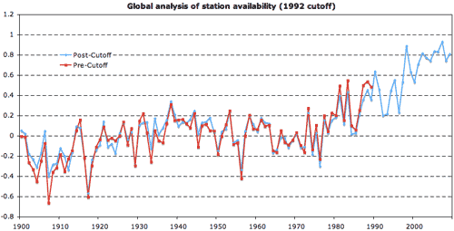
Figure 3: Comparison of stations with records post-1992 to those without (The Blackboard).

So the reason for the "dropped" weather stations is merely the result of stations no longer actively recording temperature data. More importantly, the removal of dropped stations does not cause a spurious warming trend. In fact, the opposite is true as the removal of high latitude sites imposes a slight cooling trend since 1880. The change in warming trend since 1970 is negligible.

UPDATE 29 April 2010: Mark Richardson informs me of a blog post by Roy Spencer that compares the GCHN record to his own temperature record that uses a much broader range of weather stations combined with the satellite record and finds pretty much an identical warming trend.

0 0

Printable Version  |  Link to this page

Comments

Comments 1 to 46:

  1. I know that in my region the GHCN has dropped some stations which still operate. The stations take only daily recordings and have them online in the climate.gc archive for all of canada. Turns out GHCN only downloads the monthly data which results in leaving out a lot of available data. In a related story, the two stations I looked at in particular that they dropped are rural stations which have undergone incredible warming in the last two decades (2-3 degrees)
    0 0
  2. Is there any chance of getting graphs that compare the calculated temperatures rather than comparing the anomalies? Only then can we be sure that there is no basic bias.
    0 0
  3. johnd, Calculating a global average of temperature as opposed to temperature anomaly would seriously bias the analysis. For example, losing spatial coverage at high northern latitudes would cause the global average to spike when it shouldn't. By converting the station data to anomalies the fact that the tropics is much warmer than higher latitudes and that stations are being lost in those colder regions becomes much less a serious concern. The difference in anomalies is much smaller than the difference in temperatures between those two regions so the potential for bias is much lower. Like John Cook pointed out, losing stations at high latitudes (which have experienced the largest warming) will depress the warming trend a bit.
    0 0
  4. There is no sufficient argument to deny the existence of the current warming relying on data from rural stations, but ... ... the scale of the current warming is questionable. For example, data from rural stations in Europe may not be reliable. All Europe Central and Western Europe is (in all likelihood) a great sub-continental UHI (de Laat, ATJ, 2008: Current Climate Impact of Heating from Energy Usage). There is also the problem of homogenization of data from different time periods. Anthony Watts wrote about it (for example: the Darwin station in Australia).
    0 0
  5. I'm still amazed that there are people out there who will cite Watts as a source for anything but humour and laughter. His beliefs about the Darwin station have been dismissed and disregarded by all but those most in denial. Just by reading one blog (The Way Things Break) I was able to get access to two official sources (BOM, Australia & NOAA) which show why Watts is mistaken - as usual. It even led to a pertinent REALCLIMATE comment which summed up the situation very nicely : "Second, just because the writer can't work out why something changed, it does not mean it was 'manually adjusted'". As for UHI, you should read more of the articles on SKEPTICAL SCIENCE, especially here and here
    0 0
  6. John can you just clarify a few points. 1) Have the "dropped stations" stopped recording temperature or have they been dropped from the set of stations that go into the GHCN series? 2) Has the data from the "dropped stations" that was collected before they were dropped been dropped from the GHCN series? Just from the 3 graphs you show the looks to be good correlation from 1950's onwards but earlier decades look very different. Any thoughts why?
    0 0
  7. re#4: Is this the de Laat article to which you refer? (pdf version here- http://www.knmi.nl/~laatdej/EOS2008.pdf) I have to say it makes a pretty underwhelming argument, consisting of little more than innuendo. It makes no predictions in order to engage with data - but there are obvious predictions it should make: namely that if human energy consumption is a significant forcing of global temperature, we should observe the rate of warming to vary dramatically by region. As we all know -and as is spelled out elsewhere on this site, for example- the rate of warming is remarkably consistent across the globe.
    0 0
  8. re#7: Just compare the map on page 7, "Climate change and extreme events - the Central European perspective," Z. Kundzewicz (IPCC expert - COP 14, 2008) the population density of Europe; to accept - at least the possibility of existence - the European UHI (covering and villages) . The same is true in SE China, Japan, and other. Only in the U.S. there is a sufficient number of truly rural stations. Among other things, hence the temperature change in the U.S. differ greatly from those in Europe and worldwide.
    0 0
  9. re # 8, Would you kindly provide a link to the Kundzewicz paper please?
    0 0
  10. Now..is this it? Kundzewicz paper If it is the paper to which you refer, I would be cautious about citing a slide show intended to accompany a lecture, without knowing how the speaker intended to use the information. In any case, the graphic on page 7 shows temperature, not the rate of temperature change (temperature anomaly). Naturally, we expect absolute temperatures to be higher in urban areas. Temperature anomaly measures the underlying trend in temperature, irrespective of the urban heat island effect. If urban power use were a significant climate forcing, the trend would differ from region to region, but it is precisely this trend that turns out to be quite homogeneous around the world. It actually doesn't even matter whether the density of stations varies from continent to continent, because the global trend is indicated quite uniformly. This can only be explained by a well mixed, general effect in the atmosphere - urban power consumption is not such a generalised effect, but CO2, which disperses very widely, is clearly the best explanation for the evidence.
    0 0
  11. HumanityRules at 19:25 PM, regarding your comments about the correlation from the 50's onwards. One of the problems? advantages? of plotting anomalies against one another is that they will naturally show good correlation at around the time of the base period selected. The base period is not shown on the graphs used here, it should be. A bit of digging indicates that a base period of 1960-1970 was used by one of the other analysis referenced, I haven't determined what base period was used by the others. First one has to assume that the same base period was used for both anomalies on each chart. Secondly one has to wonder why that particular period was selected. It is not the mid point of the time span. It however is the mid point of the post WW2 global cooling period. Would that be significant? Why not choose a period during the rapid warming pre WW2, or at the beginning of the time span. If that was done, then correlation would have been shown as best early on and getting worse as time progressed. Lastly, the use of anomalies against one another gives the impression that the raw data matches closely. However the two sets of data could shown differences of say 10 degrees, and the anomalies would still appear interwoven.
    0 0
  12. johnd, it doesn't matter what the base period is when you're interested in the trend in anomalies from the base period--the change in the anomalies over time. That's not an assumption, it's a mathematical fact. You can demonstrate it yourself, simply by adding or subtracting any number from all the anomalies and observing that the shape of the line over time is unchanged. The line merely moves up or down.
    0 0
  13. Why is it that so many people simply don't understand what temperature anomalies are? Is it something about the name? too late to do anything about it now, I suspect, but misconceptions abound.
    0 0
  14. #13 "Why is it that so many people simply don't understand what temperature anomalies are?" I suspect it's simply because so many people aren't used to them. They have a certain commonsense expectation of how temperatures should be measured; when actual scientific practice doesn't match that expectation, some people will get confused, and others will conclude that there's something underhanded going on. I don't think it's too late to do anything about it, though. Perhaps there could be a post on it here (or on arguments that exploit this misunderstanding).
    0 0
  15. Since debating this subject with Ned on another thread I posted a response relating to the station drop off problem in the Canadian Arctic: http://www.skepticalscience.com/news.php?p=2&t=81&&n=164 The above post is based on correspondence with Environment Canada and NOAA/NCDC that demonstrates John Cook made an incorrect statement at the head of this thread when he said: "The physical number of weather stations that are reporting temperature data has diminished......" There are 37 stations to GCN/WMO standards reporting in the Canadian Arctic. The data from all of them is available to the NCDC but only Eureka appears consistently in GHCN v2. I still don't know why the number of stations in the Canadian Arctic has fallen dramatically so I am planning a trip to NCDC in Asheville next month. If I learn anything I will let y'all know. If you still think that a very thin data set does not affect published results take a look at what happened on July 13, 2009 and March 29, 2010 (thank you, Berenyi Peter): [LINK] A temperature anomaly of 4 degrees Celsius for March 2010 should raise a few eyebrows!

    0 0
    Moderator Response:

    [DB] Shortened link breaking page formatting.

  16. Further to that topic, when I first got into the climate change issue, one of the things I initially found confusing was the term "temperature anomaly". Anthony Watts' site was one of the first that I read, which undoubtedly added to my confusion. For about the first 6 months, I was deeply skeptical about the temperature record. My background is in biology and philosophy of science, but I had to work very hard to grasp statistical principles. Once I got my head around the issues, I realised the whole approach of Watts et al is confused. The issue isn't whether a given weather station is close to buildings, while another one is in a forest. Obviously the first will be affected by urban heat production. What matters is whether the temperature trends differ widely, or indeed whether there is no trend at all. When the trend is similiar across a wide variety of stations, then there is clearly a general influence that is greater than the local, variable influences. You must explain the data, and the urban heat island effect just doesn't do it. That realisation was one of the first major steps for me in satisfying my skepticism. Watts' famous photos of weather stations are total red herrings. And let's think about this - if the actual trends in weather station data were chaotic, the skeptics would have been all over it like a rash. He really is dumbing down the debate. I suspect the use of temperature anomalies is actually inherently conservative, because it compares the current year's temperature to the average of the last century. As real temperatures increase, the average must increase slightly, thereby modestly reducing the difference between the two. I remember reading a study showing that, if we separate out the rural and urban weather stations, the rate of temperature change is almost identical. I don't have the article saved -perhaps somebody can help with a link..?
    0 0
    Response: How urban heat island has little effect on temperature trends is examined in Does Urban Heat Island effect add to the global warming trend?
  17. Phila at 12:05 PM, if anyone does follow up with a post perhaps they could illustrate it by using the Global Land Index, figure 2 above, with the base period set as 1880-1890. I don't know what period is used at present, I'm guessing 1960-70 as that was used for figure 3. A graphic illustration should be easier to demonstrate what difference, if any, different base periods make.
    0 0
  18. If you look at only the U.S. temperature sensors that remain in a 'rural' environment, you will not see the 'hockey stick' increase in global temperature. Most of the 'hockey stick' increase is due to sensor contamination of human heat sources. sensor contamination You also might find the following interesting: Space & Science Research Center
    0 0
  19. re # 18, sorry, but I don't see how the D'Aleo article you link to shows at all that "if you look at only the U.S. temperature sensors that remain in a 'rural' environment, you will not see the 'hockey stick' increase." The claim is false in any case, but your source doesn't even support you. In fact, the D'Aleo article is confused about many of the same matters already discussed in this thread. I strongly recommend any readers of this site check out the US EPA's response to these questions. The EPA, following its recent "Endangerment and Cause or Contribute" findings, was obliged to respond exhaustively to over 300,000 emails -many objecting to the findings. For the UHI, start from page 16 of the PDF: EPA RTC Volume 2 ) It is a thorough and methodical treatment. A resource to keep. (EPA report previously reported here, by the way: EPA Report
    0 0
  20. A question that skeptics often ask, and which I can't quite answer, is - why can't a small team be supplied to collect the huge amount of weather data available online. Example is La Paz, which is not included in recent GHCN, but which has an online weather portal with mean/max/min temps, precipitation etc. My initial response is that it takes time to sort the online data into GHCN format - there's no one chip catches all computer program that can be utilised to translate data from a variety of websites with a variety of formats. GHCN rely on participating Met stations who provide the monthly data in the format required. But I'm not dead sure that this description is precisely accurate, just what I've gleaned from reading blogs. It would be nice to get a straightforward but detailed description of the challenges the data collectors face, especially so skeptics can understand why, in the age of light speed information and broad access, it is not a simple matter to retrieve the abundant, daily updated online data for many stations/met services not covered by GHCN.
    0 0
  21. Hi, can you clarify for me the statement near the end of the article, which says "More importantly, the dropped stations do not cause a spurious warming trend." At first, it seems like it's saying "The dropped stations when considered by themselves do not cause a spurious warming trend." In the context of this article, I think you don't mean that. Do you actually mean "More importantly, removal of the dropped stations does not cause a spurious warming trend."? Apologies for being picky, but it puzzled me when I looked at it at first. Thanks for fixing the glitch that prevented comments being added (after #10).
    0 0
    Response: Good point, your wording is an improvement and I've updated the text in the final paragraph. Thanks for the feedback.
  22. Do you actually mean "More importantly, removal of the dropped stations does not cause a spurious warming trend."? Yes. That's what is shown by all the data analyses to which the post points.
    0 0
  23. A question that skeptics often ask, and which I can't quite answer, is - why can't a small team be supplied to collect the huge amount of weather data available online. Example is La Paz, which is not included in recent GHCN, but which has an online weather portal with mean/max/min temps, precipitation etc.
    Gavin Schmidt has suggested that efforts to do such things would be excellent "citizen science" contributions to climate science efforts. As opposed to, oh, running around photographing weather stations.
    0 0
  24. Seems to me that data collection of this type would be the perfect next step for surfacestations.org. It would be good outreach from NOAA to skeptics and make a fine and logical contribution for critics of the temperature record, obviating post-hoc auditing. Thinking about it, it's a pretty obvious marriage.
    0 0
  25. I think an important bit that you have missed out is the analysis of the surfacestations.org data by Menne et al. I refer to it in a rather provocatively titled blog post here: Nasa underestimates global warming"
    0 0
  26. Another issue is the claim that the temperature adjustments at various weather stations are the reason for the warming trend, once again this is based on anecdotal evidence. What demonstrates this claim to be false is a different graph from the Zeke Hausfather page already referred to in this piece. In that plot they compare the warming trend various forms of the raw data against GISS Temp. GISS Temp shows the weakest warming trend of them all demonstrating that the adjustments are reducing the measured trend not increasing it. From Zeke Hausfather at rankexploits
    0 0
  27. Posted by John Cook at 15:28 PM the dropped weather stations actually show a greater warming trend than the kept weather stations Interesting. However, it deserves some checking, doesn't it? So I have fetched current GHCN data form the GISS Temperature site. Raw data are in v2.mean.Z. The readme file is also handy. I have lumped together data according to WMO station number and selected 610 stations that have reasonable coverage for the last forty years (from April 1970 to March 2010). Then I have calculated average temperature trend on this set for each station and for the entire set on the first and second twenty year periods (April 1970 - March 1990 & April 1990 - March 2010 respectively). The warming found is huge and accelerating. It is 0.0239 °C/year for the first two decades and 0.0297 °C/year for the rest on this particular set. Then I have divided the set of stations into two equal subsets. Subset A contains those stations that have the least trend during the first two decades, subset B the rest. Average warming for A in this period is 0.0018 °C/year while it is 0.0461 °C/year for B in this period. And here comes the surprise. For the last two decades the trend for A is 0.0359 °C/year while for B it is 0.0235 °C/year. It is really odd. Let me rephrase it. If stations with the largest warming trend at the beginning were dropped, the rest would show more warming on average, not less. Therefore what Tamino did, is meaningless and you also have to reconsider your points. The vague description of procedure followed is intentional. I would like others to repeat it, with slightly different assumptions, just to see how robust it is. Neither have I applied any adjustments, although it would be easy to repeat it with v2.mean_adj. The result begs for an explanation. My bet would be it is UHI. The local warming influence of human presence is roughly proportional to the logarithm of population density. If population growth is slower than exponential, the UHI effect increases in a sub-linear fashion. If we keep throwing out stations with large warming, the rest is getting more rural with larger warming potential. Indeed, in set B there are considerably more stations flagged rural than in set A. the reason for the "dropped" weather stations is merely the result of stations no longer actively recording temperature data John, this statement is not an adequate description of reality. Find another explanation, please. Weather Underground manages somehow to collect several reports per day for the overwhelming majority of stations dropped from GHCN in 1990 and also for those USHCN stations dropped in 2005. I have started a script that pulls down the daily data from that site. Unfortunately it takes time, for the site is protected against DoS attacks, therefore large pauses are needed between accesses (otherwise access is rejected). They have station histories going back to decades, in some cases as far back as the fifties. With these the hypothesis above can be tested. As soon as I'll have enough data, I will report back.
    0 0
  28. Berényi Since you consider what Tamino has done is meaningless. Have you taken it up with Tamino. Since Zeke, Nick Stokes, Jeff Id, CCC seem to have replicated much of what Tamino has done plus one of them has extended the analysis to produce a global land/ocean temperature reconstruction have you taken this issue up with those who have the tools and experience/background to interpret your results. http://rankexploits.com/musings/2010/comparing-global-land-temperature-reconstructions/ http://rankexploits.com/musings/2010/comparing-global-land-temperature-reconstructions/ http://moyhu.blogspot.com/2010/04/incorporating-sst-and-landocean-models.html http://clearclimatecode.org/ http://residualanalysis.blogspot.com/2010/03/ghcn-processor-11.html http://tamino.wordpress.com/2010/03/05/global-update/ It will be interesting to see the discussion where those who have the statistical background and knowledge of the temperature data to interpret your results. Kevin
    0 0
  29. #28 Oxford Kevin at 08:23 AM on 1 May, 2010 It will be interesting to see the discussion Thanks for the links, I'll look into them. However, to make it clear, I don't claim they have made an error in their calculations. Just have asked the same wrong question. Anyway, I'd prefer to have this result checked and double checked first. It is not too difficult, in a technical sense. There are tens of thousands of guys out there with the proper skills to do that. Also, as I have said, there is a vast amount of fresh data online. Just takes time to collect it. I really don't understand why it has not been done long ago. It seems to be a bit reckless to base a multi billion dollar trade like carbon credits (with plenty of room for fraud) on deficient data. It simply makes more sense to do the job right away than trying to explain why it does not need to be done.
    0 0
  30. Berényi Péter> Actually, I don't find your result on the populations A and B very surprising. If we suppose that these stations have some natural variations, the elements of group B will at the time +20 years be more likely to be in a state of positive natural variation than the elements of group A. So when this natural variation on average falls back to normal (in the period between +20 and +40), this will give a negative contribution to the trend. It would be interesting to compare the trends of A and B through the whole interval (not just for the last 20 years). My prediction is that then the trend for B would be equal to or slightly more positive than the trend for group A. I'm sure that you can do this computer experiment with a few clicks, now that you have enetered all the data? But I absolutely agree with you that we should try to get as much data as possible.
    0 0
  31. #30 Marcel Bökstedt at 19:09 PM on 1 May, 2010 It would be interesting to compare the trends of A and B through the whole interval Trends for the entire 40 years long interval are: set A: 0.0223 °C/year set B: 0.0322 °C/year set A+B: 0.0272 °C/year Your prediction is confirmed on these sets. However, if the last twenty years of set B is dropped from the analysis, the trend becomes 0.0342 °C/year. That is, overall trend is increased twofold by dropping stations at midpoint with large initial trends. It is a serious bias. If the many stations actually dropped from GHCN in 1990 have warming trend larger than average indeed prior to this date as Tamino claims, GHCN (and GISTEMP) does suffer from this bias.
    0 0
  32. Bérenyi Péter> My hypothesis is that the effect you see in your A,B experiment is an "edge effect", coming from the fact that the stations with a high trend in the first 20 years will on average be in an unusually warm state in the year 20. I can't see why the stations which dropped out in the GHCN data would show a similar edge effect, but of course I might just be uninventive. Can you think of a way of testing/debunking this hypothesis? Or can you think of a way to produce an edge effect in the original situation? Another thing - I thought that when GHCN computes the trends, the stations which were dropped were dropped for the entire interval, not just for the last time period. So to check their method, we should compare 40 y average A with (the more correct) 40 average A+B, not with an average where we use 40 y of A and some years of B. Please tell me if I'm wrong about this.
    0 0
  33. Berenyi Peter, the name of the purely mathematical effect that Marcel explained to you is an example of "regression to the mean." You'd get the same effect even if the numbers had nothing to do with temperatures--they could be cow growth or purely abstract numbers. No UHI required.
    0 0
  34. #32 Marcel Bökstedt at 07:13 AM on 3 May, 2010 Can you think of a way of testing/debunking this hypothesis? Yes. As I have already mentioned, I am collecting recent data for stations dropped from GHCN. That should be enough to clarify things beyond reasonable doubt.
    0 0
  35. In this blog are used to the strong but not supported claims by Berényi Péter. This is just one more example. Indeed, I cannot see the rationale of the station selection criterion nor how any reasonable judgement can be done on the global average temperature trend without proper gridding and averaging. Taking subsets and subsets of subsets is no easy task and the fact that the very same results has been replicated several times using different methodologies makes me think that the only possible conclusion from Peter's mathematics is that his selection criterion is biased.
    0 0
  36. #35 Riccardo at 17:13 PM on 3 May, 2010 I cannot see the rationale of the station selection criterion The rationale, as I have already stated, is the fact that dropped stations have slightly higher warming trend prior to dropout than the rest. the very same results has been replicated several times Yes, but all of them have found the right answer to the wrong question. Except Roy Spencer of course, who did something entirely different. He actually collected some more data, which is the proper thing to do anyway. He uses ISH data from ftp://ftp.ncdc.noaa.gov/pub/data/noaa/ but says they are only accessible for ".gov or .edu domains". He may be right. He checks CRUTem3NH against it and finds no serious difference, provided an increasing urban heat island effect is not taken into account. Satellite data are not used in this analysis. However, there ara also several follow-up articles on his website including Spurious Warming in the Jones U.S. Temperatures Since 1973 and The Global Average Urban Heat Island Effect in 2000 Estimated from Station Temperatures and Population Density Data His population density / station warm bias graph is particularly interesting. This effect alone can be responsible for a good portion of "Arctic Amplification" (because population density is pretty low there).
    0 0
  37. Berenyi Peter, you are incorrectly assuming that your purely mathematical experiment is an analog of the actual station dropout data. In your experiment, you split the data at an exact midpoint of time, and deliberately and perfectly split lower-trending from higher-trending data. Those choices of yours are what led to--indeed, forced--the existence of the regression to the mean that you found, purely due to the math. You might just as well have removed all the lower-than-average anomalies and expressed shock that the remaining anomalies are higher-than-average. It's the combination of lower with higher that defines the average! In contrast, the real data analyses' station discontinuation point is not at the time midpoint, but long after. Also, the discontinued data are not selected for discontinuation because they trend lower or higher. Indeed, the majority are discontinued only temporarily. Every month, more get added as the data dribble in.
    0 0
  38. #37 Tom Dayton at 00:16 AM on 4 May, 2010 Every month, more get added as the data dribble in. They do dribble. Records updated in GHCN (v2.mean) between 2010-03-19 & 2010-05-03 according to year:
      2005:    9
    2006: 11
    2008: 13
    2007: 14
    2009: 213
    2010: 1292
    Data earlier than 2005 are not even dribbling.
    0 0
  39. Berenyi Peter, I'll try to be clearer: In the real data analyses, the missing/dropped/discontinued data do not contribute to the overall average trend, because those data are ... missing. In contrast, in your math experiment, the data you dropped did contribute to the overall average trend.
    0 0
  40. Berényi Péter, I know Spencer blog posts and they are not related to station drop out nor with your analysis. The replications I was talking about are on the effect of the dropping of stations and they have done it properly, contrary to your analysis.
    0 0
  41. Berényi Péter, you are once again making very strong assertions based on a rather poorly conceived analysis. I applaud your interest in trying things out for yourself, but you really ought to put a little more effort into understanding what other people have done first rather than just leaping to the conclusion that they're wrong. As far as I can tell, your analysis completely ignores the spatial distribution of stations, which makes any conclusions essentially worthless. Tamino, Zeke Hausfather, Ron Broberg, and the other bloggers who have worked on this (Nick Stokes at moyhu.blogspot.com, Joseph at Residual Analysis, the Clear Climate Code team, etc.) all correctly understood that you can't just look at nonspatial averages of station anomalies. They all implemented some form of spatial gridding. The fact that temperature trends are spatially autocorrelated over long distances means that a gridded analysis will be robust to changes in the station population that would bias the trend in a more naive, lumped analysis. The scenario you've constructed is not a good match for reality.
    0 0
  42. Ok I will respond to two different comments here, the rest are just similar in line with these two comments. .41 Ned and # 16 Nautilus_Mr You are both pretty much saying the same things as everyone else and I challenge these statements. First Nautilus_Mr is saying that Watt’s famous photos are red herrings and dumbing down the information. No! Those pictures are the crux of what is wrong with much of the information being pushed by the side of ACGW alarmists. On one hand you say that obviously the first will be a casual effect of weather increase but in the same breath you say that these pictures are red herrings. These new weather stations were placed between 1995 and the year 2000. There were guidelines which were obviously ignored in the placement of numerous sensors. I have pictures of about 30 sensors that are placed either over asphalt or lava rock, or in front of air conditioner outlets or even in the case of two pictures, within 50 feet of the exhaust of airplanes where they sit on the hot tarmac with the exhaust aimed right at the sensor. These sensors were placed at about the same time that the temperature anomalies started showing up. Also the sensors that are missing aren’t just one or two, there are 30,000 sensors that have been removed and are no longer giving temperature. This occurred roughly during the same time period between the years 1995 to 200. People talk about UHIE and how it doesn’t have any appreciable effect. I have lived in Southern Arizona and I know for a fact that there are more people now. A tremendous amount versus 1984 when I lived in the Tucson area and the Grand Canyon area. How can any scientist in good conscious not consider that data from an area whose paved roads, homes, automobiles, trucks bringing in supplies and goods to a vastly increased population would further increase temperatures in an already extremely hot place? I just can’t understand it. Not to mention if you look at the main USHCN sensors, I am currently looking at a 10.5 X 11 picture of it as I write this… Just look at the picture and ask yourself what is wrong with this picture. There are at least 10 cars that have parked within 15 feet of it, obviously by looking at its placing you can see with your own two eyes that they had to go passed it and then stop and cool down. Have you ever felt the heat given off by a catalytic converter in a cold town let alone one like Tucson? There is also a very large building nearby which anyone that has lived in Arizona, New Mexico, Utah or Mexico will tell you that this type of building will give off a tremendous amount of heat and is less than 50 feet away. The reason why I talk about this town and this sensor so much is it is frequently mentioned as one of the hottest growing towns in the last 25 years. Can I just be a man and lose the scientific pontification for a minute and just say an emphatic DUHHH! Then you throw in the 30,000 sensors that disappeared from Russian and numerous other high latitudes or high altitudes. You put all those things together and try to tell me seriously with a straight face while you look me in the eye that those are all nominal enough that you can just wipe them out with an adjustment in a proxy in a computerized model and it don’t mean anything? Seriously? As if all the other evidence wasn’t enough for the Jury at hand… There was a study done for UHIE effects in Barrow Alaska, one of the smallest villages in the world, in one of the coldest places in the world. There were several dozen temp sensors placed around the village with roughly 200 or less people depending on the birth, death, and escaping of teens to warmer more exciting climes…. And then several dozen more placed outside the “urban area”. Now when I say urban area, there are only a few buildings, you can only drive a full size vehicle less than three months out of the year and around 200 people. This is not a metropolis folks. It’s an Alaskan village. But still even in the middle of winter, (a very cold winter I might add) the study showed an increase in temperature in the town versus the outlying “rural” area. If that doesn’t make a believer out of you on UHIE I don’t know what will. But yet once again this is one of the many things that the ACGW believers either aren’t willing to talk about, don’t know about, or try to hide. Ned… here’s a good match for scientific reality for you. View the report about the joint study between NASA with their Satellites, and an organization called Remote sensing Systems. They took the information provided by NASA and their own oceanic buoy sensors and both Satellite and buoy information shows that even with Vulcanic offflow (which is very important because I think both sides of the equation would agree that heat rises, unless there is a new study for that now as well) the oceanic temperatures are cooler now by a considerable amount than they have been for the last 35 years since Satellites have flown around our orbit. Keep in mind, any kind of satellite data is relatively new since they have only been flying since 1975. If you go to their website you can view a real time chart that shows the globe with a daily updated view of all the buoys on the globe, there are a lot of them. http://www.remss.com/ This is a grid of buoys as of their daily update from about 2 weeks ago. As you can see there is quite a large amount of these sensors splattered across the globe. This mixed with science I feel can be a very good depiction of true information. I would challenge anyone to tell me that surface and shallow subsurface temperature sensors placed around the oceans of the globe would not be a far better even keeled relative measurement than land surface sensors that have all sorts of built in biases. Looking at Ocean bound sensors that tell us that temperatures for the last 20 years have been cooling globally (even though they have to deal with Volcanic effluence) are not a better picture of the global warming or cooling trends I would love to have you help me wrap my brain around that. Ignoring all the papers that have been written on the side of the ACGW can you still tell me that UHIE amounts to nothing? So yes it does matter that new sensors aren’t being placed very intelligently (or at the most polite that I can be, failed to follow the rules of best practice given to them by the people telling them what to do and where to go) Yes it does matter and no it is most certainly not a red herring when you look at a picture of a sensor less than two feet and right over the top of a very large industrial grade air conditioning outvent. Or sensors very near where the exhaust of a plane would blow for long periods of time as it warmed up before takeoff. Yes it does matter that towns have more people in them and more asphalt roads. It matters very much. http://www.remss.com/ also shows a grid of sea surface temperatures that are pretty much flat since the beginning of the 21st century and shows the drastic decrease of sea surface temperatures in 2008, which mimic the cold temperatures on land surface. If you look at the map on the link below it shows a gridded map of surface temperaatures across the US over a period of time. It points out Tuscon, AZ specifically.(Map by Steve McIntyre in 2007 of USHCN data adjusted for Time of Observation. http://www.climateaudit.org/?p=1687) Let’s also look at the facts of Amateurs who truly had nothing to gain, and people that work for an arm of the government that is spending trillions of tax payers dollars to research in the name of global warming. Who is more trustworthy here folks? Is there a scientific formula or computer model to proxy or filter out greed and corruption? What does this have to do with anything you might ask? It’s not politics and it’s not ad hominem, it goes to the evidence of what placing of sensors has to do with anything and why the UHIE is real and it effects the numbers beyond what you can wish away with a computer model. The timeline of all this, the disappearance of 30,000 colder clime sensors, the takeover of weather sensor monitoring and placement by United states government workers, all correlating to roughly the same time period, 1995-2000. How can you look me in the eye, scientist or otherwise and deny these facts and tell me that sensor placement, or UHIE has nothing to do with the presentation of those on the side of ACGW? Next I will bring up the incident where the Goddard institute had to eat crow and admit the fact that it didn’t do any quality control of information given to them. There was a report put out about the anomaly of the warmest snowy day in history. It talked about the anomaly of 2008 when there was more snow in Russia than there had been in a very long time. There was also a lot more snow in the Pacific Northwest and in Alaska in a very long time, yet the information given stated that it was the warmest October on record. Continued signs of global warming. Not just in the United States but also in Russia. What the paper didn’t state was that the person giving the Goddard institute it’s temperature data apparently for some reason decided to give the same data two months in a row, in reality instead of giving data for September and for October, they gave the same data for September two months in a row. (You have to ask yourself why the rocket scientists at NASA didn’t catch this) I have to say here that my 83 year old mother who is about as far as you can get from being a scientist has told me since I can remember, that September is typically one of the warmest months of the year and is even warmer than August usually, it’s called Indian Summer. The question begging to be asked, If my 83 year old mother who can’t even figure out how to program her VCR and watch another show at the same time understands this why didn’t Goddard? The best excuse they could come up with is that it is third party information that has been given to them for a long period of time and it wasn’t there fault. Isn’t part of the scientific method and the idea behind the ETHOS of writing a presentation supposed to be that you follow up on your information so no bad information ever gets past you? This isn’t to insult the scientists at Goddard in an ad hominem attack, this is to point out some very shoddy scientific writing that is supposed to support the agenda of ACGW and deny UHIE and other information pretty much drives home the importance of those two previously discussed items more than ever.
    0 0
  43. sorry, I had a typo, I meant it they said it wasn't their fault...
    0 0
  44. skepticstudent, only climate change skeptics claims that scientists say there's no UHI. On the contrary, scientists say it's there and it is accounted for. Sea surface temperature is not at its minimum in 35 years. It looks like your long "dissertation" is not based on recognizable facts.
    0 0
  45. skepticstudent, thanks for your comment. However, I would gently suggest that it's often best to keep one's comments a bit shorter and more focused on one or a few points, rather than trying to include everything at once. (Of course, I say this as someone who has produced more than my share of too-long comments!) In science it's very important to be clear about what the question is that you're addressing. Taking photographs of weather stations could be part of testing the following question: (1) Does weather station X meet the following criteria [...] that we use to define a "good" station? In addition, if you used an appropriate sampling scheme (completely randomized, systematic, stratified random, ...) one could also test the following question: (2) What is the best estimate of the percentage of the weather stations in the US that meet the criteria, and what are the 95% confidence intervals around that estimate? Merely taking photographs, however, does not address the following question: (3) Does the suboptimal siting of individual weather stations have a statistically significant impact on estimates of the regional (or global) temperature trend? Now, Watts has made a lot of assertions that his photos "prove" that there is a problem with the temperature record. But neither he nor any of his colleagues has ever published (on his blog, or in the literature) anything that actually shows that quantitatively. In fact, the only quantitative analyses of Watts's surface station results (by John Van Vliet on various blogs, and by Menne et al. 2010) clearly suggest that the kinds of problems Watts and others have identified don't actually propagate through to the final estimates of temperature trends. Likewise, Watts and D'Aleo pointed to a decline in the numbers of stations, and claimed that this decline (particularly among stations that are high-latitude, high-altitude, and/or rural) is artificially biasing estimates of the global mean temperature trend. But neither Watts nor D'Aleo did any quantitative studies to justify their claims. Once again, when people actually started calculating and quantifying the impact of this, it became quite clear that there's been no significant effect at all -- and in fact, insofar as there is any effect, it's been a slight bias in the opposite direction. In fact, you can actually get a good estimate of the global temperature trend using a very small number of stations. This is because temperature anomalies are spatially autocorrelated over long distances. In a recent analysis, Nick Stokes used only the 61 stations in GHCN that have more than 90 years of data and that are categorized as rural. The results match what you'd get using the full set of stations very closely, though there's clearly much more year-to-year variation in the 61-station version: FWIW, the entire US including Alaska is less than 2% of the surface area of the Earth. So one could actually calculate an accurate global mean temperature data set using a group of stations that included only a single station within the US. Of course, more stations is better! But anyone claiming that the decline in the number of stations has a significant effect needs to prove that quantitatively, and all the studies I've seen so far have found exactly the opposite.
    0 0
  46. re #8: I did - and I certainly noticed that some of the least densely populated areas of Europe (like parts of Spain and France, West Scotland and Southern Scandinavia and the islands in the North Sea and Baltic Sea) are red, while some densely populated areas (like the Mediterranean coast and that lone spot in the middle of England) are not red. Blaming it all on the UHI effect is clearly wrong. re #28 On the fraud issue: that kind of fraud (Missing trader fraud) has nothing to do with what is traded (as it has been done with just about anything that can be traded) - the fact that this story was picked up by the Skeptosphere falls fully in line with why it does what it does the way it does.
    0 0

You need to be logged in to post a comment. Login via the left margin or if you're new, register here.


The Consensus Project Website

THE ESCALATOR

(free to republish)


© Copyright 2024 John Cook
Home | Translations | About Us | Privacy | Contact Us