Global Sea Level Rise: Pothole To Speed Bump?
Posted on 7 February 2012 by Rob Painting
As indicated in a press release from the NASA Jet Propulsion Lab last year, short-term trends in global sea level rise are greatly affected by temporary exchanges of water mass between the land surface and ocean - creating 'potholes' and 'speed bumps' in the sea level record. This a consequence of changes in precipitation (rainfall & snow) resulting from the El Niño-Southern Oscillation (ENSO).
During La Niña the sea surface is cooler-than-normal and rainfall is concentrated over land, which leads to a temporary fall in global sea level. With El Niño the surface of the tropical Pacific Ocean becomes warmer-than-normal, and rainfall gets concentrated over the ocean. This, combined with the drainage of water from land, causes a temporary spike in global sea level.
ENSO is principally responsible for the large year-to-year fluctuations evident in the global sea level record, but neither of these two phenomena (El Niño/La Niña) alter the long-term sea level rise which results from the melting of land-based ice, and the thermal expansion of the oceans as they warm. They do, however, cause sufficient 'noise' to obscure the long-term sea level rise when viewed at short intervals.
In the last two years two back-to-back La Niña have temporarily lowered sea level, but La Niña appears to have weakened in recent months and accordingly we would expect an uptick in sea level rise as conditions move closer to neutral. A quick look at AVISO confirms this, see Figure 1.

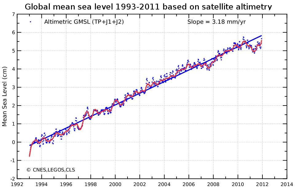
Figure 1 - The reference mean sea level since January 1993 (left) is calculated after removing the annual and semi-annual signals. A 2-month filter is applied to the blue points, while a 6-month filter is used on the red curve. By applying the postglacial rebound correction (-0.3 mm/year), the rise in mean sea level has thus been estimated as 3.18 mm/year. Image from AVISO.
Rather than focusing on the potholes, as the skeptics do, one needs to consider the broader picture. That means factoring in the speed bumps too. See figure 2.

Figure 2 - University of Colorado global mean sea level data with a 12-month running average, and short-term declines. This animation does not include the latest sea level updates indicated in figure 1.
What happens to global sea level rise over the short-term will depend on which aspect of ENSO develops in the tropical Pacific this year. Whatever the case may be, global sea level rise will continue over the long-term because of the accelerating melt of land-based ice and continued warming of the oceans.

Arguments


IMO crests & troughs (like waves in water) would be a better use of imagery, especially given the topic.
So far that accelerating melt and warming hasn't caused sea level rise to accelerate. Here's Colorado University's data from their 2011 rel 4 plotted out with an Excel 2nd order polynomial trend line which shows slight deceleration:
* What is the quality of the polynomial fit versus a linear fit for this (fairly short) time period? You have not shown whether the polynomial is a better (more justified) fit.
* Looking at longer term data indicates a clear acceleration of sea level rise:
[Source - IPCC 2007, projections are for the SRES A1B scenario]
As this thread points out - you have to look at the broader picture, and include all of the relevant data. As opposed to, say, the short term noise.
It is yet another iteration of this:
Or this:
However, when discussing why cherry-picking short term noisy data is statistically a bad idea in science, I find it quite useful when someone comes along and (once again) provides a demonstration.
Apologies.
"I find it quite useful when someone comes along and (once again) provides a demonstration."
Agreed.
The only thing I can think of that would mask the heating of the oceans is if cold water was being heated from 0C to 4C, where its density would increase and volume contract.
Once above water's anomalous density transfer function, a temperature vs sea-level correlation would be more apparent.
That short term variation, of course, will likely reverse over the next El Nino pattern.
A quadratic model is always going to have a better fit than a linear one. Adding more parameters to a model makes a better fit, but tells you nothing about whether the model is correct. Often one runs into trouble and starts modeling noise instead of signal (i.e. overfitting). KR makes a very good point about the short time frame, but some additional relevant questions are:
1) Is there a compelling reason to reject the simple model for the more complex model? There are statistical ways to deal with this, but just looking at it makes me think probably not.
2) As is the entire point of the post - what is driving sea level rise? We have good mechanistic explanations for the recent dip in sea level rise, which means much more than any statistical polynomial model.
Hansen (2011) suggest ocean heating has slowed in recent times for several reasons, but expects it's going to build up quickly this decade.
Regardless, in terms of predictive power:
Physics - excellent predictive power
Good statistics - fair predictive power if nothing's changing
Bad statistics - better off with a wishing well
Short term high order fits without evaluation are really just bad statistics.
And of course the connection with the El Nina.... but it could be more direct also.
...If ice melt has accelerated, and it has, then perhaps thermal expansion might have slowed in the last decade? Hansen (2011) has an interesting look at the thermal expansion aspect and his team's calculations show a rapid acceleration in sea level rise is likely this decade.
This paper?
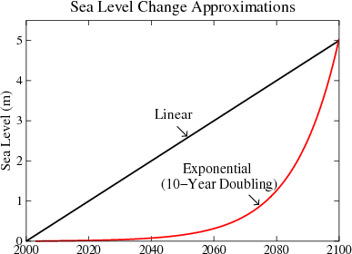
Paleoclimate Implications for Human-Made Climate Change
I thought it showed modest acceleration in sea level rise this decade and doubled per decade until by 2100 it was going up hundreds of millimeters per year. See figure 7 on page 14
Fig. 7. Five-meter sea level change in 21st century under assumption of linear change (Alley, 2010) and exponential change (Hansen, 2007), the latter with a 10-year doubling time.
Hansen et al 2011, "Paleoclimate Implications for Human-Made Climate Change", shows that image simply to demonstrate that "the fundamental issue is linearity versus non-linearity", and showing the differences in projections - an illustration of growth rate curves, not a prediction, which is clear upon reading the paper.
Question is, what are you expecting to see?
Even if enough of Greenland's ice melted to increase sea level by 1 meter, it would still take many years or a couple of decades for it to distribute by gravity and be noticed on far-off shores.
1) Sea level has gone up ~3" in the last 30years (since 1980); it is unlikely you could discern this unless taking careful measurements.
2) It has gone up ~8.5" since 1870 (Sea level rise: the broader picture).
3) When including melting from Greenland ice-sheets & antartica, sea level is projected to rise a minimum of 30" by 2100 (Sea level rise predictions are exaggerated). This 30" rise assumes curbing CO2 emissions per IPCC's 'B1' scenario, which doesn't seem very likely anytime soon. .. For me, this is very concerning!
I would not expect to notice much change in reefs and rocks, but beaches are another matter.
All up and down the east coast of Australia, from Wilson's Prom and up to the Sunshine coast, there is severe beach erosion. My "home" beach, Old Bar (east of Taree), will likely loose it's surf club in the next few years.
Less dramatic is the sand just offshore - over the Christmas break we bodysurfed at beaches from Coffs Harbour down to Lorne. We found that at most of these beaches the bottom shelved more quickly and deeply than I remember, and waves were "dumping" far more: sand had been removed over the years.
Look not at rocks and reefs as a layman's visible sign of rising sea levels - look at the beaches.
For my part, I think it's interesting to look at the observations and see if they match prior expectations. If not, why not?
We don't know what role (if any) the rapid industrialization of China in the last decade has had on the concentration of reflective particles of pollution (aerosols) in the atmosphere, but it's possible they contributed to a slower rate of ocean heat uptake. We won't get to find out for a few years yet, when the next state-of-the-art aerosol measuring satellite is launched. Hopefully that one won't crash into the sea.
Anyway, I'll cover all this when I get around to writing up the Hansen paper.
You need to support those bald assertions ("zero rise"? "incidental variations"? Please!) with evidence. Your reference to "panic" is IMO violating the spirit of the comments policy here.
At present the best evidence shows your claims regarding empirical phenomena are simply incorrect.
If you have any evidence to present to support your assertions, any on sea level can be presented in this thread. Any others can be directed to the appropriate threads so as not to be on-topic.
Where does the data for your combined heat content graph come from. The land + atmosphere and ice heating looks close to 20*(10^21) joules. Your ocean heating would then be over 200*(10^21) joules.
On the NOAA page for ocean heat content none of the graphs show an ocean heat content of this magnitude. Their scale is in (10^22) joules but none of the graphs make it to 20 (which would be 200 in your units). It is correct that the ocean is gaining heat content since the study began but is this a slight stretch of the actual amount?
source of graphs.
[DB] "Where does the data for your combined heat content graph come from."
The SkS graphic originates from Church et al 2011, and is derived from the original data used to make this graphic from the paper:
This depicts all the various components of our planet's energy budget. The dark purple is all the heat going into the upper ocean, the red is all the heat going into the deeper ocean and the green is all the heat going into land + atmosphere + ice. The other components are cooling due to volcanoes (light blue), cooling due to aerosols (grey), increased outgoing radiation due to a warmer earth (yellow).
So to isolate all the heat accumulating in our climate, just take the purple, red and green. The data was provided to SkS directly from one of the co-authors of the paper. The authors were then sent the final graph for approval.
So the SkS Total Heat Graph is based on peer-reviewed data and is an update of an earlier graph based on Murphy 2009, done by a different team but finding the same result.
Apparently the US Navy is concerned about sea level rise.
In 2008, the National Intelligence Council judged that more than 30 U.S. military installations were already facing elevated levels of risk from rising sea levels.
But maybe they should chuck that report over the side and go with your anecdotal evidence.
In your graphs only the heat content from 0-700m and 0-2000m are shown, so the discrepancy is due to the heat content of the ocean below 2000m.
Rob Painting at 05:57 AM on 7 February, 2012
Specifically addressed me and had no link.
Rob Painting at 06:11 AM on 7 February, 2012
Addressed AndyLee and had the link you are referreing to
And on Page 43 in Section 13.5 of that link, Dr. Hansen says "Sea level rise has averaged about 3 mm/year since satellite measurements began in the early 1990s, with a moderate decrease in this rate during the past several years (Fig. 16)." And figure 16 is a redo of the Colorado Universtiy data. He concludes that, "[T]he rate of sea level rise is likely to accelerate during the next several years." and and gives two reasons, thermal expansion and ice melt.
So it will take several years, (I always think of several as hovering around five) to see if he's right.
Regarding the link I put up, and whether or not Dr. Hansen predicted 5 meters of sea level rise by 2100 starting on page 15 he says:
However, the fundamental issue is linearity versus non-linearity. Hansen (2005, 2007) argues that amplifying feedbacks make ice sheet disintegration necessarily highly non-linear. In a non-linear problem, the most relevant number for projecting sea level rise is the doubling time for the rate of mass loss. Hansen (2007) suggested that a 10-year doubling time was plausible pointing out that such a doubling time from a base of 1 mm per year ice sheet contribution to sea level in the decade 2005-2015 would lead to a cumulative 5 m sea level rise by 2095.
"Plausible ... lead[ing] ... to a cumlative 5 m sea level rise by 2095." I won't be here 83 years from now to find out. I can only try to imagine what would be required of the worlds's rivers, glaciers and sunshine in order to sustain a rate of sea level rise 100 times what it is today.
As to:
"I can only try to imagine what would be required of the worlds's rivers, glaciers and sunshine in order to sustain a rate of sea level rise 100 times what it is today"
See the USGS data on water in the cryosphere:
Estimated potential maximum sea-level rise from the total melting of present-day glaciers.
Location / Volume (km3) / Potential sea-level rise, (m)
East Antarctic ice sheet / 26,039,200 / 64.80
West Antarctic ice sheet / 3,262,000 / 8.06
Antarctic Peninsula / 227,100 / .46
Greenland / 2,620,000 / 6.55
All other ice caps, ice fields, and valley glaciers / 180,000 / .45
Total / 32,328,300 / 80.32
Collapse of the West Antarctic ice sheet alone would do it.
The main thing to remember is that large sea level rise rates won't be smooth. The ice on Greenland and Antarctica doesn't have to melt to cause a surge in SLR - it only has to shift.
All you need for a big pulse of seawater to inundate a place, is for one, or several, almighty chunks of glacier or icesheet to slide into the ocean in some other place. These floating ice islands could calmly meander (or blunder) around and not fully melt until long after the effects of their water displacement had destroyed beaches, mangroves, farms or jetties or even ports and other major seaside infrastructure.
I vectorised Hansen's graph, and keeping in mind that the resolution of the line was not wonderful, I obtained these additional rates of sea level rise:
2050: 0.0 mm/day (id est, below resolution)
2080: 0.2 mm/day
2090: 0.4 mm/day
So your figure is ballpark, but you seem to think that it is surprising. You also seem to be completely ignoring Skywatcher's comment immediately preceeding yours, that Meltwater Pulse 1A added 20 m to sea level from ice sheets in as little as two centuries...
In such a scenario, where ice is catastrophically melting as a consequence of sudden warming, it is entirely feasible for a millimetre order of magnitude to be added per day. However, the trajectory will be sigmoid, so the interval of time where such rise occurs will be short.
The rates of rise for the preceeding decade intervals should have clued you in to the fact that the millimetre(s) per day phase would be short, and in the middle of the 'catastrophic' period.
Your quibble is really a mathematical straw man. Given a particular global ∆T there will be a corresponding ∆SL, occurring over a corresponding ∆t. Fact. If Hansen's scenario comes to past, the rate of ∆SR will be in the order of millimetres per day around the point of inflection of the trajectory.
Fact.
And if it comes to pass, humans alive at that time will not be thanking humans alive today for having sat on their hands and argued about "how many Angels may fit upon the point of a Needle", to quote the theologian Baxter.
Where you are might not be experiencing the same sea level rise as everywhere else. Link to sea level rise map.
Some regions are seeing faster, some slower and some are even falling (versus the average). This is mostly short term noise, you can't keep expanding the ocean and building up ever bigger differences, the water will trickle around to balance it out (as a rule, it depends on other stuff). Also, do you know if where you are living is experiencing tectonic uplift, or post-glacial rebound?
For example, the north of the UK is currently rising, whilst the south is sinking because the north used to be weighed down by ice. Just like throwing weights overboard, the floating object straightens out a bit afterwards. This means that the southern UK is seeing much more apparent rise than the north.
As for the problems: so far the last 30-odd years have only been about 90% faster than the last century. But if that acceleration happens again you'll be seeing more serious effects. The UK for example is talking about hundreds of millions of pounds a year of extra sea defences assuming that the best cases are right.
The deeper ocean seems to be gaining some heat content but it is small compared with the surface water and it not well measured. The upper ocean has much better measured coverage.
Here is an article that goes into the contribution of the deep Pacific ocean on the energy budget.
Recent Bottom Warming Water in the Pacific Ocean.
Quote from article: "Thus, abyssal Pacific Ocean heat content variations may contribute a small but significant fraction to the earth’s heat budget."
[DB] Your source is 5 years out-of-date. Use the Search function to find posts referencing far more current materiel.
I get the very same numbers you get, and if you continue the progression out to 2101 it is indeed one millimeter per day.
Were I to live to 2101 I would be surprised to see the ocean creep up that fast. Comparing Pulse 1A to today or 2100 is apples and oranges. We currently don't have continental ice sheets in the temperate zones waiting to melt. There is certainly enough water locked up in the Greenland and Antarctic ice sheets to cause such a rise if they were to melt. However there's conflicting evidence of such melting. Table 10.7 in the IPCC's AR4 tells us that the contribution of Greenland and Antarctica to sea level rise by 2100 will be negative. Elsewhere The GRACE studies say the opposite.
Dr. Hansen's graph isn't sigmoid, it's an asymptotic progression and he didn't say when it would end. He only plotted it out to 2100. I extended it by one year to get the one millimeter per day number. My mathematical "Straw man" as you've put it merely puts Dr. Hansen's curve in actual numbers that can be understood by ordinary people who can decide for themselves whether or not such a scenario is likely to come to pass.
What part of "Decadal Doublings" (from your Hansen quotes) don't you understand? You continually post here with handwaving assertions based on linear thinking when the records are fraught with evidence of exponential change.
In that you cite Hansen, quote Hansen, then cherry-pick the parts that support your agenda & elide the rest, your "argument" devolves to straw.
"Further accelerations in ice flow of the kind recently observed in some Greenland outlet glaciers and West Antarctic ice streams could increase the ice sheet contributions substantially, but quantitative projections cannot be made with confidence"
While it is amusing to see a 'skeptic' using modeled results from the IPCC to 'refute' direct measurements from GRACE, the simple fact is that the IPCC AR4 estimates are now known to be significantly conservative. There is no "conflicting evidence" here. Just a past incorrect estimate vs current measurements.
Then you are putting forth either the Argument from Common Sense (recommended link - very relevant) or the Argument From Personal Astonishment. Both are logical fallacies - when your personal opinions are contradicted by actual data, the data wins.
As to asymptotic versus sigmoid - ice loss will taper off, but possibly only when we run out of ice... It depends on what our future emissions are.
Erm, I think that you mean geometric (although that too is a clumsy term), not "asymptotic".
If a progression were "asymptotic" to the independent variable (time), you'd have the interesting phenomenon where the progression wouldn't reach a particular moment. Perhaps the planet's accelerating toward c with respect to your reference frame...?
If a progression were asymptotic to the dependent variable (temperature), and if it's initially accelerating or 'geometric' (as Hansen's trajectory is), then I'm not-so-sorry to tell you that the trajectory will be approximately sigmoid.
Hansen's trajectory appears to be continuously exponentially increasing only because it's extrapolated to 2100, and no further. You may like to re-interpret what this means, but simple physics dictates that the overall curve (that is, when extended beyond the 2100 upper x-axis bound that was shown on a simple graph) will be sigmoid.
And one day, when current society is merely a layer in the fossil record, that trajectory may even head downward.
None of this changes the fact that with the appropriate ∆T/∆t, ∆SR will approach (for a relatively brief period) the order of magnitude of millimetres per day. Your argument can only be whether ∆T and/or ∆t are likely to be of the values that would result in Hansen's predicted 2100 rate of sea level rise.
Does time cause climate change?
If not, why all the consternation about time-series plots of surface temperatures?
If so, how exactly does time cause climate change?
Time simply allows processes to take their course, not cause them.
I followed your instructions to use the Search function to look for more current information on deep sea heat content.
Here is what I found. Ari Jokimaki: "From 1993 to 2008 the warming of the upper 700 m of the global ocean has been reported as equivalent to a heat flux of 0.64 (±0.11) W m–2 applied over the Earth’s surface area (Lyman et al. 2010). Here, we showed the heat uptake by AABW contributes about another 0.10 W m–2 to the global heat budget. Thus, including the global abyssal ocean and deep Southern Ocean in the global ocean heat uptake budget could increase the estimated upper ocean heat uptake over the last decade or so by roughly 16%."
The "could" is important. Also in the same article by Ari: "The warming below 4000 m is found to contribute 0.027 (±0.009) W m–2. The Southern Ocean between 1000–4000 m contributes an additional 0.068 (±0.062) W m–2, for a total of 0.095 (±0.062) W m–1 to the global heat budget (Table 1)."
Look at the range of error so the total could be as small as 0.033 or as large as 0.157. Of the 0.64 heat flux in the 0-700 meter section of the oceans the deep ocean may contribute as little as 5% or as much as 25% more. It seems the method of determining the deep ocean heat content is not so well established and remains in the very high error bar range of possibilities. More research will need to be done before any declarative statements can be made about total ocean heat content. The graph you posted in #4 showing the ocean heat content may approach this value or again it is just as possible it may be much less and closer to the total energy found in the first 2000 meters of ocean water (which has much smaller error bars).
Ari Jokimaki article I used.