Climate Science Glossary

Term Lookup

Enter a term in the search box to find its definition.

Settings

Use the controls in the far right panel to increase or decrease the number of terms automatically displayed (or to completely turn that feature off).

Term Lookup

Settings


All IPCC definitions taken from Climate Change 2007: The Physical Science Basis. Working Group I Contribution to the Fourth Assessment Report of the Intergovernmental Panel on Climate Change, Annex I, Glossary, pp. 941-954. Cambridge University Press.

Home Arguments Software Resources Comments The Consensus Project Translations About Support

Twitter Facebook YouTube Mastodon MeWe

RSS Posts RSS Comments Email Subscribe


Climate's changed before
It's the sun
It's not bad
There is no consensus
It's cooling
Models are unreliable
Temp record is unreliable
Animals and plants can adapt
It hasn't warmed since 1998
Antarctica is gaining ice
View All Arguments...


Username
Password
New? Register here
Forgot your password?

Latest Posts

Archives

Christy Exaggerates the Model-Data Discrepancy

Posted on 22 June 2012 by dana1981

John Christy, climate scientist at the University of Alabama at Huntsviile (UAH) was recently interviewed for an article in al.com (Alabama local news).  The premise of the article was reasonable, focusing on the fact that the hot month of May 2012 is by itself not evidence of global warming.  However, hot weather will of course become more commonplace as the planet warms and global warming "loads the dice"; a fact which Christy and the article neglected to mention.

As has become an unfortunate habit of his, Christy also made a number of misleading claims in the interview.  The primary assertion which became the main focus of the article was similar to some other recent claims from climate contrarians - an exaggeration of the discrepancy between global climate models and observational measurements.

Models vs. Data

Specifically regarding the model-data discrepancy, Christy claimed:

"It appears the climate is just not as sensitive to the extra CO2 as the models would predict. We can compare what the models said would happen over the past 34 years with what actually happened, and the models exaggerate it by a factor of two on average."

To arrive at this conclusion, Christy appears to have used the Coupled Model Intercomparison Project Phase 5 (CMIP5) model runs and compared them to the observational data, presumably from UAH estimates of the temperature of the lower troposphere (TLT).

The CMIP5 average model surface temperature simulations, based on the radiative forcings from the IPCC Representative Concentration Pathways (RCPs), are discussed and plotted by Bob Tisdale here.  From 1978 through 2011 they simulate a surface warming trend of a bit more than 0.2°C per decade (~0.23°C/decade).  The observed surface temperature trend over that period is approximately 0.16°C/decade, or 0.17°C/decade once short-term effects are removed, per Foster and Rahmstorf (2011).  According to UAH the TLT trend is approximately 0.14°C/decade.

So while there is a small discrepancy here, it is closer to a factor of 1.3 and no more than 1.6 over the past 34 years, not the factor of 2 asserted by Christy.  However, it is possible to find a larger average CMIP5 warming trend (and thus a larger apparent model-data discrepancy), depending on what starting date is (cherry)picked.

Hiatus Decade Discrepancy

The greater discrepancy over shorter timeframe arises partly from non-climatic interannual variability - particularly the El Niño cycle - which is by its nature unpredictable and has been dominated by a preponderance of La Niña events over the past decade.  Over longer timeframes such factors will even out.  Other climate-related factors with a cooling influence over the past decade include an extended solar minimum, rising aerosols emissions, and increased heat storage in the deep oceans.

While the RCP scenarios do appear to account for some of these effects by estimating very little increase in total radiative forcing from 2000 through 2011, the average CMIP5-simulated surface temperatures nevertheless continue to rise over this period (Figure 1).

CMIP5 vs. GISS surface temps

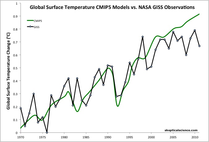
Figure 1: Average global temperature surface anomaly multi-model mean from CMIP5 (green) and as measured by the NASA Goddard Institute for Space Studies (GISS black).  Most of this figure is a hindcast of models fitting past temperature data.

The largest contributing factor to the discrepancy is likely to be the preponderance of La Niña events over the past decade.  The CMIP5 models do not simulate the El Niño Southern Oscillation (ENSO) by using observational data - for example, 1998 is not an anomalously hot year in CMIP5 models, which it was in reality due to a very strong El Niño (Figure 1).  Thus the CMIP5 models also do not account for the short-term surface cooling effect associated with the recent La Niña events, as more heat has been funneled into the deeper oceans during the current 'hiatus decade'.

There may be other factors contributing to the short-term average model-data discrepancy.  For example, it's possible that the transient climate sensitivity of the average CMIP5 model is a bit too high, and/or that the ocean heat mixing efficiency in the models is too high (as suggested by James Hansen), and/or that the recent cooling effects of aerosols are not adequately accounted for, etc.  However, thus far the relatively small discrepancy has only persisted for approximately one decade, so it's rather early to jump to conclusions. 

More to the point, in his interview John Christy specifically said that models exaggerated the observed warming by a factor of two "over the past 34 years."  However, this claim is untrue.  The factor of two discrepancy only exists over approximately the past decade, and using the methodology from Foster and Rahmstorf (2011), the preponderance of La Niñas alone over the past decade accounts for roughly half of that discrepancy (removing the effects of ENSO brings the observed GISS trend up from ~0.1°C/decade to ~0.15°C/decade, compared to the ~0.2°C/decade average CMIP5 simulation).

Ignoring the Envelope

It's also important to note that we're only examining the model mean simulation here and not the full range of model simulations.  While the observed trend over the past decade is less than the average model simulation, it is likely within the envelope of all model simulations, as was the case in the 2007 IPCC report (Figure 2).

Schmidt model-data comparison

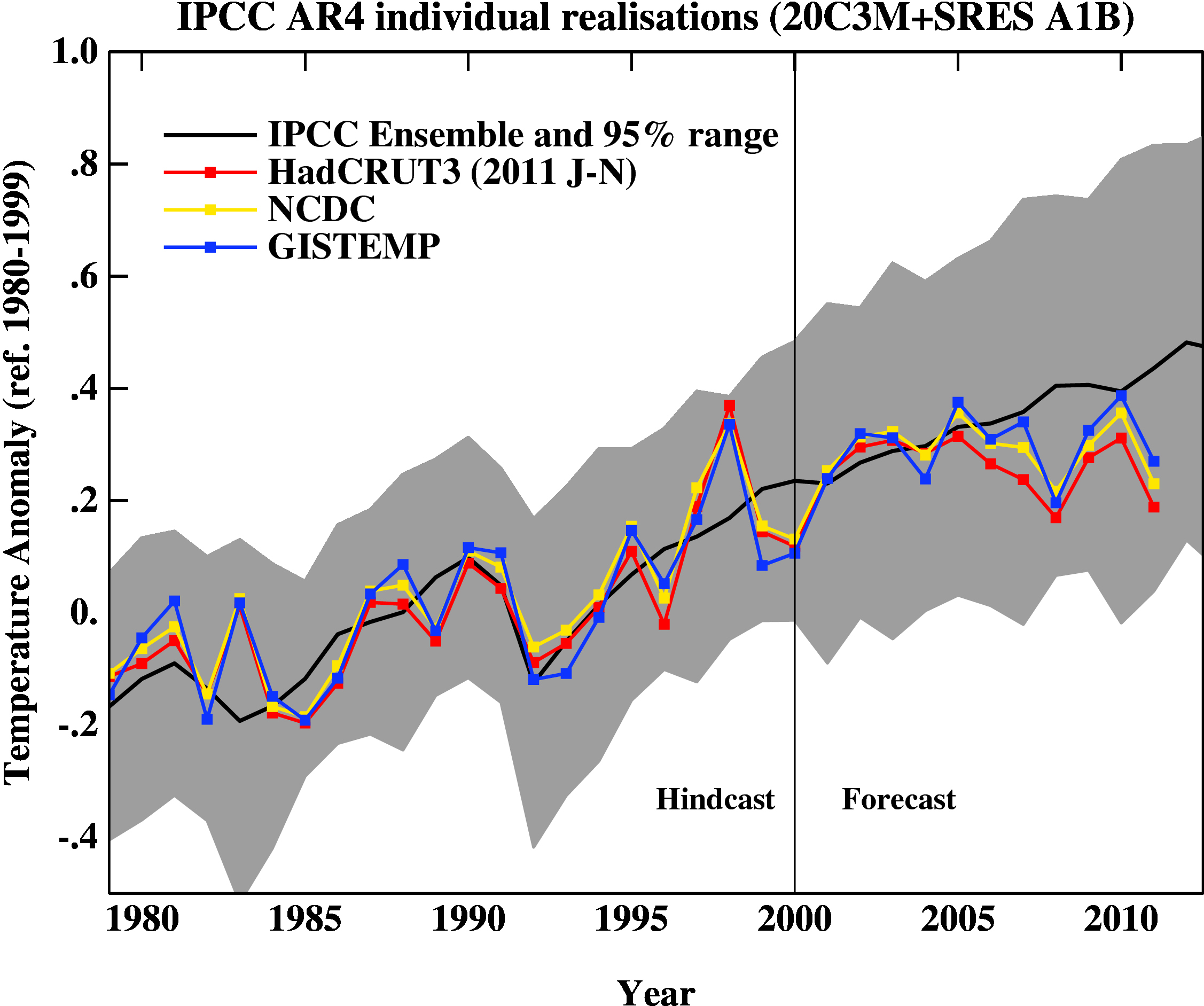
Figure 2: 2007 IPCC report model ensemble mean (black) and 95% individual model run envelope (grey) vs. surface temperature anomal from GISS (blue), NOAA (yellow), and HadCRUT3 (red).

Essentially Christy is focusing on the black line in Figure 2 while ignoring the grey model envelope.

Ultimately while Christy infers that the discrepancy between the data and average model run over the past decade indicates that climate sensitivity is low, in reality it more likely indicates that we are in the midst of a 'hiatus decade' where heat is funneled into the deeper oceans where it is poised to come back and haunt us.

Human Warming Fingerprints

Christy's misleading statements in this interview were not limited to exaggerating the model-data discrepancy.  For example,

"...data collected over the past 130 years, as well as satellite data, show a pattern not quite consistent with popular views on global warming."

Christy is incorrect on this issue.  There have been dozens of observed anthropogenic 'fingerprints' - climate changes which are wholly consistent with and/or specifically indicative of a human cause (Figure 3).

fingerprints

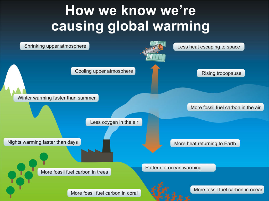
Figure 3: 'Fingerprints' of human-caused global warming.

Satellites vs. Surface Stations

Although the two show very similar rates of near-surface warming, Christy pooh-poohed the accuracy of the surface temperature record and played up the accuracy of his own UAH TLT record.

"These [satellite] measurements, he says, are much more accurate than relying solely on ground measurements.

"We're measuring the mass, the deep layer of the atmosphere. You can think of this layer as a reservoir of heat. It gives you a better indication than just surface measurements, which can be influenced by so many factors, such as wind and currents, and things like urbanization."

Christy adds that using the same thermometer, on the same spacecraft, adds to measurement accuracy. "It's using the same thermometer to measure the world," he says."

There are a number of problems with this quote.  First of all, the accuracy of the surface temperature record has been confirmed time and time again

Second, there are a number of challenging biases in the satellite record which must be corrected and accounted for.  For example, the orbital drift of satellites, the fact that they have to peer down through all layers of the atmosphere but need to isolate measurements from each individual layer, etc.  It's also worth noting here that while Christy has promised to make the UAH source code available to the public, which people have been requesting for over two years, the code has not yet been made public.

Third, contrary to Christy's assertion that TLT measurements are made by a single satellite, they have actually been made by several different satellites over the years, because the measurement instruments don't have lifetimes of 34 years.  Splicing together the measurements from various different satellite instruments is another of the challenging biases which must be addressed when dealing with satellite data.

All in all, it is entirely plausible that there are remaining biases in the UAH data which  Christy and co. have not addressed, whereas many different studies have confirmed the accuracy of the surface record, and the various different surface temperature records (GISS, NOAA, HadCRUT4, BEST, etc.) are all in strong agreement.

Tip of the Global Warming Iceberg

It's also important to put the warming discussed here in context.  We are only focusing on the warming of surface air, whereas about 90% of the total warming of the Earth goes into the oceans.  Overall global warming has continued unabated (Figure 4).

church global heat content

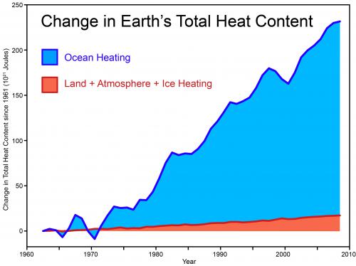
Figure 4: Total global heat content, data from Church et al 2011.

Over the past 20 years, 14 x 1022 Joules of heat have gone into the oceans, which is the equivalent of 3.7 Little Boy Hiroshima atomic bomb detonations in the ocean per second, every second over the past two decades.  Over the past decade we're up to 4 detonations per second.  Focusing exclusively on surface temperatures, as Christy has in this interview, neglects that immense amount of global warming.

Local Aerosol Cooling vs. Global Warming

Despite the premise of the article - that global warming can't be blamed for short-term temperature changes - Christy nevertheless loses focus on long-term global warming and emphasizes local temperature changes.

"Data compiled over the past 130 years show some warming over the northern hemisphere, but actually show a very slight cooling trend for the southeastern U.S., Christy says."

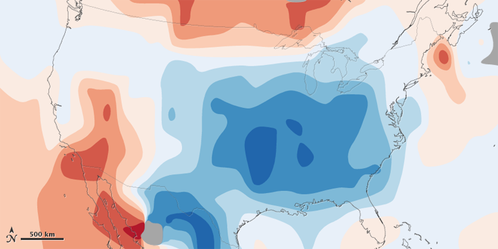
Why this assertion is relevant to the topic at hand is something of a mystery.  However, as NASA Earth Observatory shows, the "warming hole" in the southeastern USA is due to local aerosol emissions from coal power plants, which are relatively common in this region of the country (Figures 5 and 6).

aerosol loading

key

Figure 5: 1970-1990 aerosol loading of the atmosphere over the lower 48 United States and estimated associated surface air temperature change.

US temp change

key

Figure 6: Observed total surface temperature change over the lower 48 United States from 1930 to 1990.

Christy does not mention this local aerosol loading of the atmosphere, however.  Rather than providing this explanation or explaining the important difference between local and global temperatures, Christy leaves the statement about local southeastern USA cooling unqualified and unexplained, which is something of a disservice to his Alabama readers.

Exaggerating Discrepancies to Downplay Concern

To summarize, in this interview Christy has exaggerated the discrepancy between model averages and data, failed to explore the many potential reasons behind that short-term discrepancy, failed to consider the envelope of model runs, neglected the many 'fingerprints' of human-caused global warming, ignored the vast and continued heating of the oceans and planet as a whole, and focused on short-term temperature changes without examining the causes of those changes or putting them in a global context.

The overall tone of the article has likely served to sow the seeds of doubt about human-caused global warming in the minds of Alabama readers.  Christy also made various claims about the "resiliency" of the Earth to climate change to further sow these seeds. 

Christy further downplayed Alabaman climate change concerns by claiming that global warming will lead to fewer tornadoes, and that the local tornado outbreak of 1932 caused more deaths than recent tornadoes.  However, as research meteorologist Harold Brooks discusses, the impact of climate change on tornadoes is not as clear as Christy claims - "there will undoubtedly be more years with many bad storms, as well as years with relatively few."  And quite obviously, there were more tornado-related deaths in 1932 because technology and warning times have greatly improved over the past 8 decades, unrelated to climate change.

Unfortunately when we look at the totality of the evidence for human-caused global warming and associated future impacts, the big picture is not nearly so rosy as the one Christy's selective vision paints.

0 0

Printable Version  |  Link to this page

Comments

Comments 1 to 35:

  1. Not the subject matter of this article but... from 'poised to come back and haunt us': "Heat buried in the deep ocean remains there for hundreds to thousands of years." from this article: "where heat is funneled into the deeper oceans where it remains only temporarily" Despite its title 'poised to come back and haunt us' does not describe the heat coming back, which is correct; It doesn't. I think a small correction to this article (erase 'where it remains only temporarily,' would help prevent a misleading concept getting established. PS. I suggest anyone wanting to comment on this should add comments to poised to come back and haunt us
    0 0
  2. As far as I can see, tying any single weather event to global warming is a bit like tying an individual smoker's lung cancer to his or her smoking habit - you can't really do it. But as soon as you start looking at larger and larger groups of individuals - hey presto! The smoking gun (pun intended) emerges from the statistical noise. Likewise, I expect the global warming signal in the weather - the loading of dice, or the training of the boxer, so to speak - becomes clear when one reviews aggregates of increasingly large weather events. Indeed, if I am not mistaken that is the sort of thing Hansen et al 2011 (reviewed on Skeptical Science here) or the Cuomo & Rahmstorf 2012 paper (press release republished here) set out to quantify.
    0 0
  3. Speaking of "model discrepancies", please debunk this: Climate Models Missing Key Component of Temperature Changes One of the co-authors is a known AGW denier, so I have a strong feeling this is a case of "lies, damn lies, and statistics". The actual paper can be found here.
    0 0
  4. pixelDust: I can't access the full paper (behind a paywall), but the language in the press release appears to be a lot stronger than the language in the paper abstract. So I suspect in the first place that McKitrick is pulling a "Forbes" and overstating the findings of the paper in the press release. Second, if McKitrick's assertion is that climatologists do not account for land-use changes in either modelling or teasing out different forcings from the empirical data, it appears he is incorrect: from this rebuttal on Skeptical Science we are linked to NASA GISS summary of radiative forcings which quite obviously takes land-use changes into account. To be fair, it doesn't follow that newer GCMs do a great, or even a good, job of accounting for land-use changes. However statements such as McKitrick's: “A lot of the current thinking about the causes of climate change relies on the assumption that the effects of land surface modification due to economic growth patterns have been filtered out of temperature data sets. But this assumption is not true.” (in the press release) appear to be incorrect when the information from NASA GISS is considered. If memory serves the IPCC also has a summary table of radiative forcings, including land-use changes. I'm sure better rebuttals can be made, but that's just what sprang to mind for me.
    0 0
  5. The first place I would look is the sign of the socio-economic influence on local temperature. If more growth leads to lower temperatures, then he may have discovered that aerosol emissions have a local impact, but are (AFAIK) modelled as a global term in climate models. In which case, it's something we knew all along. But he may have inadvertently come up with a way of improving climate model inputs. And bears not much relation to the press releases.
    0 0
  6. Thanks Composer. The entire paper is accessible for me using that link, though I now realize it's because I'm accessing the URL from a university (so anyone else in an academic setting should be able to access it as well; it appears to auto-detect if your IP is from a subscriber institution). I don't have a background in statistics, but I'm sure someone who does (and can access the full paper) can easily find any flaws, trickery, and obfuscation therein.
    0 0
  7. pixelDust - I believe McKitrick's major misstep is more than sufficiently described by Gavin Schmidt at RealClimate, where he commented:
    "He makes the same conceptual error here as he made in McKitrick and Nierenberg, McKitrick and Vogel and McKitrick, McIntyre and Herman. The basic issue is that for short time scales (in this case 1979-2000), grid point temperature trends are not a strong function of the forcings - rather they are a function of the (unique realisation of) internal variability and are thus strongly stochastic. ... He knows this is an error since it has been pointed out to him before ... There are other issues, but his basic conceptual error is big one from which all other stem. - gavin"
    [Emphasis added]
    0 0
  8. I'm curious... who owns the UAH computer code? I understand that a university would not want to step on a researcher's toes in that regard, but could UAH step in and make the satellite interpretation code available, if necessary against Christy's and Spencer's wishes?
    0 0
  9. I read the U of Guelph press release on the McKittrick paper, and I have to say it made me laugh. An economist claiming that his "simple economic model" made better predictions that a physical model... alarms bells ring straight away. It screams "cherry picking!". Just look at how succesful "simple sconomic models" have been in predicting what they are supposed to predict - the economy.
    0 0
  10. (inflammatory snipped; link without discussion snipped)
    0 0
    Moderator Response: TC: Compliance with the comments policy is not optional for anyone. Please read it and comply to avoid future moderation. Please note that links (and URL's) should be accompanied by discussion which provides an indication of the contents of the link; and that inflammatory language is not permitted.
  11. Ross McKittrick is a signatory to the Cornwall Alliance Declaration: WHAT WE BELIEVE We believe Earth and its ecosystems—created by God’s intelligent design and infinite power and sustained by His faithful providence —are robust, resilient, self-regulating, and self-correcting, admirably suited for human flourishing, and displaying His glory. Earth’s climate system is no exception. Recent global warming is one of many natural cycles of warming and cooling in geologic history. We believe abundant, affordable energy is indispensable to human flourishing, particularly to societies which are rising out of abject poverty and the high rates of disease and premature death that accompany it. With present technologies, fossil and nuclear fuels are indispensable if energy is to be abundant and affordable. We believe mandatory reductions in carbon dioxide and other greenhouse gas emissions, achievable mainly by greatly reduced use of fossil fuels, will greatly increase the price of energy and harm economies. We believe such policies will harm the poor more than others because the poor spend a higher percentage of their income on energy and desperately need economic growth to rise out of poverty and overcome its miseries. WHAT WE DENY We deny that Earth and its ecosystems are the fragile and unstable products of chance, and particularly that Earth’s climate system is vulnerable to dangerous alteration because of minuscule changes in atmospheric chemistry. Recent warming was neither abnormally large nor abnormally rapid. There is no convincing scientific evidence that human contribution to greenhouse gases is causing dangerous global warming. We deny that alternative, renewable fuels can, with present or near-term technology, replace fossil and nuclear fuels, either wholly or in significant part, to provide the abundant, affordable energy necessary to sustain prosperous economies or overcome poverty. We deny that carbon dioxide—essential to all plant growth—is a pollutant. Reducing greenhouse gases cannot achieve significant reductions in future global temperatures, and the costs of the policies would far exceed the benefits. We deny that such policies, which amount to a regressive tax, comply with the Biblical requirement of protecting the poor from harm and oppression. Signature page I do not consider it an ad homenim attack when someone publicly declares that his mind is made up, and he cannot be confused by the facts. Why should any University accept any work by McKittrick as a serious work of scholarship, as opposed to theologically motivated propaganda?
    0 0
  12. Dana, I notice that you use Gavin Schmidt's RC data for you comparison instead of the official AR4 chart. I am quite surprised that you do not use AR4 to criticise Christy. Therefore, I include the AR4 TS.26 chart below in order to compare Gavin's diagram with actual global temperatures and the discrepancy highlighted by Christy. Figure 1: Model Projections of Global Mean Warming Compared with Observed Warming. (after AR4 Figure TS.26) The following points should be noted about Figure 1 and AR4 Figure TS.26:
    1. I have deleted the FAR, SAR and TAR graphic from Figure TS.26 in Figure 1 because they make the diagram more difficult to understand and because they are already presented elsewhere in AR4.
    2. The temperature data shown in AR4 Figure 1.1 does not correspond to that shown in Figure TS.26. The Figure 1.1 data appear to be approximately 0.026 °C higher than the corresponding data in Figure TS.26. I have assumed that this is a typographical error in AR4. Nevertheless, I have used the same 0.026 °C adjustment to the HadCRUT3 data in required for AR4 Figure 1.1 for Figure TS.26. My adjusted HadCRUT3 data points are typically higher than those presented in AR4 Figure TS.26.
    3. Despite items (1) and (2) above, there is very good agreement between the smoothed data in TS.26 and the adjusted HadCRUT3 data presented in Figure 1, particularly for the 1995-2005 period.
    4. It should be noted that AR4 uses a 13-point filter to smooth the data whereas HadCRUT uses a 21-point filter but these filters are stated by AR4 to give similar results.
    Dana, comparing your data and Gavin's projections in the RC chart with the official AR4 projections in Figure 1, the following points are evident:
    1. There is a huge discrepancy between the projected temperature and real-world temperature.
    2. Real-world temperature (smoothed HadCRUT3) is tracking below the lower estimates for the Commitment emissions scenario., i.e., emissions-held-at-year-2000 level in the AR4 chart. There is no commitment scenario in the RC chart to allow this comparison.
    3. The smoothed curve is significantly below the estimates for the A2, A1B and B1 emissions scenarios. Furthermore, this curve is below the error bars for these scenarios, yet Gavin shows this data to be well within his error bands.
    4. The emissions scenarios and their corresponding temperature outcomes are clearly shown in the AR4 chart. Scenarios A2, A1B and B1 are included in the AR4 chart – scenario A1B is the business-as-usual scenario. None of these scenarios are shown in the RC chart.
    5. The RC chart shows real world temperatures compared with predictions from models that are an "ensemble of opportunity". Consequently, Gavin Schmidt states, "Thus while they do span a large range of possible situations, the average of these simulations is not 'truth" [My emphasis].
    In summary, I suggest that your use of the RC chart is a poor comparison. I suggest that Figure TS.26 from AR4 is useful for comparing real world temperature data with the relevant emissions scenarios. To the contrary, Gavin uses a chart which compares real world temperature data with average model data for which he states does not represent "truth" I suggest that this is not much of a comparison. Therefore, why use the RC data? I conclude that the AR4 chart is much more informative. It is evident that Christy is correct in highlighting a possible discrepancy and there is certainly a discrepancy between the data presented by you and that presented in the official AR4 charts.
    0 0
    Moderator Response: [Dikran Marsupial] Please restrict the width of the images in your posts (I have restricted this one to 450 pixels)
  13. angusmac - I would suggest you go back and re-read the post, because you're making many of the same errors that Christy made.
    0 0
  14. angusmac wrote "Dana, I notice that you use Gavin Schmidt's RC data for you comparison instead of the official AR4 chart." If you mean figure 2, I should point out that the CMIP5 model runs are publicly available and it is straightforward to download them and recreate the plot and find that the conclusions are exactly as Gavin suggests. I know this because I have done so for a paper I am writing at the moment (with Dana). Now if you feel that the AR4 diagram tells a different story then there are two possibilities (i) The IPCC have made a serious error in analysing the output of their GCM runs or (ii) perhaps there is some subtlety that explains the apparent difference between the two diagrams that you do not understand. I would suggest that (ii) is more probably a-priori. I would suggest you start by investigating the error bars on the projections so that you know what the models actually say. I would also suggest that you look into the details of how baselining of observations and model output is performed. Then I would consider whether the choice of observational dataset makes a difference (note that Gavin uses more than one). I tell my students that science is best peformed the way a chess player plays chess, you don't play the move that maximises your immediate gain, you play the move that mimises your opponents maximum advantage. In this case, for example, if the IPCC are arguing that there will be warming the if they use the HADCRUT observations that show lower warming than GISSTEMP, then their choice is not easily criticised as being a cherry pick. Likewise if you want to argue that there is a discrepancy between models and observations then choosing the dataset that maximises the discrepancy is a questionable move. Yes I know that is the one that the IPCC uses, but that doesn't make it an equally good choice for your (or Christies) argument because of the assymetry I have just pointed out. This sort of thing lies at the heart of scientific skepticism - it much begin with self-skepticism. I'd be happy to answer any questions you have about Figure 2, or at least my version of it (which is essentially identical).
    0 0
  15. At the risk of drifting off-topic, but in response to the above reference to McKitrick, Steve Mosher has recently been putting the boot in to Ol' Ross over at Curry's. All one can do is to shake one's head...
    0 0
  16. Angusmac, We see this sort of post written by you often when the cherry picking , distortions and misrepresentations of fake skeptics are exposed. Instead of acknowledging and openly condemning the misrepresentations and errors made by Christy, the tactic seems to be to try and divert attention away from the many problems with the fake skeptic's reasoning/argument. So before this thread goes too far off topic by addressing your "suggestions", how about you please start a constructive dialogue by directly speaking to Christy's misrepresentations, cherry picking and fallacious claims outlined in the main post? Thanks.
    0 0
  17. Bernard @15, Interesting, but not entirely surprising. McKitrick clearly has strong confirmation bias and is not qualified to undertake research outside his field. Gavin Schmidt and Mosher have now identified glaring problems with McKitrick's paper. Ironically, the self-proclaimed auditor that the fake skeptics continually fawn over, and who is also McKitrick's close compadre, failed to identify any of the egregious errors in McKitrick's paper. What is laughable (yet tragic) is what Judith Curry had to say about the horrendous paper: "Congrats to Ross for getting his paper published in Climate Dynamics, which is a high impact mainstream climate journal. My main question is whether the lead authors of the relevant IPCC AR5 chapter will pay attention to these papers; they should (and the papers meet the publication deadline for inclusion in the AR5)." But why should they pay any attention to shoddy and seriously flawed work? Curry has once again exposed her severe bias and agenda.
    0 0
  18. Bernard @15 - wow, assuming population density is uniform over entire countries? It doesn't get much sloppier than that - unless you consider McKitrick's previous work, I suppose. Mosher suspects that doing the analysis properly will strengthen McKitrick's conclusions. Let's just say I'm skeptical, but until he does it properly, his conclusions are wholly unsupported, and certainly don't deserve consideration by the IPCC.
    0 0
  19. @Composer99, Regarding "As far as I can see, tying any single weather event to global warming is a bit like tying an individual smoker's lung cancer to his or her smoking habit - you can't really do it" ... It takes a bit of a mind warp, but as Dr Trenberth pointed out to me, if the physics underlying climate change is as solid as we believe it to be, and the evidence is as solid as it seems, then there is nothing in the world which can properly be interpreted in the absence of the fact of climate change. Indeed, the idea of trying to "prove climate change" or attribute this or that phenomenon to climate change kind of misses the point. If the physics implying climate change are wrong, then there should be many other experimental and engineering things we see and do which also don't work. To the degree they do, this bolsters our confidence that we really understand how the world works. If we do that, then climate change is part of our basic engagement with that world, and we should be surprised if something is NOT connected with climate change. A climate denier does more than deny climate: The denier is claiming physics really doesn't know what it is doing. To be a proper scientific claim, the denier needs to offer not only an alternative explanation of the data they are challenging, but also an alternative physics. Dr Trenberth isn't the only one who feels this. Dr Jennifer Francis observes that how can the Arctic melt NOT affect the weather? It would be a basic violation of physical law if dumping this amount of carbon into the atmosphere did NOT cause increase in energy. See the "Physical Chemistry of Climate Change" by Dr Fritz Franzen. He in fact wrong a guest column for Skeptical Science, but the PDFs at the site that links to are broken. A current link is: http://edu-observatory.org/Franzen/GWPPT10.pdf
    0 0
    Moderator Response: [DB] Hot-linked articles.
  20. empirical_bayes: I agree with you, more or less completely at the conceptual and logical levels. If climate drives weather (which I conclude it does) and the climate is changing, it follows that every weather event will be affected by the climate change. All I was stating was that this is hard to show, statistically speaking, at the level of individual weather events, for the same reason that it's hard (perhaps not even possible) to show a causal chain between tobacco smoking and lung cancer incidence when examining individual patients in isolation. Of course, elsewhere on this site caerbannog has shown that with a tiny handful of weather stations one can produce a temperature series much like the global GISS series, so linking AGW with individual weather events may not be nearly as difficult as I imagine.
    0 0
  21. Climate without global warming and the anthropogenic forcing as seen in the data is like biology without evolution - nothing makes sense without that key piece.
    0 0
  22. Dikran Maraupial @14 Regarding your, "I would be happy to answer any questions about Figure 2." That's very kind of you and I would be pleased if you would answer one, which is more of a request than a question. Posting the data for your version of Figure 2 on the SkS resource library would be very useful. I have not found the data retrieval process as straightforward as you suggest. Having the numerical data in an easily accessible form (Excel or csv) would allow easy cross-checking for errors, etc. Regarding, "... if you feel that the AR4 diagram tells a different story...", you suggest that I have missed some subtlety and that I start by checking the error bars. Please note that AR4 Figure TS.26 and my version of it in Figure 1 clearly show the error bars. Furthermore, I agree with the comments presented by Tom Curtis @72 and you @73 here that the real-world temperatures are currently skirting the 2-sigma levels in the models. I also concur that Figures 2 and TS.26 both tell the same overall story, namely, real-world temperatures are following the 2-sigma levels from the model ensemble. It is just that TS.26 presents this fact more clearly. My main contentions regarding Figure 2 are as follows:
    1. Figure 2 hides the 2-sigma trend in real-world temperatures in a mass of grey, whereas the TS.26 shows this discrepancy very clearly.
    2. Figure 2 does not show smoothed data. Once again this tends to hide the discrepancy between real-world temperatures and model projections.
    3. Figure 2 omits the Commitment Scenario that is presented in TS.26. This scenario should be shown in any projections diagram because it is a very useful benchmark for comparing the accuracy of the projections.
    If I were to use the AR4 standard terms and definitions to define the 2-sigma confidence levels, Box TS.1 of AR4 would describe the current model results as, "Very low confidence" and the chance of being correct as, "Less than 1 out of 10."
    0 0
  23. Albatross @16 There is little need for me to criticise Christy, plenty of people on this website are well able to do that. The main point of my post @12 was to query the use of Figure 2, which is lifted directly from RC. I asked why not use Figure TS.26 from AR4? I also explained why TS.26 is better @12 and subsequently @22.
    0 0
  24. @angusmac writes "Figure 2 hides the 2-sigma trend in real-world temperatures in a mass of grey, whereas the TS.26 shows this discrepancy very clearly. " The mass of grey in figure 2 is the 2-sigma region, I cannot see how much more clearly it could be depicted than that. This one comment suggests quite strongly to me that you have misunderstood what figure 2 is actually saying. "Figure 2 does not show smoothed data. Once again this tends to hide the discrepancy between real-world temperatures and model projections". No, if you want to determine if there is a model-observation discrepancy you need to look at the data itself. Smoothing hides the true variability of the data, and to detect a discrepancy you need an accurate characterisation of the variability. The observations are currently between the 1-sigma and 2-sigma boiundaries (actually more or less half way). Is this surprising or unusual? No, the observations can be expected to be in that region about 1/3 of the time, even if the models are perfectly correct (so your 1 out of 10 characterisation is rather off). Note that in 1998 the observations were skirting the other side of the 2-sigma region even more closely. Does that mean that in 1998 ecomentalists would have a point in saying that the models underestimate warming? No. An important factor that is often missed is that there is a one in 20 chance of seeing an observation outside the 2-sigma range if you look at a random sample from the distribution. However if you wait for an observation that supports your argument (as the "skeptics" often do), then the chance of such an observation ocurring by random chance increases quite rapidly the longer you wait, until it reaches the point where it is essentially inevitable. This is why statistics has the concept of "multiple hypothesis testing" to compensate for this bias (c.f. the Bonferonni adjustment). While the observations are nearish the 2-sigma region, that doesn't mean that this is statistically surprising in any way. If you want to find out just how unsurprising it would be, then here is an experiment to try. Run a model aith A1B forcings and generate, say, 100 model runs. For each run in turn, treat it as the observations and the rest as the ensemble projection. From the start of the run, count how many years you have to wait to find a model-observation discrepancy as large as the one we see at the moment. Generate a histogram. Compare with the number of years the skeptics have has to wait since the CMIP3 models were completed. I suspect you will find that the probability of having ssen such a discrepancy by now is substantially higher than 1 in 20. I'll try and dig out the data when I have a moment.
    0 0
  25. @angusmac wrote The main point of my post @12 was to query the use of Figure 2, which is lifted directly from RC." This is essentially an ad-hominem, questioning the source of some information rather than the content. Why not get it from RC, from an article written by a climate modeller, who is an expert in the area and knows how to properly determine if there is a model-observation discrepancy. Would it make any difference if we used the version of the diagram that I created from the same model runs? "I asked why not use Figure TS.26 from AR4?" because TS.26 provides only a very brief summary of what the CMIP3 models actually say, and does not provide the required information to determine whethere there actually is a model-observation discrepancy (the answer is "no, not really").
    0 0
  26. Angusmac @22, quoting my discussion of the 2 sigma range of Hansen 88 as evidence that observations are skirting the lower bound of the 2 sigma range of CMIP-3 (AR4) model predictions is disingenuous. Hansen 88 had a lower 2 sigma range, primarily because it did not include major forms of natural variability, in particular ENSO events and random (in time) volcanic eruptions. Therefore, that actual temperatures are skirting the bottom of the 2-sigma range for Scenario B from Hansen 88 implies nothing about their behaviour with respect to the AR4 models. The loose way in which you treat facts if they can be distorted to appear to support your position is very disturbing.
    0 0
  27. angusmac @23, if you are not suggesting that you agree with those other criticisms, your comment is an irrelevant smoke screen.
    0 0
  28. Dikran Marsupial @24 & 25 When I said that the grey hides the 2-sigma trend in Figure 2 perhaps I should have been more explicit. The uniform grey shading implies a uniform probability of occurrence but what I should have stated is that a contour diagram similar to that below shows the probability distribution much better. Source: AR4 Figure 6.10c (IPCC, 2007) If Figure 2 had used percentile contours (as in the above diagram) then it would be evident that the 2-sigma values would be the lines at the extremities of the diagram and that most of the model runs would be near to the mean.
    0 0
  29. Tom Curtis @26 & 27 Could you please elucidate regarding Hansen and the 2-sigma levels. I have already shown in SkS here @78 that the Hansen 1988 projections were statements of certainty. No mention of error bars in Hansen (2005) "almost dead on the money" or Schmidt (2011) "10% high". Your comments would be appreciated. Furthermore, my Figure 1 shows real-world temperatures are at the low end of the AR4 Commitment Scenario. Your comments would also be appreciated.
    0 0
  30. #29, I was motivated to actually check the source of one of your fragmentary statements. This is what I found. Hansen, making a model-observation check in 2005:
    Curiously, the scenario that we described as most realistic is so far turning out to be almost dead on the money. Such close agreement is fortuitous. For example, the model used in 1988 had a sensitivity of 4.2°C for doubled CO2, but our best estimate for true climate sensitivity[2] is closer to 3°C for doubled CO2. There are various other uncertain factors that can make the warming larger or smaller[3]. But it is becoming clear that our prediction was in the right ballpark.
    In 2005, the observed temperature was, as it had been doing for the preceding six years, following Scenario B closely (Figure 1 in Hansen's piece). In 2005, it was ever so slightly above the B scenario; 2004 a little below, and 2003 almost exactly on the same value. These observations did not require elucidation of errors, they were a comparison of observations to a specific model, and the observations at that time merited "almost dead on the money. Hansen also goes on to say that was lucky in this, as his sensitivity was too high and other factors weren't included. But the 2005 'dead on the money' quote, when placed into context is correct. Its context is 2005, not 2012, where the fortuitous circumstances that allowed Hansen to make the above statement no longer apply.
    0 0
  31. angusmac @29, before making such absurd statements about Hansen 88, you should read the paper. In particular you should read section 5.1 of the paper (reproduced below, for a larger copy, click on the image): You will note that Hansen explicitly states that "Interpretation of [the graph of the projections for scenarios A, B, and C] requires quantification of the magnitude of natural variability in both the model and observations and the uncertainty in the measurements." This represents a categorical rejection of any interpretation of the model projections as "statements of certainty". The only reasonable way in which you could be this wrong is if you have simply failed to read the paper you are misinterpreting. As it happens, Hansen finds that the standard deviation of natural variability is 0.13 C, while that of the measurements is 0.05 C. For our purposes, that means the 2 sigma error bars for the model projections is +/- 0.27 C. This does not mean the projections are those graphed, plus or minus 0.27 C. Because each projection represents a single model run, there is no reason to think the projection follows the model mean. At any point, it may be 0.22 C [edited: two standard deviations] of model variability) above or below the model mean, and indeed, one twentieth of the time will be even further from the mean. That means the model is not falsified if any band of temperatures 0.54 C wide and including 19/20 values in a projection also includes the actual temperatures. This, I would agree, is an unsatisfactory test, but that is the limitation imposed by limited computational power and single model runs. As it happens, it is borderline as to whether scenario A fails that test, and certainly neither Scenario B or C fail it at present. Given the known flaws in the model, that is remarkable. Hansen knew the limitations of his experiment, and so developed a test which was not restricted by the fact that he could not do sufficient model runs. He calculated that a temperature increase of 0.4 C would exceed the 1951-1980 mean by three standard deviations, thereby representing a statistically significant test or warming. He predicted that test would be satisfied in the 1990s, which indeed it was. Finally, skywatcher @30 has exposed the extent of your out of context quotation from Hansen (2005). I have a very low opinion of those who deliberately quote out of context - so low that I cannot describe it withing the confines of the comments policy. Suffice to say that if the out of context quotation is deliberate, I will no longer trust you, even should you say the sky is blue. If, however, it was inadvertent, I will expect your apology for accidentally deceiving us immediately.
    0 0
  32. @angusmac, I am always amazed at some peoples ability to misconstrue scientific data. Yes, we could indeed have used a density based plot, however it only requires common sense and a basic understanding of what a GCM actually does to realise that the grey area doesn't imply uniform denisty. The funny thing is that the figure from AR4 that you prefer is far less easily understood. For a start the error bars are not error bars on where we should reasonably expect to see the observations, just an indication of the plausible range for the linear trend. have pointed this out to you, but you have not responded to that at any point. However, on the other thread, you have repeatedly ignored a key issue relating to the uncertainty of the predictions, so it seems to me that your continued quibbling about this diagram is merely a distraction.
    0 0
  33. Dikran Marsupial @32 I am not quibbling about the diagram. My version of the AR4 Figure TS.26 is much clearer than the SkS Figure 2 from RC. Incidentally, @24, have you had any success digging out your data for Figure 2?
    0 0
    Moderator Response:

    [DB] Cease with your dissembling. Figure 2 (taken from this RC post) are for global model runs. The IPCC figure you cite a portion of is for NH only. You compare apples and porcupines.

    Continuance of this posting behaviour of dissembling will result in an immediate cessation of posting rights.

  34. Moderator @33 Both the RC Figure 2 and my version of AR4 Figure of TS.26 refer to global temperatures. Therefore, I am comparing apples with apples. The NH figure to which you refer (AR4 Figure 6 in angusmac @ 28) was clearly a reference to the shading of the diagram; I did not compare RC global temperatures with AR4 NH temperatures.
    0 0
    Moderator Response:

    [DB] "Both the RC Figure 2 and my version of AR4 Figure of TS.26 refer to global temperatures."

    Still wrong. Your graphic at 28 above is clearly labeled as AR4 Figure 6.10c (IPCC, 2007). Explanatory text of that graphic:

    Figure 6.10. Records of NH temperature variation during the last 1.3 kyr.

    You would be better served by admitting that you misunderstood the applicability of the graphic you referenced and also (un)intentionally misrepresented how you presented it. Since you persist in your error the only conclusion one can draw is that the error is willful; the intent, to dissemble and mislead.

    Please note that posting comments here at SkS is a privilege, not a right. This privilege can and will be rescinded if the posting individual continues to treat adherence to the Comments Policy as optional, rather than the mandatory condition of participating in this online forum.

    Moderating this site is a tiresome chore, particularly when commentators repeatedly submit offensive, off-topic posts or intentionally misleading comments and graphics or simply make things up. We really appreciate people's cooperation in abiding by the Comments Policy, which is largely responsible for the quality of this site.

    Finally, please understand that moderation policies are not open for discussion. If you find yourself incapable of abiding by these common set of rules that everyone else observes, then a change of venues is in the offing.

    Please take the time to review the policy and ensure future comments are in full compliance with it. Thanks for your understanding and compliance in this matter, as no further warnings shall be given.

  35. @angusmac the error bars do not mean the same thing on the two graphs though, hence you are not comparing apples with applies. The error bars on the AR4 diagram are the uncertainty in the forced trend, the error bars on the RC diagram represent the uncertainty in the observations, which includes both the forced and unforced trends. Note that on AR4 Figure TS.26 the observations lie well outside the error bars from the outset (1990), which should be a hint that the error bars plotted in that figure are not an indication of where we should expect the observations to lie. At least seven of the data points plotted on that figure lie outside the error bars. Do you really think the IPCC would pulish a figure that (according to your interpretation) falsifies the pojection, without mentioning it?
    0 0

You need to be logged in to post a comment. Login via the left margin or if you're new, register here.


The Consensus Project Website

THE ESCALATOR

(free to republish)


© Copyright 2024 John Cook
Home | Translations | About Us | Privacy | Contact Us