


 Arguments


Ten temperature records in a single graphic
Posted on 26 January 2011 by John Cook
Last week in Monckton Myth #2, Robert Way published an intriguing graph 'All Method Temperature Index'. The graph plots the average of ten different global temperature datasets:

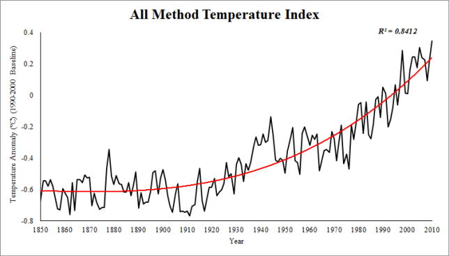
Figure 1: All Method Temperature Index (AMTI). 1990-2000 Baseline.
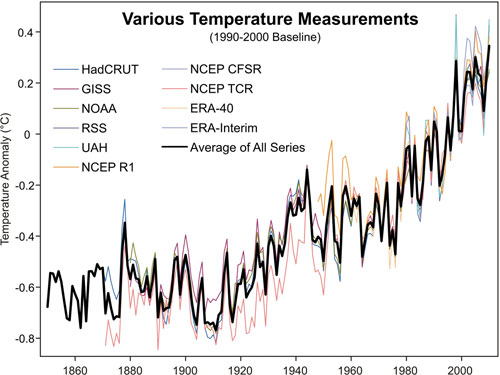
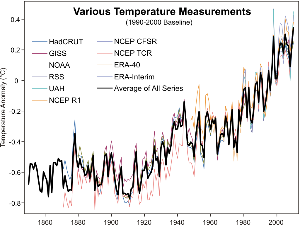
To create this graph, Robert had to track down a number of different temperature series. There were your classic "rock star" datasets - NASA GISS, NOAA and HadCRUT. The other favourites, although not going back as far as the thermometer records, are the satellite records UAH and RSS.
But another great addition are a number of other "reanalysis products". These are datasets that use a wide range of sources to reconstruct temperature. This includes thermometers, radiosondes, satellites, buoys and ship measurements. This way, they're able to create temperature records covering the entire globe, even Arctic regions that other datasets such as UAH, RSS and HadCRUT fail to cover. This is important because the Arctic is warming faster than the rest of the planet. To omit the Arctic is to underestimate the global warming trend.
Robert has also plotted a graph of all ten temperature records in a single graph, a vivid reminder that many independent lines of evidence all tell us the same thing. I've added it to our steadily growing Climate Graphics resource:
As with all our climate graphics, this is under a Climate Commons license so you're free to use this elsewhere. And the graph is available in a number of formats including an Excel Spreadsheet which contains all of Robert's methodology including the ten datasets and his graph from Monckton Myth #2. I'm very happy about this as I've been wanting to get hold of the European reanalysis data for while but have been too lazy busy to process the data myself :-)


 0
0  0
0 For the rest of your comment, please break it up into those components you feel most important and post them on the appropriate thread. Search function, upper left corner (in case you missed it).
 As for what this proves: Until you can show a 'natural cycle' that runs in a straight line for 35 years, this says 'it's not natural.' So much for all that 'ramp and sine' gibberish.
 Albatross,
I'm curious as to the coverage of the RATPAC-A data geographically. I'm also wondering as to whether anyone can find the JMA data. Thanks though. I'll have a look into it a bit.
Chris G,
Combining them is useful because the Reanalysis datasets have superior coverage of the Polar regions because they use so many different datasets. Furthermore their results validate those of GISS. The boys at clear climate code incorporated environment Canada data too and their results also validated GISS. I think assuming that the North is warming at the same rate as the global data is a flaw in hadley's analysis to be honest. In fact their whole station combination method is very good at excluding data whereas RSM (used by GISS) is very inclusive.
Albatross,
I'm curious as to the coverage of the RATPAC-A data geographically. I'm also wondering as to whether anyone can find the JMA data. Thanks though. I'll have a look into it a bit.
Chris G,
Combining them is useful because the Reanalysis datasets have superior coverage of the Polar regions because they use so many different datasets. Furthermore their results validate those of GISS. The boys at clear climate code incorporated environment Canada data too and their results also validated GISS. I think assuming that the North is warming at the same rate as the global data is a flaw in hadley's analysis to be honest. In fact their whole station combination method is very good at excluding data whereas RSM (used by GISS) is very inclusive.


Comments