Climate Science Glossary

Term Lookup

Enter a term in the search box to find its definition.

Settings

Use the controls in the far right panel to increase or decrease the number of terms automatically displayed (or to completely turn that feature off).

Term Lookup

Settings


All IPCC definitions taken from Climate Change 2007: The Physical Science Basis. Working Group I Contribution to the Fourth Assessment Report of the Intergovernmental Panel on Climate Change, Annex I, Glossary, pp. 941-954. Cambridge University Press.

Home Arguments Software Resources Comments The Consensus Project Translations About Support

Twitter Facebook YouTube Mastodon MeWe

RSS Posts RSS Comments Email Subscribe


Climate's changed before
It's the sun
It's not bad
There is no consensus
It's cooling
Models are unreliable
Temp record is unreliable
Animals and plants can adapt
It hasn't warmed since 1998
Antarctica is gaining ice
View All Arguments...


Username
Password
New? Register here
Forgot your password?

Latest Posts

Archives

Are surface temperature records reliable?

What the science says...

Select a level... Basic Intermediate Advanced

The warming trend is the same in rural and urban areas, measured by thermometers and satellites, and by natural thermometers.

Climate Myth...

Temp record is unreliable

"We found [U.S. weather] stations located next to the exhaust fans of air conditioning units, surrounded by asphalt parking lots and roads, on blistering-hot rooftops, and near sidewalks and buildings that absorb and radiate heat. We found 68 stations located at wastewater treatment plants, where the process of waste digestion causes temperatures to be higher than in surrounding areas.

In fact, we found that 89 percent of the stations – nearly 9 of every 10 – fail to meet the National Weather Service’s own siting requirements that stations must be 30 meters (about 100 feet) or more away from an artificial heating or radiating/reflecting heat source." (Watts 2009)

At a glance

It's important to understand one thing above all: the vast majority of climate change denialism does not occur in the world of science, but on the internet. Specifically in the blog-world: anyone can blog or have a social media account and say whatever they want to say. And they do. We all saw plenty of that during the Covid-19 pandemic, seemingly offering an open invitation to step up and proclaim, "I know better than all those scientists!"

A few years ago in the USA, an online project was launched with its participants taking photos of some American weather stations. The idea behind it was to draw attention to stations thought to be badly-sited for the purpose of recording temperature. The logic behind this, they thought, was that if temperature records from a number of U.S. sites could be discredited, then global warming could be declared a hoax. Never mind that the U.S. is a relatively small portion of the Earth;s surface. And what about all the other indicators pointing firmly at warming? Huge reductions in sea ice, poleward migrations of many species, retreating glaciers, rising seas - that sort of thing. None of these things apparently mattered if part of the picture could be shown to be flawed.

But they forgot one thing. Professional climate scientists already knew a great deal about things that can cause outliers in temperature datasets. One example will suffice. When compiling temperature records, NASA's Goddard Institute for Space Studies goes to great pains to remove any possible influence from things like the urban heat island effect. That effect describes the fact that densely built-up parts of cities are likely to be a bit warmer due to all of that human activity.

How they do this is to take the urban temperature trends and compare them to the rural trends of the surrounding countryside. They then adjust the urban trend so it matches the rural trend – thereby removing that urban effect. This is not 'tampering' with data: it's a tried and tested method of removing local outliers from regional trends to get more realistic results.

As this methodology was being developed, some findings were surprising at first glance. Often, excess urban warming was small in amount. Even more surprisingly, a significant number of urban trends were cooler relative to their country surroundings. But that's because weather stations are often sited in relatively cool areas within a city, such as parks.

Finally, there have been independent analyses of global temperature datasets that had very similar results to NASA. 'Berkeley Earth Surface Temperatures' study (BEST) is a well-known example and was carried out at the University of California, starting in 2010. The physicist who initiated that study was formerly a climate change skeptic. Not so much now!

Please use this form to provide feedback about this new "At a glance" section, which was updated on May 27, 2023 to improve its readability. Read a more technical version below or dig deeper via the tabs above!


Further details

Temperature data are essential for predicting the weather and recording climate trends. So organisations like the U.S. National Weather Service, and indeed every national weather service around the world, require temperatures to be measured as accurately as possible. To understand climate change we also need to be sure we can trust historical measurements.

Surface temperature measurements are collected from more than 30,000 stations around the world (Rennie et al. 2014). About 7000 of these have long, consistent monthly records. As technology gets better, stations are updated with newer equipment. When equipment is updated or stations are moved, the new data is compared to the old record to be sure measurements are consistent over time.

 GHCN-M stations

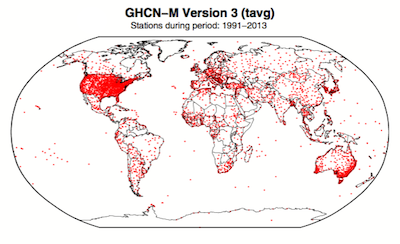
Figure 1. Station locations with at least 1 month of data in the monthly Global Historical Climatology Network (GHCN-M). This set of 7280 stations are used in the global land surface databank. (Rennie et al. 2014)

In 2009 allegations were made in the blogosphere that weather stations placed in what some thought to be 'poor' locations could make the temperature record unreliable (and therefore, in certain minds, global warming would be shown to be a flawed concept). Scientists at the National Climatic Data Center took those allegations very seriously. They undertook a careful study of the possible problem and published the results in 2010. The paper, "On the reliability of the U.S. surface temperature record" (Menne et al. 2010), had an interesting conclusion. The temperatures from stations that the self-appointed critics claimed were "poorly sited" actually showed slightly cooler maximum daily temperatures compared to the average.

Around the same time, a physicist who was originally hostile to the concept of anthropogenic global warming, Dr. Richard Muller, decided to do his own temperature analysis. This proposal was loudly cheered in certain sections of the blogosphere where it was assumed the work would, wait for it, disprove global warming.

To undertake the work, Muller organized a group called Berkeley Earth to do an independent study (Berkeley Earth Surface Temperature study or BEST) of the temperature record. They specifically wanted  to answer the question, “is the temperature rise on land improperly affected by the four key biases (station quality, homogenization, urban heat island, and station selection)?" The BEST project had the goal of merging all of the world’s temperature data sets into a common data set. It was a huge challenge.

Their eventual conclusions, after much hard analytical toil, were as follows:

1) The accuracy of the land surface temperature record was confirmed;

2) The BEST study used more data than previous studies but came to essentially the same conclusion;

3) The influence of the urban stations on the global record is very small and, if present at all, is biased on the cool side.

Muller commented: “I was not expecting this, but as a scientist, I feel it is my duty to let the evidence change my mind.” On that, certain parts of the blogosphere went into a state of meltdown. The lesson to be learned from such goings on is, “be careful what you wish for”. Presuming that improving temperature records will remove or significantly lower the global warming signal is not the wisest of things to do.

The BEST conclusions about the urban heat effect were nicely explained by our late colleague, Andy Skuce, in a post here at Skeptical Science in 2011. Figure 2 shows BEST plotted against several other major global temperature datasets. There may be some disagreement between individual datasets, especially towards the start of the record in the 19th Century, but the trends are all unequivocally the same.

rural-urban T

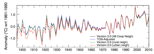
Figure 2. Comparison of spatially gridded minimum temperatures for U.S. Historical Climatology Network (USHCN) data adjusted for time-of-day (TOB) only, and selected for rural or urban neighborhoods after homogenization to remove biases. (Hausfather et al. 2013)

Finally, temperatures measured on land are only one part of understanding the climate. We track many indicators of climate change to get the big picture. All indicators point to the same conclusion: the global temperature is increasing.


See also

Understanding adjustments to temperature dataZeke Hausfather

Explainer: How data adjustments affect global temperature recordsZeke Hausfather

Time-of-observation Bias, John Hartz

Berkeley Earth Surface Temperature Study: “The effect of urban heating on the global trends is nearly negligible,” Andy Skuce

Check original data

All the Berkeley Earth data and analyses are available online at http://berkeleyearth.org/data/.

Plot your own temperature trends with Kevin's calculator.

Or plot the differences with rural, urban, or selected regions with another calculator by Kevin

NASA GISS Surface Temperature Analysis (GISSTEMP) describes how NASA handles the urban heat effect and links to current data.

NOAA Global Historical Climate Network (GHCN) DailyGHCN-Daily contains records from over 100,000 stations in 180 countries and territories.

Last updated on 27 May 2023 by John Mason. View Archives

Printable Version  |  Offline PDF Version  |  Link to this page

Argument Feedback

Please use this form to let us know about suggested updates to this rebuttal.

Related Arguments

Further reading

Denial101x video

Here is a related lecture-video from Denial101x - Making Sense of Climate Science Denial

Additional video from the MOOC

Kevin Cowtan: Heat in the city

Comments

Prev  1  2  3  4  5  6  7  8  9  10  11  12  13  14  15  16  17  18  19  20  Next

Comments 101 to 125 out of 530:

  1. Berényi Péter at 23:54 PM on 10 August, 2010 Peter, some of the links seems to be broken? Anyway, does your first chart represent published results or just your own analysis? If you are interested in Arctic surface station records have a look at Bekryaev 2010 which uses data from 441 high latitude and Arctic surface stations.
  2. Berényi Péter writes: Unfortunately I do not have too much time for this job, you may have to wait a bit. Like Berényi Péter, I also don't have a lot of time right now, being about to leave for vacation in a few days and having far too much to do. But I thought it would be worth putting up a quick example to illustrate the necessity of using some kind of spatial weighting when analyzing spatially heterogeneous temperature data. Since BP uses Canada as his example, I'll do the same. He mentions a useful data source, the National Climate Data and Information Archive of Environment Canada. I'll use the same data source. Since I want to get this out quickly, I'm just using monthly mean temperature data from July, and as another shortcut I'll just look at every 5 years (i.e., 2010, 2005, 2000, 1995, ...) I picked July because it's the most recent complete month and 5-year intervals for no particular reason. Maybe sometime later I can expand this to look at the complete monthly data set. In any case, using just one month per 5 year interval will make this analysis more "noisy" than it would otherwise be, but that's OK. I then identified all stations with data in all years, and whose name and geographic coordinates were exactly the same in all years. There's just over 150 of them: Note, first, that the stations aren't distributed uniformly. Note, second, that the trends differ greatly in different regions. In particular, note that there are a large number of stations showing cooling in inland southwestern Canada. There are also a lot of stations showing warming across eastern and northern Canada. (This is an Albers conical equal-area projection, so the apparent density of stations is proportional to their actual density on the landscape). If you calculate the trend for each station, and then just take the overall non-spatial average, you get a slight cooling of about -0.05C/decade for Julys in the 1975-2010 period. But as the map shows, that's quite unrealistic as an estimate of the trend for the country as a whole! The large number of tightly-clustered stations in certain areas outweighs the smaller number of stations that cover much larger areas elsewhere. To estimate the spatially structured temperature trend I used a fairly simple kriging method. This models a continuous surface based on the irregularly distributed station data. There are many other approaches that could be used (e.g., gridding, other interpolation methods, etc). Anyway, the spatially weighted trend across all of Canada is warming of +0.18C/decade. So ... a naive nonspatial analysis of these data give an erroneous "cooling" of -0.05C/decade. A spatially weighted analysis gives a warming of +0.18C/decade. This is why I keep telling Berényi Péter that his repeated attempts to analyze temperature data using simple, nonspatial averages are more or less worthless. Again, this is based on a small fraction of the overall data set, and a not necessarily optimal methodology. But it's sufficient to show that using real-world data you can end up with seriously misleading results if you don't consider the spatial distribution of your data.
  3. #101 Peter Hogarth at 04:25 AM on 11 August, 2010 some of the links seems to be broken? Yes, two of them, sorry.
    • GHCN data
    • March, 1840 file at Environment Canada - this one only contains a single record for Toronto, but shows the general form of the link and structure of records
    Anyway, does your first chart represent published results or just your own analysis? As I have said, it is my own analysis. But it is a pretty straightforward one using only public datasets. Really nothing fancy, anyone can repeat it. BTW, the result, as you can see, is published (here :) It is not peer reviewed of course. But since the quality of the peer review process itself is questioned in this field, it is a strength, not a deficiency. Any review is welcome. have a look at Bekryaev 2010 which uses data from 441 high latitude and Arctic surface stations You still don't get it. The Bekryaev paper is useless in this context, as it is neither freely available nor has its supporting dataset published. Therefore it is impossible to repeat their analysis or check the quality of their data here and now. Credibility issues can get burdensome indeed.
  4. That map from my previous comment also nicely illustrates the conceptual flaw in the claim (by Anthony Watts, Joe D'Aleo, etc.) that the observed warming trend is an artifact of a decline in numbers of high-latitude stations. Obviously, stations in northern Canada are mostly warming faster than those further south. So, if you did use a non-spatial averaging method, dropping high-latitude stations would create an artificial cooling trend, not warming. Using gridding or another spatial method, the decline in station numbers is pretty much irrelevant (though more stations is of course preferable to fewer).
  5. Berényi Péter at 07:07 AM on 11 August, 2010 Thanks for fixing the links, though I think Ned has actually answered one question I had quite efficiently. I'm not sure what it is I still don't get? (why so defensive?) Bekryaev lists all sources (some of them available for the first time), the majority with links, though I admit I haven't followed them all through. I am surprised you make comments without even looking at the paper. Anyway, I genuinely thought you might be interested.
  6. #105 Peter Hogarth at 07:58 AM on 11 August, 2010 Bekryaev lists all sources (some of them available for the first time), the majority with links, though I admit I haven't followed them all through. Show us the links, please. I am surprised you make comments without even looking at the paper. Anyway, I genuinely thought you might be interested. I am. However, I would prefer not to pay $60 just to have a peek what they've done. I am used to the free software development cycle where everything happens in plain public view. #104 Ned at 07:11 AM on 11 August, 2010 Obviously, stations in northern Canada are mostly warming faster than those further south I see that. However, that does not explain the fact the bulk of divergence between the three datasets occurred in just a few years around 1997 while the sharp drop in Canadian GHCN station number happened in July, 1990. Anyway, I have all the station coordinates as well, so a regional analysis (with clusters of stations less than 1200 km apart) can be done as well. But I am afraid we have to wait for that as I have some deadlines, then holidays as well.
  7. #102 Ned at 06:50 AM on 11 August, 2010 I thought it would be worth putting up a quick example to illustrate the necessity of using some kind of spatial weighting when analyzing spatially heterogeneous temperature data OK, you have convinced me. This time I have chosen just the Canadian stations north of the Arctic Circle from both GHCN and the Environment Canada dataset. The divergence is still huge. Environment Canada shows no trend whatsoever during this 70 year period, just a cooling event centered at the early 1970s, while GHCN raw dataset is getting gradually warmer than that, by more than 0.5°C at the end, creating a trend this way. No amount of gridding can explain this fact away.
  8. This one is related to the figure above. It's adjustments to GHCN raw data relative to the Environment Canada Arctic dataset (that is, difference between red and blue curves). Adjustment history is particularly interesting. It introduces an additional +0.15°C/decade trend after 1964, none before.
  9. BP #108 Your approach still gives the appearance of cherry picking stations. As I said previously, you need to make a random sample of stations to examine. Individual stations on a global grid are not informative, except as curiosities :)
  10. #109 kdkd at 19:37 PM on 11 August, 2010 Your approach still gives the appearance of cherry picking stations You are kidding. I have cherry picked all Canadian stations north of the Arctic Circle that are reporting, that's what you mean? Should I include stations with no data or what? How would you take a random sample of the seven (7) stations in that region still reporting to GHCN every now and then? 71081 HALL BEACH,N. 68.78  -81.25 71090 CLYDE,N.W.T.  70.48  -68.52 71917 EUREKA,N.W.T. 79.98  -85.93 71924 RESOLUTE,N.W. 74.72  -94.98 71925 CAMBRIDGE BAY 69.10 -105.12 71938 COPPERMINE,N. 67.82 -115.13 71957 INUVIK,N.W.T. 68.30 -133.48 BTW, here is the easy way to cherry pick the Canadian Arctic. Hint: follow the red patch.
  11. One more piece of the puzzle. If DMI (Danish Meteorological Institute) Centre for Ocean and Ice is visited, a very cool melt season can be noticed this year north of the 80° parallel (compared to the 1958-2002 average). It went below freezing two weeks ago (with the sun up in the sky 7×24 hours a week) and stayed there consistently. This is unheard of since measurements started. Melt season is defined here as the period when 1958-2002 average is above freezing. It is 65 days, from 13 June to 16 August. One wonders how exceptional this weather might be. Therefore I have recovered average melt season temperatures for the high Arctic from the DMI graphs for the last 53 years. This is what it looks like: It is pretty stable up to about 1992. Then, after a brief warming (a tipping point?) it dives into a rather scary, accelerating downward trend. So no, this year is not exceptional, just an extension of the last two decades. It may even be consistent with recent ice loss of the Arctic Basin, because lower temperatures mean higher pressure, a predominantly divergent surface wind pattern around the Pole, hence increased export of ice to warmer periphery. Of course with further cooling this trend is expected to turn eventually. However, there is one thing this downward trend is surely inconsistent with. It is the upward trend reported by e.g. GISS (US National Aeronautics and Space Administration - Goddard Institute for Space Studies) and the computational climate models it is calibrated to, of course. This conflict should be resolved.
  12. BP - homogenization adjustments are something that happen at an individual station level and relate to time of day of reading, screen type, thermometer type, altitude etc. I've said it before and I'll say it again. If you think the homogenization is done wrong, then you need to show us a station where the adjustment procedure has been incorrectly applied or proof that those procedures have flaws. There is just not enough information here to assess whether you supposed problems are real problems. Pick a station in this high arctic set. Dig out the data needed for homogenization, follow the GHCN manual and show us where they went wrong. Just one station.
  13. BP- and I will ask again. What do you think the probability of surface temp record, glacial ice volume, sealevel and satellite temperatures trends ALL being wrong so as to give us a false trend? Consilience anyone?
  14. #112 scaddenp at 10:49 AM on 18 August, 2010 Pick a station in this high arctic set. Dig out the data needed for homogenization, follow the GHCN manual and show us where they went wrong. Just one station. Nah, that would be cherry picking and excessive detail.
  15. BP - you show a site saying how interesting but never found out what the homogenisation procedure was. As I pointed out earlier, people have done this for 2 stations in NZ where "they were apparently adjusted to show warming", but when the station siting history etc was examined, the homogenisation procedure was shown to be correct. Its not enough to show just the readings, you have to have site history and adjustment procedure. And you guess on probability that the consilience is wrong?
  16. #113 scaddenp at 10:52 AM on 18 August, 2010 BP- and I will ask again. What do you think the probability of surface temp record, glacial ice volume, sealevel and satellite temperatures trends ALL being wrong so as to give us a false trend? I can't assign a probability to that event, because the sample space is undefined. We have no idea what might or might not going on in the background. But I would say it's likely in the ordinary sense of the word. In all these cases people are desperately looking for tiny little effects hidden in huge noise with predetermined expectation. Not the best precondition for objectivity. At least the surface temperature record has serious problems with neglecting the temporal UHI effect due to fractal-like population distribution and quadrupling of global population density in slightly more than a century. If you subtract this from the trend, not much remains, leaving all the multiple independent lines of evidence inconsistent with each other.
  17. #115 scaddenp at 11:20 AM on 18 August, 2010 never found out what the homogenisation procedure was Listen, I am talking about adjustments done to raw data here. I thought homogenization is supposed to come later. Anyway, it is next to impossible to assess the validity of a procedure if truly raw data are not published. How likely is it that Environment Canada stations needed an increasing upward adjustment starting in 1964 up to 0.9°C toward the end to make their way into GHCN raw dataset?
  18. BP writes: In all these cases people are desperately looking for tiny little effects hidden in huge noise with predetermined expectation. Not the best precondition for objectivity. I don't think that's a reasonable suggestion. Spencer & Christy are "skeptics" but their UAH satellite record is not dramatically different from RSS's version (+0.14C/decade vs. +0.16). Several of the recent "blog-based" replications of the GISTEMP/HADCRUT surface temperature record were done by "skeptics" or "semi-skeptics" ... but they don't show any difference from the mainstream versions. If Greenland were gaining ice, or if the global mean temperature were falling over the 1979-2010 period, or if there were a reasonable way to process satellite altimetry data that showed sea levels declining ... somebody would have published it by now. Do you seriously think Spencer & Christy haven't scrutinized their methods, looking for anything that could get them back to the (erroneous) cooling trend they got so much fame and attention for in the 1990s? Sorry, BP, but that argument just won't fly.
  19. BP - the irony in your post on objectivity is amazing. Signal to noise in MSU and sealevel is easily quantifiable. And your UHI doesnt make any sense with numerous papers on measuring and understanding the effect. As to GHCN. Do think it reasonable that stations going into the GHCN have temperatures corrected so that every station measures temperature on the same basis? THEN you worry about gridding etc. I think you should actually get the station data and the GHCN adjustment data from the station custodian. Why guess?
  20. #119 scaddenp at 14:53 PM on 18 August, 2010 Do think it reasonable that stations going into the GHCN have temperatures corrected so that every station measures temperature on the same basis? Definitely. That is, it would be reasonable, but unfortunately it is not what happens. In reality data from GHCN stations inside the US of A go into the raw data file pretty much unchanged, then later on multiple adjustments are applied to them as they make their way to v2.mean_adj. The bulk of the 20th century warming trend for the US is introduced this way. For the rest of the world an entirely different procedure is followed, where adjustments are hidden from the public eye. That is, for these stations the additional upward trend introduced during the transition from v2.mean to v2.mean_adj is next to negligible, but there are huge adjustments to data before they have a chance to get into the raw dataset. Of course it is always possible to re-collect data from the original sources and make a comparison (that's what I was trying to do with Environment Canada and Weather Underground), but it is not a cost effective way to do the checking, that much you have to admit. Worse, for most of the stations in GHCN there is no genuine raw data online (not to mention metadata) from the original source, so one would need a pretty extensive organization to do an exhaustive validation job of GHCN data integration procedures.
  21. BP - no one doubts for a moment that data in the series has to be adjusted but you seem to assume that data adjustment is evidence for global conspiracy to create global warming but you havent investigated the adjustment for any single station so far as I am aware. Take Wellington. Original station close to sea level. Then it was moved to met office on top of nearby hill. ("Proof of global cooling. Adjustments arent required"). Later it was moved to airport at sealevel. ("Conspiracy to create warming by moving station. Must make adjustment"). NONE of this history is apparent in the raw data. In fact none of it accessible via internet. Since you are so sure that a station has be incorrectly adjusted, then surely the way to prove this is get the adjustment procedure from custodian and check it against the GHCN manual. None of your graphs mean anything until basis for adjustment has been audited for individual station. You can claim a coup if you find just ONE piece of fraud, so surely worth effort of writing directly to custodian and a lot more cost effective than analysis that shows that adjustments are made - we know that. Papers written on what, how, and how effective these are.
  22. #121 scaddenp at 08:04 AM on 19 August, 2010 no one doubts for a moment that data in the series has to be adjusted Agreed. However, everyone with a basic training in science and a bit of common sense would doubt the right time for adjustments is before data are put into the raw dataset. If it is done to numerous Canadian sites we can check by Environment Canada, there is no reason to assume it is not a general practice, also done to most stations there is no easy way to recover genuine raw data for. The straight, simple and honest path would be not to do it ever, not in a single case. Include all the necessary metadata there along with truly raw measurements and do adjustments later, putting adjusted values into a separate file. From the Tech Terms Dictionary: Raw data Raw data is unprocessed computer data. This information may be stored in a file, or may just be a collection of numbers and characters stored on somewhere in the computer's hard disk. For example, information entered into a database is often called raw data. The data can either be entered by a user or generated by the computer itself. Because it has not been processed by the computer in any way, it is considered to be "raw data." To continue the culinary analogy, data that has been processed by the computer is sometimes referred to as "cooked data." Therefore it is a valid statement that the majority of data in GHCN are cooked.
  23. With two stages of adjustment,you have two types of data. If Environment Canada (are they the real custodian or the collection agency) says this the data as read from thermometer, then it raw. You have to have the metadata about the thermometer and station changes before you can do the adjustment procedures though. This is the what is missing from your analysis. I am pretty sure that GHCN "raw" data is the station-adjusted data ready for gridding. GHCN does not have the data for station series adjustment as fas as I know. This is done by custodial agency in NZ and I guess the rest of the world. It needs local knowledge.
  24. BP - apologies. I have taken time I don't really have to read the GHCN documentation. The raw file should indeed be the thermometer readings as received from custodian corrected only for scale. If the individual data from environment Canada dont match individual data from GHCN, then you do have a case for asking why not. However, averaging isnt meaningful without methodology for the average. Is difference in the individual stations or in the averaging method? I note that GHCN rejects station data for which the raw data for homogenization correction is not available, so in principle, you should be able to find all that. Since you think the adjustments must be wrong, then pick the station with highest adjustment and get the homogenization data for that. Repeat the procedure in Petersen et al
  25. The answer might be no. A STATISTICAL ANALYSIS OF MULTIPLE TEMPERATURE PROXIES: ARE RECONSTRUCTIONS OF SURFACE TEMPERATURES OVER THE LAST 1000 YEARS RELIABLE? McShane and Wyner. Submitted to the Annals of Applied Statistics One of the conclusions:

    ...we conclude unequivocally that the evidence for a ”long-handled” hockey stick (where the shaft of the hockey stick extends to the year 1000 AD) is lacking in the data.

    In other words, there might have been other sharp run-ups in temperature, but the proxies can't show them. The hockey stick handle may be crooked, but the proxies can't show it one way or the other.
    Response: Not the same topic. Try this thread for a better place to discuss McShane and Wyner:
    Is the hockey stick broken?

Prev  1  2  3  4  5  6  7  8  9  10  11  12  13  14  15  16  17  18  19  20  Next

Post a Comment

Political, off-topic or ad hominem comments will be deleted. Comments Policy...

You need to be logged in to post a comment. Login via the left margin or if you're new, register here.

Link to this page


The Consensus Project Website

THE ESCALATOR

(free to republish)


© Copyright 2024 John Cook
Home | Translations | About Us | Privacy | Contact Us